Computer Shop Logo Design

Behind the scene
There was not much in terms of customer requirements. I had freedom to do the work. One thing he specifically said is that he likes logos like the Microsoft logo.
Keeping those things in mind, when a service related to the computer is mentioned, something that we all usually remember is a computer icon. Because it is a common thing,
I didn't want to do the design with it. I thought that the graphic card's fan would give me a better feeling about the computer.
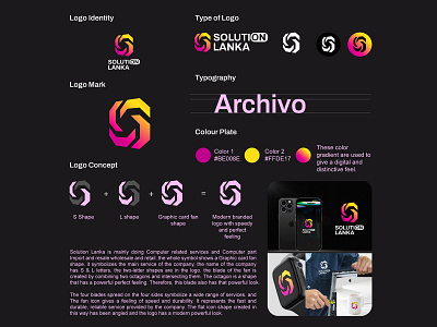
I sketched a lot of fans in different ways. I couldn't find a suitable shape for a perfect blade. After that, I stopped drawing shapes by hand. I tried to get the shape of the fan blades from the common shapes we usually know. In the end, I obtained this blade shape by welding two angles.. The shape was taken. It was perfectly set to the logo. After that, the shape of the flat icon was removed by the logo was angled to one side to give a little 3D look.
That's how this logo was created.
The four arrow shapes on the 4 sides show that a wide range of computer-related services is provided. The speed feeling and perfect shape of the fan shape show that a fast and reliable long-lasting service is provided. You can get a clear idea about this from the logo guide.


