Evouchers - Iconography


Hey all! Glad to share the iconography and patterns we developed for Evouchers.
Evouchers was initially created as solution for schools and local authorities in the UK to procure, assign and distribute grocery vouchers during the 2020 Coronavirus pandemic. Today, Evouchers is supporting all type of organisations with a robust system that is ready to fulfil any voucher requirements.
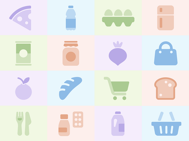
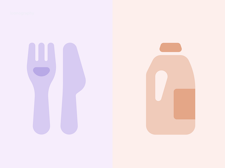
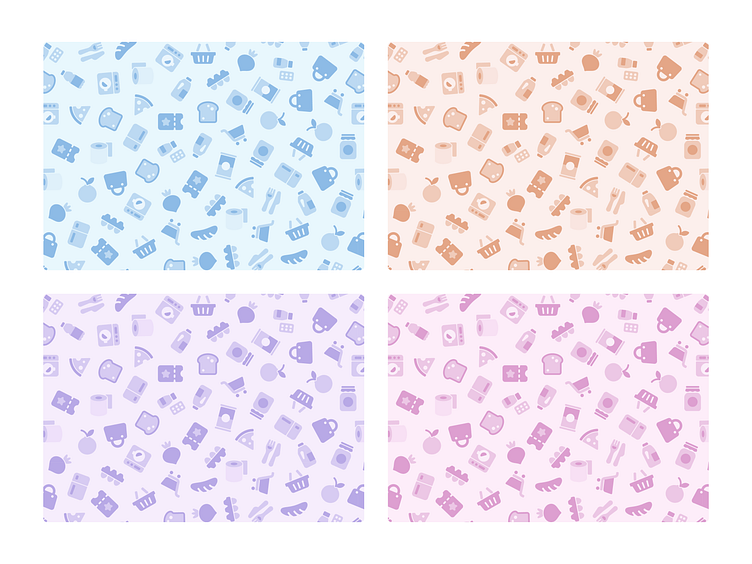
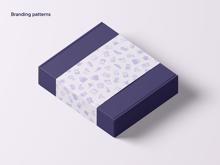
Our strategy was to create a visual identity that reflected the brand's noble origins, and expanded into an open and calming identity that resonated with the various users’ needs. We developed a logo and icon aligned with it's sister brand, Wonde, and a purple and pastel color. We wrapped everything up with a series of smile-shaped devices, and lovely icon set that reflected the brands different use cases.
From groceries, toiletries to electrical appliances, Evouchers can help you give an extra hand to employees, organisations or communities when in need.
---
We are BB Agency
We're a digital agency crafting holistic, people-friendly experiences. We serve as a strategic partner for fast-growing tech companies in need of a scalable website with modular CMS, a design system, and future-proof brand identity. Through challenging core assumptions, we shape the products and services that improve the lives of thousands every single day.
Check us out at www.bb.agency


