MART logotype

The International Festival of Culture MART in Tel Aviv annually presents a wide program of events covering new areas of the theatre, music, and dance industries. The festival is organised by the MART Foundation.
We developed a new logo for the foundation as well as the festival's new visual identity. The identity's main metaphor is the dawn, or sunrise, which represents emerging opportunities and the discovery of young artists.
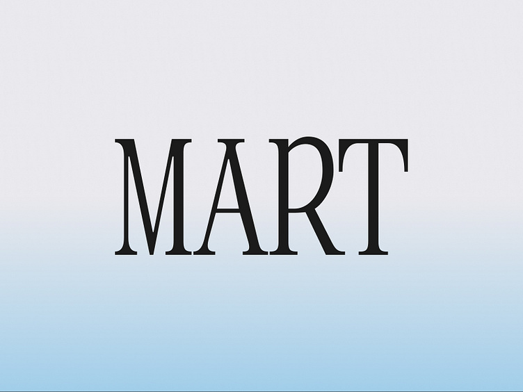
The typography is built on a combination of two contrasting typefaces — an elongated monospace serif and a narrow grotesque. The composition of the festival's logo illustrates the main focus of both the foundation and the event. MART stands for Modern Art, so we split off the M to emphasise that.
Learn more about our work:
| ESH gruppa | Instagram | Behance | LinkedIn | Twitter | Pinterest |


