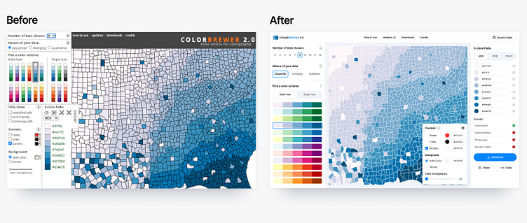
Redesign color palette utility for map makers

Redesign web tool for guidance in choosing choropleth map color schemes, based on the research of Dr. Cynthia Brewer.
1. We analyzed the interface and made it more clear and modern.
2. In the number of classes showed all the data at once, so that you do not have to choose from a drop-down list.
3. The nature of the data illustrated the names so that they are understandable without reading the prompt.
4. Arranged the list of color schemes.