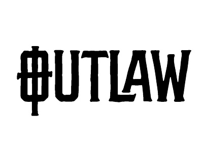
Outlaw Logotype feedback
Scott-
for me visually, the color in the original on the right is way heavier than on the left, and its kind of broken up by the celtic cross T, which i think is a little problematic for you in itself with the very small counters.
Is there an opportunity to use the O as the cross instead? It could balance the weight out and lead you in nicely instead of your eye kind of getting caught left of center... saw an opportunity and wanted to toss a quick sketch your way instead of explaining myself!
Good luck, you have a great start here and I can't wait to see how you resolve it!
View all tags
Posted on
Apr 16, 2015
More by Jason Carter View profile
Like


