Subway Fix

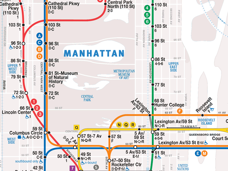


For years, I have wanted to fix the subway map. I'm a fan of Vignelli's original for its visual clarity, but can understand critics' attack for its geographic inaccuracy. I don't think we need to return to Vignelli's but borrowing his masterful use of contrast would go a long way to improve the existing maps. This GIF demonstrates how today's map uses bright colors for land and water that actually make it harder to identify and follow the subway lines, especially when you're reading it on a bumpy train in motion. Using grays for geographic textures and using colors for names and lines would greatly improve the map.
I was finally able to make this because of a PDF protection remover app I found that let me hack into the MTA's map. I immediately brought it in to Photoshop to fix this.
I feel like I just scratched an itch I've had for years.


