A guide on how to approach mobile design for a matured product


The mobile team had the vibe of a little startup in and of itself, with an extremely small team: one Android developer, two iOS developers, and myself. By comparison, the web tool had 20 programmers and 2 products!
Shani Frankel | 6 min read
1. Joining the different teams monday.com
In 2018, I joined an incredibly talented team of 7 designers (today we have grown to over 40!) as the first mobile designer. Whilst Monday was already a mature tool with many users, the mobile version was lagging behind.
The mobile team had the vibe of a little startup in and of itself, with an extremely small team: one Android developer, two iOS developers, and myself. By comparison, the web tool had 20 programmers and 2 products!
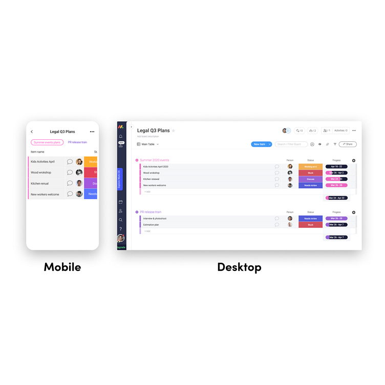
Monday’s claim to fame is its spreadsheet on steroids. A spreadsheet!! Fantastic for use in landscape mode on a big screen, you’re thinking….but for mobile users in portrait mode?!
The monday.com tool offers many solutions and addresses complex challenges. But this high level of functionality poses a challenge; how can it be incorporated in the limited screen real estate mobile setting?
Rolling up my sleeves (research)
Playing with the app, there were so many things that I wanted to improve. I wasn’t really sure where to start, so I decided to start with some user research, speaking to both existing and new users. The sheer number of challenges that came up in my discussions was huge with many users aggravated by the user experience.
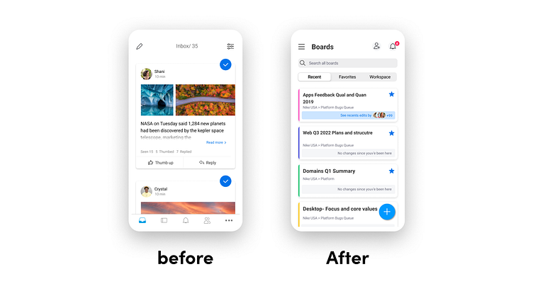
One recurrent issue was cumbersome navigation. “Where are my boards? Why am I landing in my inbox?” were questions I kept on hearing. It was clear that in-app orientation wasn’t good enough, with many users unable to find what they were looking for.
The second issue that kept cropping up was difficulty working on the board; the core product of Monday. It simply wasn’t working for the mobile users.
Whilst there were many other issues that surfaced, these were the two issues that I identified as most critical to the user experience.
So I had 2 main issues I wanted to tackle:
1. The navigation and orientation in the app
2. The spreadsheet – the core tool of the app – wasn’t working for mobile users.
I wanted to analyze the data from the mobile users to support my plan to tackle these two issues first, but it transpired that we didn’t have enough quantitative data on our mobile users to make a solid case, and, frankly, I didn’t know where to start even if there had been enough! As a designer, it was the first time I had to prove ideas through data analysis, and I just didn’t even know the basics. Being data-illiterate actually ended up being a trigger for Monday launching a Data School – to get people like me up to speed!
There were historical reasons for the original design of the in -app navigation and I felt that people’s prior investment contributed to my difficulty in getting everyone on board and understanding the problem at hand. Here’s to me trying to explain this to you, hopefully, more successfully:
Our tabs navigation placed all main features in the same hierarchical level:
I decided to tackle this board issue first by showing my team videos of frustrated users using the app the developers were on board. Guaranteed fun! Guaranteed
The spreadsheet- the core tool of the app isn’t working for users on mobile
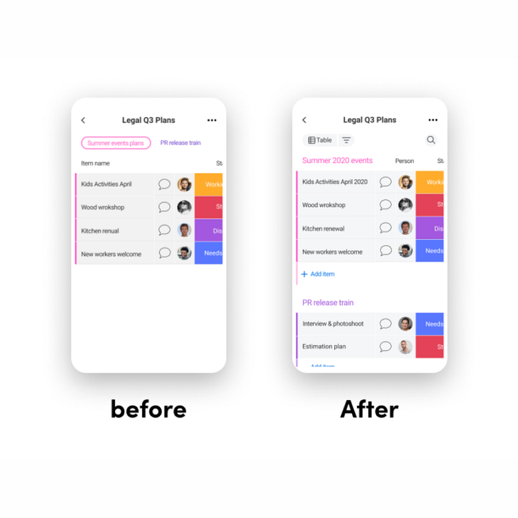
The next challenge which our users were crying out loud about was, “Where are my groups?!” These were such aggravating conversations, that I’ve had with users over and over again. To understand these conversations, let me briefly dive into how things look in monday.com: when the spreadsheet was adapted for the mobile app, the groups (a number of items gathered under a single parent item) were designed as tabs, a perfectly native usage in the world of mobile! But our users were coming from the desktop app and they couldn’t ‘see’ their groups in the mobile tabs, they were looking for the groups in the same place they remembered them from the desktop version. Makes sense, right?
Now that I understood the problem, the need to change the way groups were designed in the mobile version was crystal clear.
Solving problems is fun (finding a solution)
Designing the spreadsheet vertically took me exactly two minutes to fix (and would for any designer), but for the programmers it meant building the board from scratch. I was left extremely chuffed, the programmers slightly less so :). Most importantly it meant we could solve many other dependent issues, which was GREAT.
Issues we solved with the new board:
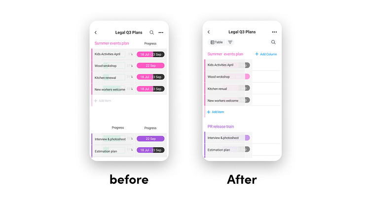
We could design new dialogues that were consistent in their behavior. We have many different column types, each with its own unique behaviors, The result – users had no idea what to expect when a dialogue was opening or closing. So we built a system relevant to all of our column types (25 and counting).
We were able to create a single header for all the spreadsheets, helping users understand that we are looking at one spreadsheet, and not different tables in the same view
1. Joining the different teams monday.com
In 2018, I joined an incredibly talented team of 7 designers (today we have grown to over 40!) as the first mobile designer. Whilst Monday was already a mature tool with many users, the mobile version was lagging behind.
The mobile team had the vibe of a little startup in and of itself, with an extremely small team: one Android developer, two iOS developers, and myself. By comparison, the web tool had 20 programmers and 2 products!
monday’s claim to fame is its spreadsheet on steroids. A spreadsheet!! Fantastic for use in landscape mode on a big screen, you’re thinking….but for mobile users in portrait mode?!
The monday.com tool offers many solutions and addresses complex challenges. But this high level of functionality poses a challenge; how can it be incorporated in the limited screen real estate mobile setting?
Rolling up my sleeves (research)
Playing with the app, there were so many things that I wanted to improve. I wasn’t really sure where to start, so I decided to start with some user research, speaking to both existing and new users. The sheer number of challenges that came up in my discussions was huge with many users aggravated by the user experience.
One recurrent issue was cumbersome navigation. “Where are my boards? Why am I landing in my inbox?” were questions I kept on hearing. It was clear that in-app orientation wasn’t good enough, with many users unable to find what they were looking for.
The second issue that kept cropping up was difficulty working on the board; the core product of Monday. It simply wasn’t working for the mobile users.
Whilst there were many other issues that surfaced, these were the two issues that I identified as most critical to the user experience.
So I had 2 main issues I wanted to tackle:
1. The navigation and orientation in the app
2. The spreadsheet – the core tool of the app – wasn’t working for mobile users.
I wanted to analyze the data from the mobile users to support my plan to tackle these two issues first, but it transpired that we didn’t have enough quantitative data on our mobile users to make a solid case, and, frankly, I didn’t know where to start even if there had been enough! As a designer, it was the first time I had to prove ideas through data analysis, and I just didn’t even know the basics. Being data-illiterate actually ended up being a trigger for Monday launching a Data School – to get people like me up to speed!
There were historical reasons for the original design of the in -app navigation and I felt that people’s prior investment contributed to my difficulty in getting everyone on board and understanding the problem at hand. Here’s to me trying to explain this to you, hopefully, more successfully:
Our tabs navigation placed all main features in the same hierarchical level:
Sani is the 7th designer at monday.com, the first mobile designer.
Today leads the Mobile design group.


