Kerning, Leading, Tracking: A Crash Course

You know when sometimes I just want to spoil you? Well, today is one of those days.
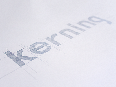
If you've been interested in lettering and typography for some time, the words « kerning », « tracking » or « leading » should sound familiar. What all these terms have in common is that they refer to the amount of space to leave around letters to make them all look nice together as words, sentences and paragraphs.
As letterers, we always concern a lot about letterforms, and too few about the space between, when it is crucial to the overall look of your piece. You can draw the most beautiful letters, a poor management of the negative space will make the whole thing look like the work of an amateur.
While there's no absolute science behind it all, you should be aware of a few principles that will allow you to avoid common mistakes, and help you to achieve better overall results with your lettering.


