Growy - Investment - Branding


Hello Everyone 👋
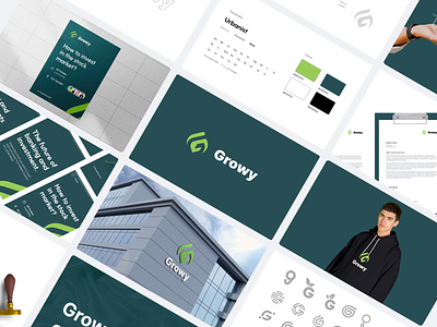
Continue the project Growy. The company's brand name is taken from the word “growing” with passion and hope to create investment business innovations that continue to grow following the modern era. The company designed a visual and structural refresh using lime green and midnight green to convey a sense of freshness and richness with dignity. The logogram is designed from the basic shape of the letter "G" and then combined with the "leaf" icon. The logotype logo uses the Inter font to create a bold and modern impression.

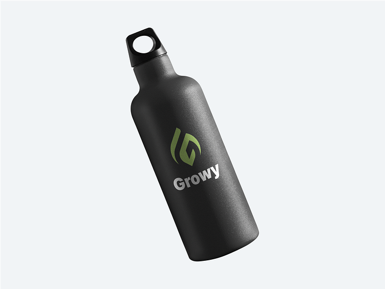
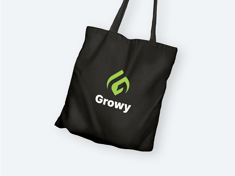
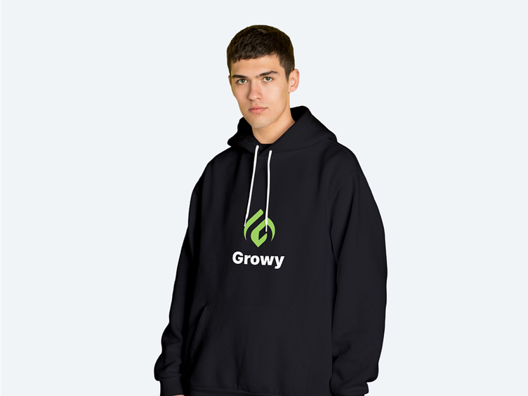
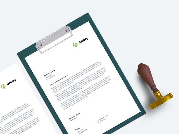
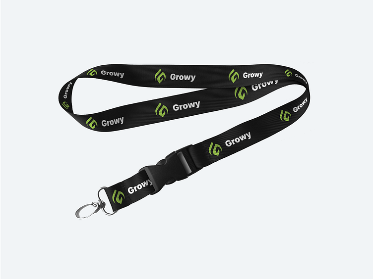
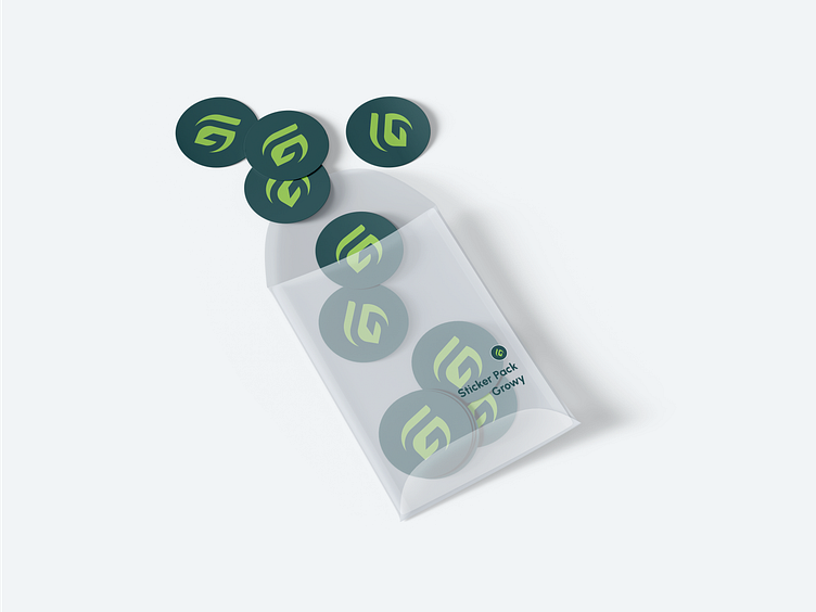
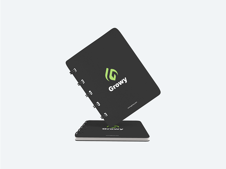
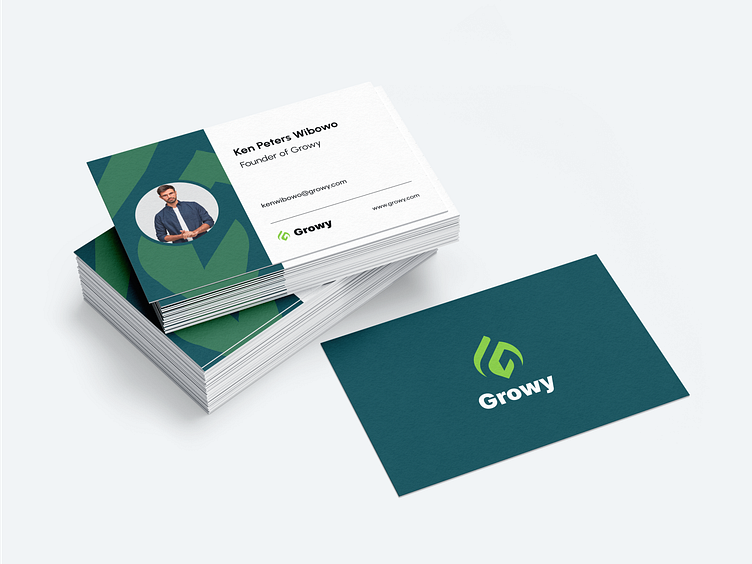
Swag Kit
Here's the swag kit preview of our design project. Check it out!
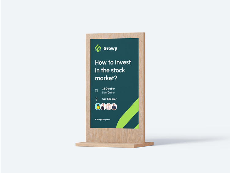
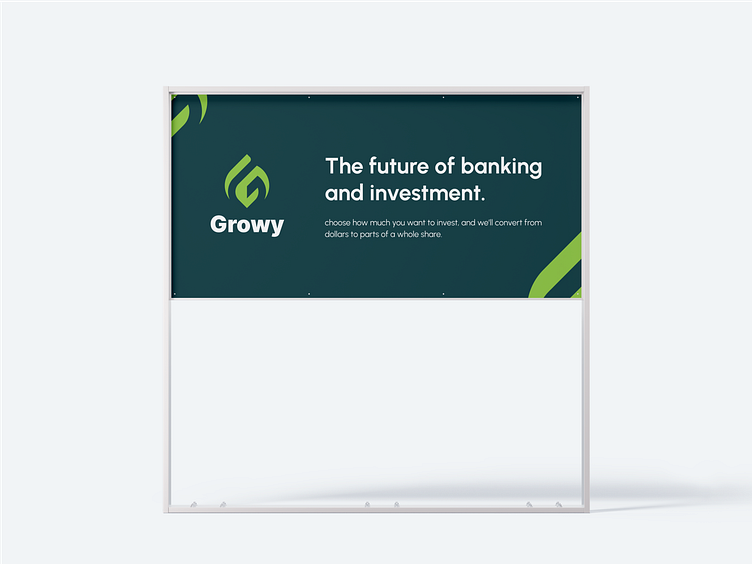
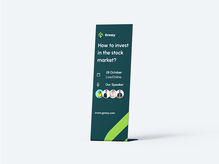
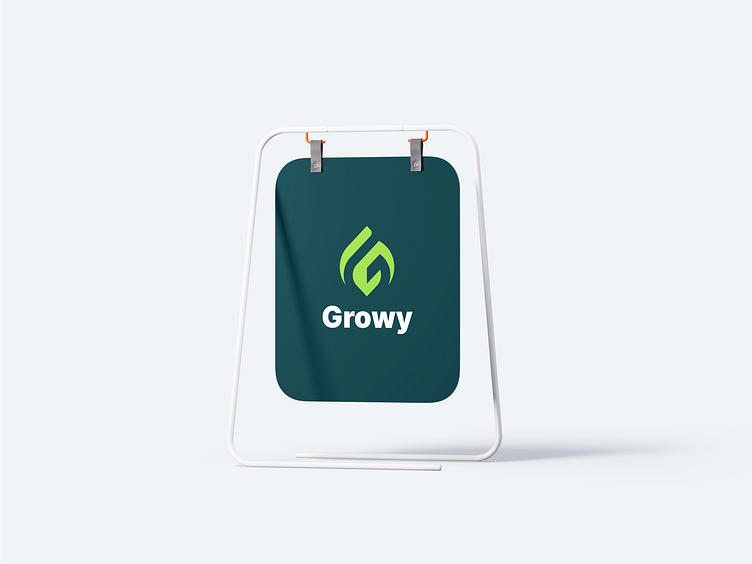
Outdoor Ads
Here's the outdoor ads preview of our design project. Check it out!
Thank you, Interesting to collaborate? 🤝
We're ready to solve your problems and collaborate with your product. Let us know and say hello at hello@dipainhouse.com
Dipa Inhouse is a creative digital design and development agency. We provide high-quality services and help you to find solutions in UI/UX designs that are intuitive and represent your business goal.
Website • Instagram • Clutch • Contact Us