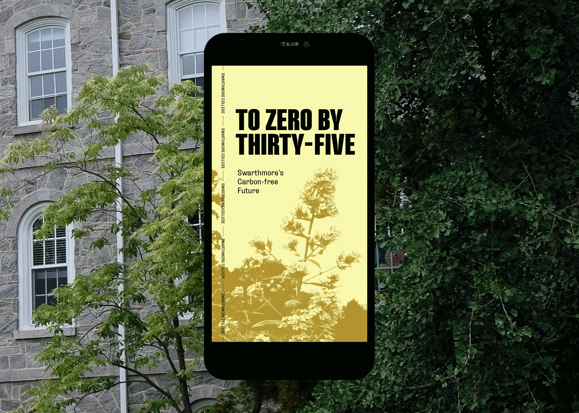
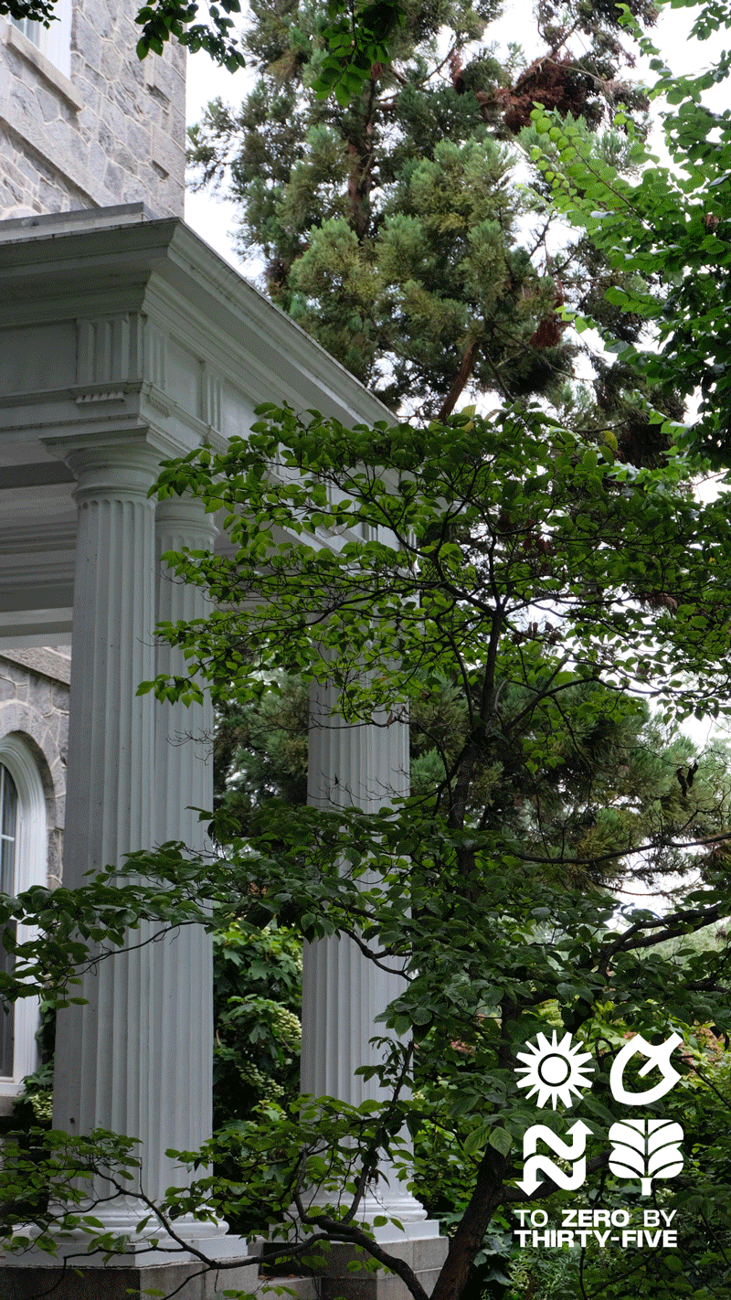
To Zero and Beyond

20X35 is a campaign launched by Swarthmore College announcing their plan and commitment to carbon neutrality by 2035.

With many moving parts, this project needed to be visually bold and high impact to ensure it conveyed the urgency of the construction while still telling the larger story in a compelling and thoughtful way. It also needed to stand the test of time, because as the name states this campaign needs to stay up for over a decade — so we wanted to ensure it would stay as relevant as possible. The striking yet simple direction seen here was born out of the idea that the process is distilled down into the essence of these icons.
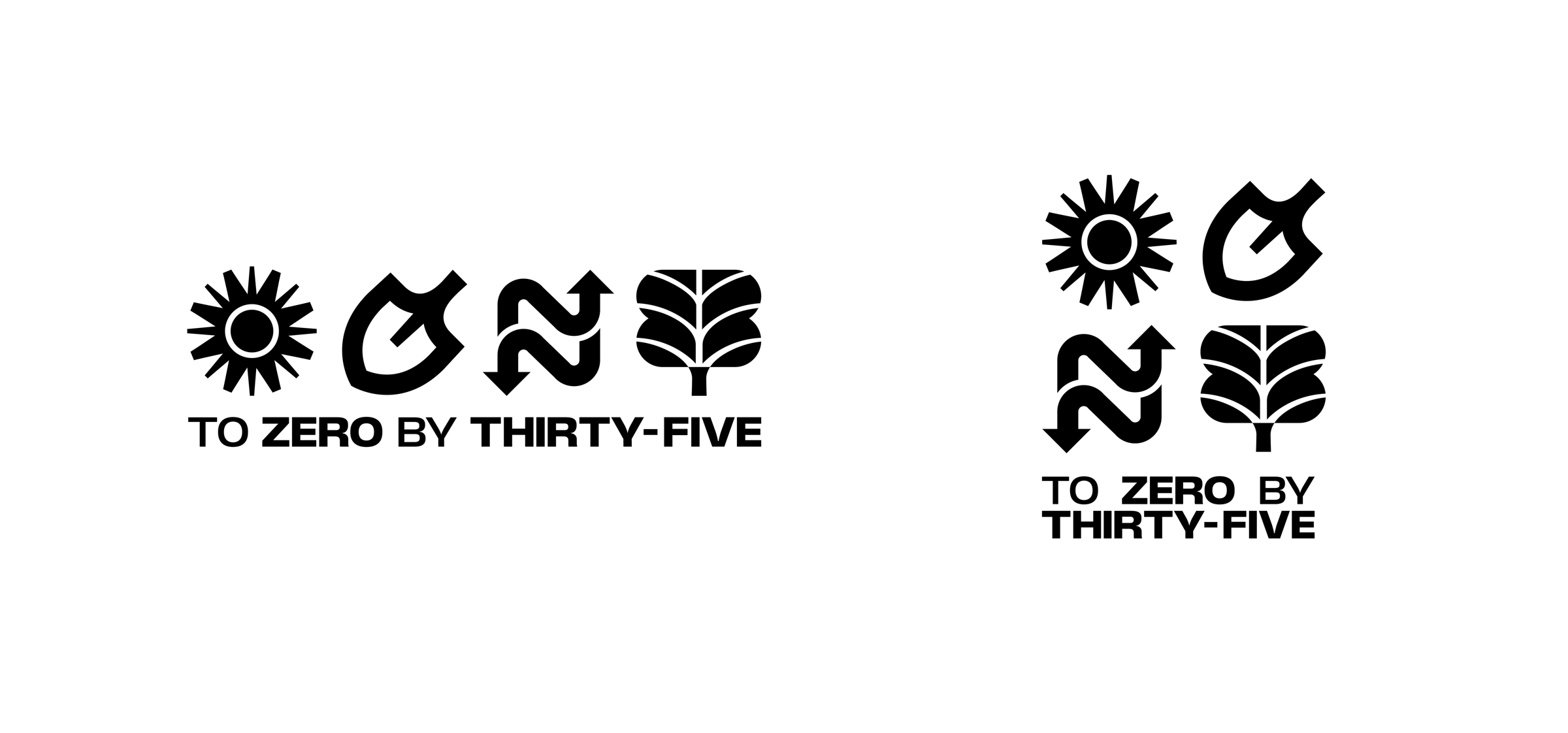
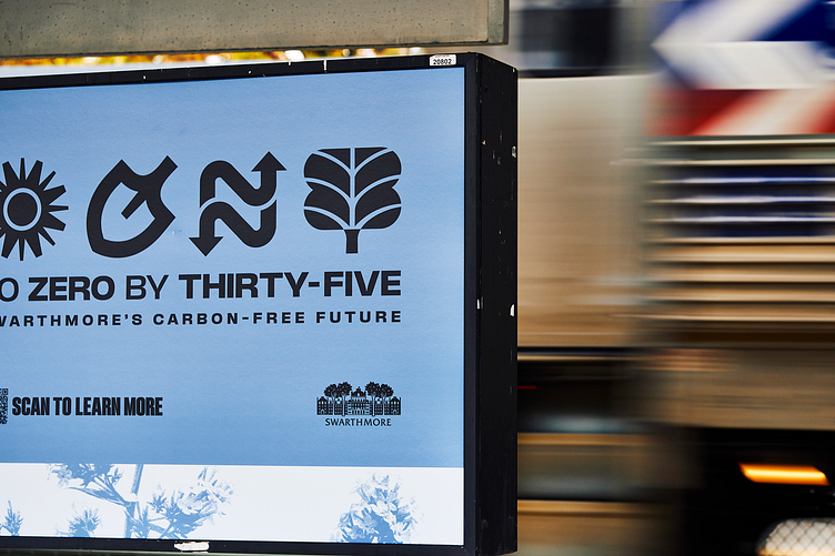
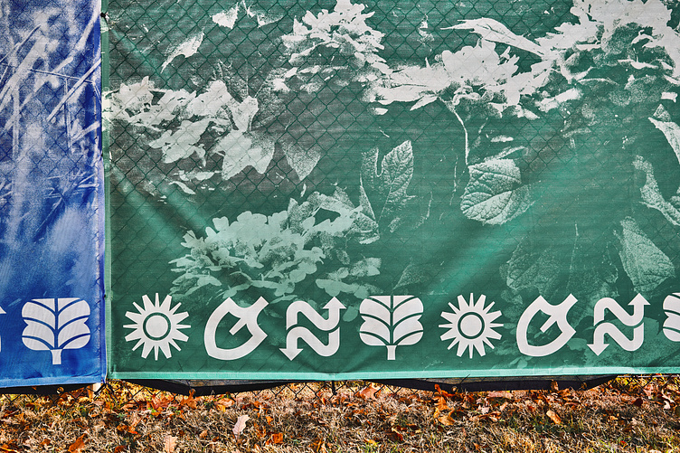
THE SUN a power source, the beginning of a new dawn
THE SHOVEL this time of transition and construction, breaking the ground
THE ARROWS showing the process of geoexchange, changing old systems
THE TREE a connection to the campus arboretum, reverence for nature


Building off of the bold weight of the icon set, we needed a type system that would work well across a huge range of use cases in signage, digital and print needs. So we ended up going with Fixture, a massive 74-style typeface that could handle anything we threw at it!


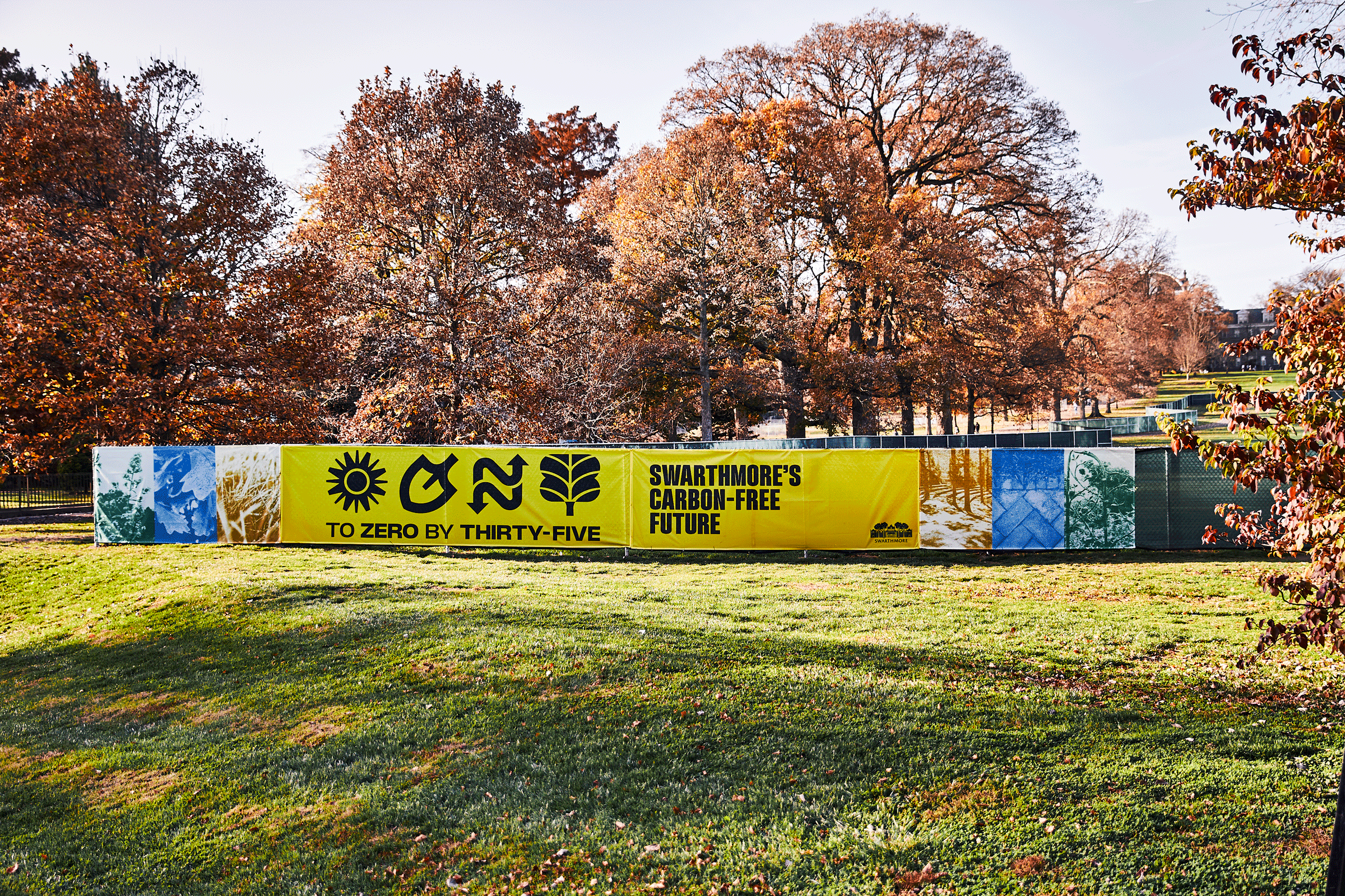
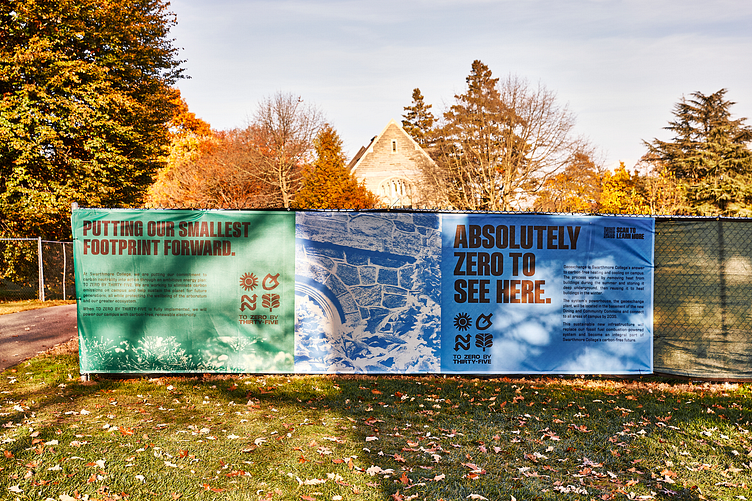
Starting with smallest scale signage we wanted to instill a color palette that would stand out from the school’s signature color (a deep burgundy red “garnet”) that would pair well with the school’s color if need be. Our solution included the three colors most symbolically linked to the natural world, with complimenting tints to go along with.
The other main component that is seen across the campaign is a range of textures that showcase the flora of the Swarthmore Campus and Scott Arboretum. They are incorporated as a way to add a softer compliment to the bold type and colors, and in larger use cases a more organic container shape sporting a ripped paper edge is introduced to prevent the larger texture swatches from feeling too boxed in.

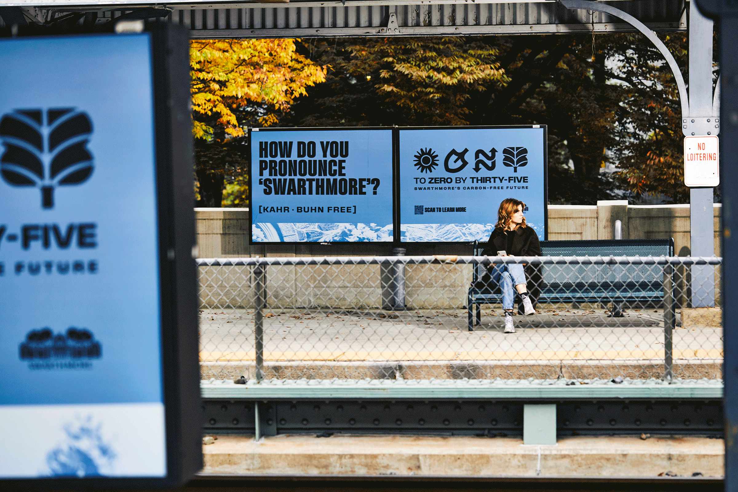
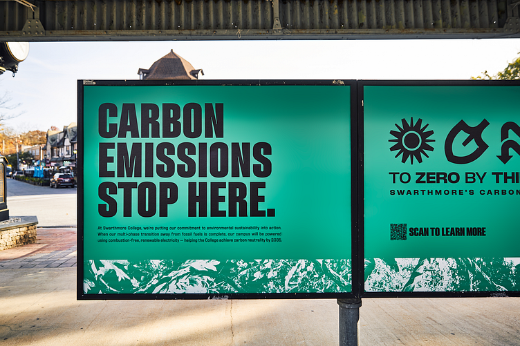
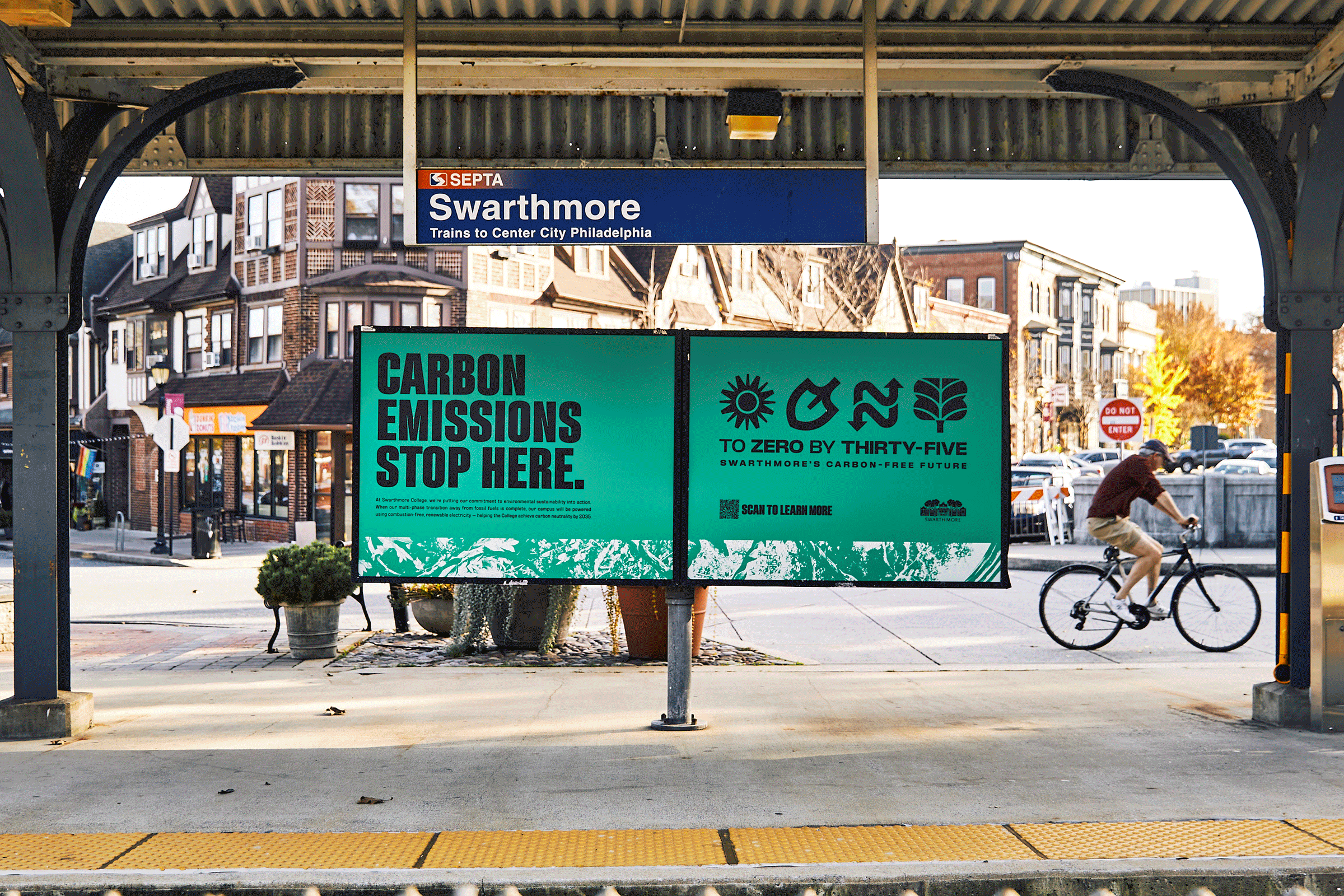
For the initial roll-out we came up with a series of billboards that would greet visitors as they entered the train station at Swarthmore explaining the project at a high level and leading people to learn more online. These clever headlines Rachael came up with announce the plan in a smart, approachable way.Enter your text here...
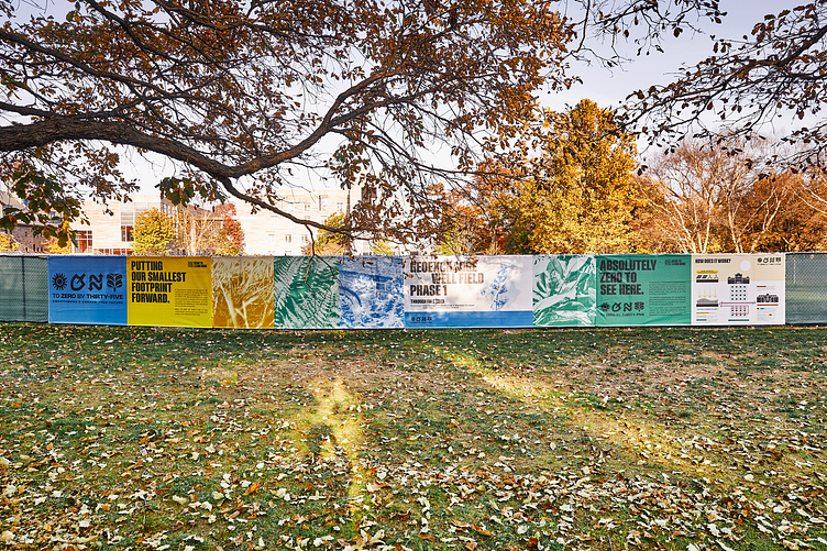
Beyond the station takeover, we also had a great opportunity to design a fence wrap style billboard on the hill overlooking the station, because a 5 foot tall logo never hurts to get the word out *wink wink*. Seeing the textures large and in charge also felt like a great way to draw intrigue and get people excited for what this was all about.

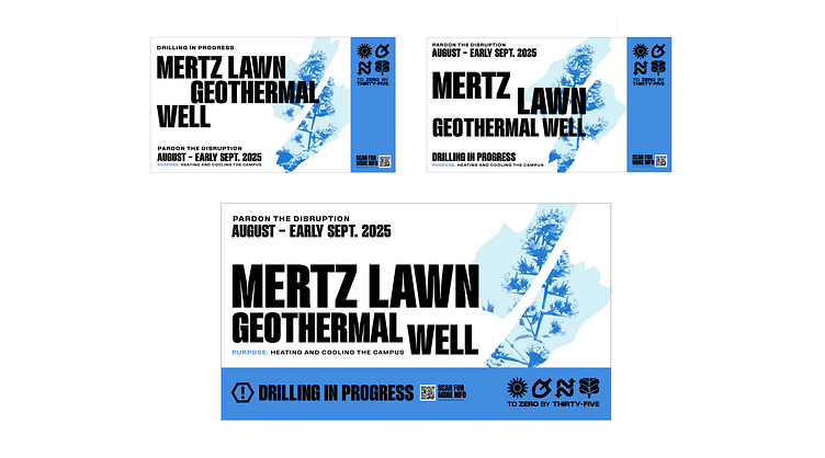
It was at this point when things really kicked into high gear and we built out signs for use all over campus. These ranged from general caution signs to larger mission and project description signs. The majority of these were executed as fence wraps to cover up the central construction site, so we also deployed a number of beauty panels featuring textures from our library to help weave the edges of the project together.


Looking ahead to the digital portion of the campaign we leaned into the idea that social media would be the best way for us to talk about the long form details of 20X35. For social and on the website it was important for us to incorporate some full color photography to compliment the brand textures and color blocking.
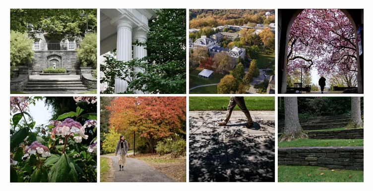
Our photo theory is such that images should feature nature throughout the campus, and arboretum, the focus being natural beauty juxtaposed with the built environment. We took care to ensure any shots with people still hold nature as the focus, never featuring a person as the primary subject within a frame.
And there you have it, To Zero By Thirty-Five! // Agency Truth & Consequences ; Creative Direction Dan Shepelavy ; Copy Rachael Silverbauer ; Photos by Ed Newton