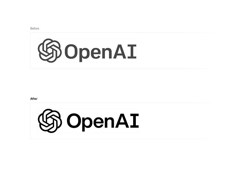
OpenAI logo redesign

OpenAI's ChatGPT and the latest art-generating AIs quietly haunt the collective nightmares of many designers. The louder voices in the field celebrate these tools, believing that raw enthusiasm can negate legal and artistic material incursions on our territory. The louder voices are unfortunately de facto correct, at least for now.
The AIs offer a glimpse of a future (actually, a present) which accelerates our drudgeries, and removes key opportunities to employ our authorial creative impulses directly on media. Regardless of the outcome on the field of design, if these technologies are going to be so pervasive in our lives, they should have branding that's harmonious, and drawn with attention to detail.
Before beginning my redesign, I did some research into Ben Barry's original drawing for the OpenAI logo (made in collaboration with Ludwig Pettersson). I found it odd that the logo felt unique and memorable but nonetheless used such strangely dissonant forms. I was curious to learn how decisions were made to end up where they did, so I aimed to create a speculative redesign which removed discrepancies while maintaining the spirit of Barry’s original drawing.
The logotype, at least in production, appears to be a custom-drawn weight of the typeface Colfax. It's unclear if this has any relation to the ColfaxAI font that's specified in the OpenAI site CSS, or if that's just a renamed font file of the original Process Type Foundry typeface.
My suspicion is that Barry custom redrew a simulated "Book" weight of Colfax for the logo because Colfax proper solely has an overly-thin Regular weight, and the next weight above that is an overly-thick Medium weight, and nothing in between. If so, he was right to feel neither were suitable for the logo and an in-between weight was needed.
The first issue that came up in this custom-drawn weight of Colfax was that the redraw was sloppy, with odd kerning choices, and drawing errors on the letterforms themselves, clearly-unintentional indentations into the letters and random extra vector points. In addition, the glyphs were all placed on different baselines at arbitrary decimal values.
Secondly, I can see why Barry used Colfax as it has a sort of technical programming sensibility, but that exclusivity feels antithetical to the premise of “openness” in OpenAI as a company. One can see my improvements here with the more round and open O in my redesign’s customized drawing of Helvetica Now. As far as alignments, the ColfaxAI logotype itself sits far too low relative to the logomark and feels unbalanced. These alignments have been improved in my redesign.
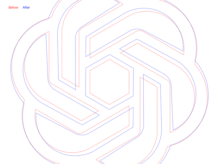
With regard to Barry’s logomark, the inner hexagon and its protruding spokes make a jarring two-step stroke weight transition into the outer curved segment. I improved on this in my redraw by employing a gradually-expanding tapered stroke. Further, the curved/angled bend on the elbow of the spokes feels not sufficiently gradual enough to balance the inner angularity with the outer curvature. It therefore needed to be more rounded to appear intentional. The overall proportions of the inner hexagon aperture to the overall shape contour also feel too small, and needed to be better balanced with a larger aperture, as seen in my redraw.
Too often today we see revolutionary rebrands that serve internal stakeholder jockeying at companies and short-term market attention grabs. Those needs can be served perfectly well with branded feature launches and campaigns. What's needed most often is evolutionary rebranding and logo redraws, especially when there's a strong brand to begin with. This is what I set out to do with this redesign.


