Food Community Mobile App - University Project

For my final UIUX project for Monash University, we were tasked to create a fully interactive mobile interface for a food community mobile application as part of our final assignment, from user data gathering to developing user stories to creating low fidelity prototypes and in the end, creating high fidelity interactive prototypes. This is that project's story!
Developing User Personas
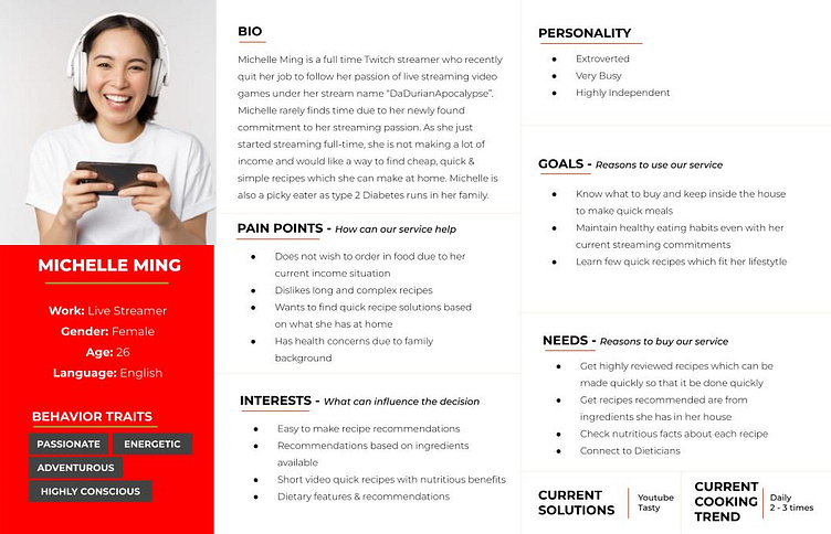
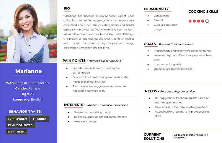
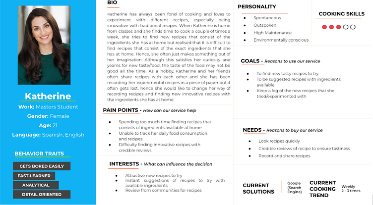
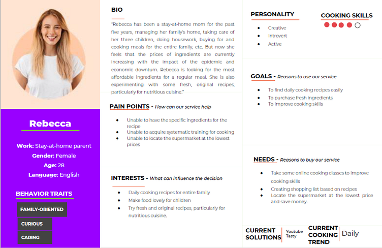
In order to formulate an analysis, Don Norman’s three levels of design of visceral, behavioural and reflective was taken into consideration when developing the conceptual framework in order to keep good design principles in mind while gathering the needed information from our potential users in addition to aligning to Norman’s seven stage of Actions. User personas were developed using the MoSCOW method.
Developing User Stories
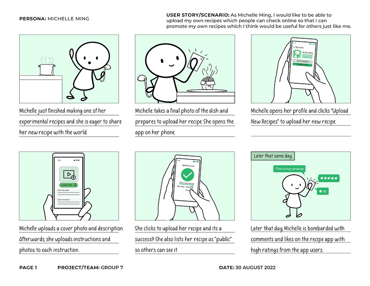
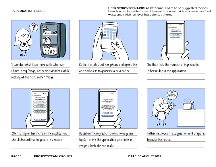
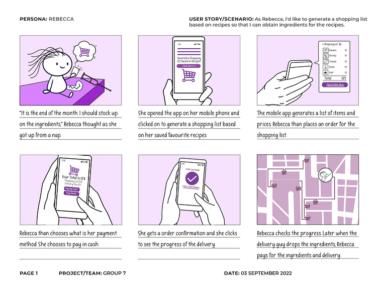
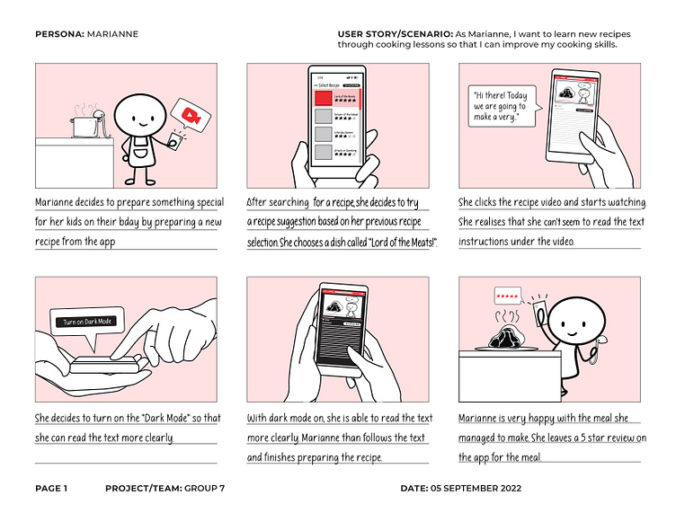
At the initial start, we developed use cases based on the user personas developed. Storyboards were further developed to showcase different scenarios to understand the user stories better.
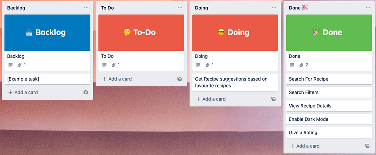
In addition, the Kanban task board was used to visualize work, track project status in real-time and identify functional criteria which needs to be met. In addition, it helped to create a selection criteria based on the different user personas. Also it helped to prioritise on what would be required to demo and use the app on a minimum viable scale.
The storyboards designed were as follows.
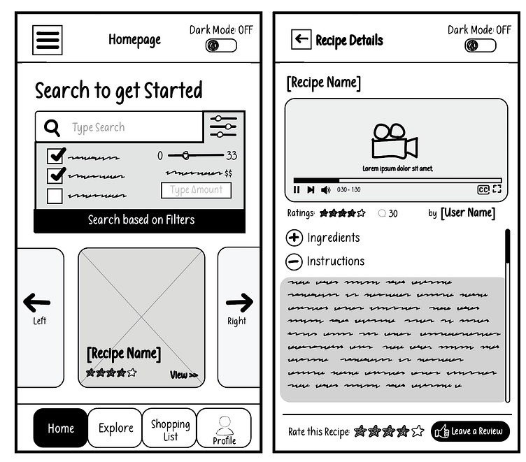
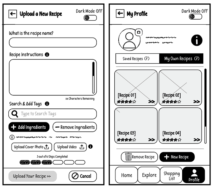
Development of Low Fidelity Prototypes
Low fidelity prototypes were developed based on the user stories. One of the main ideas behind the assignment was the application of UI design principles in addition to heuristics and application of accessibility principles. All screens put together also show how the different functions and applications are related and can work as intended.
4 Norman's Design Principles were taken into account
1. Signifiers
2. Striving for Consistency
3. Constraints
4. Feedback
The low-fidelity designs were as follows.
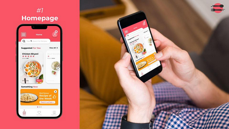
From Low-Fidelity to High-Fidelity
Once the low-fidelity designs were approved, it was about bringing life to the low-fidelity designs. This included the development of colour palettes, defining uniformed shapes, fonts, colour psychologies and understanding how a user will interact with the interface, including A/B testing of finding the best solutions for the user experience.
We started by developing theme colours and components such as buttons and carousel so that we are able to standardise the design on each screen. Then, linking up the screens is done at the last step to allow audiences to interact with the prototype.
In order to check compliance, our team decided to take the 10 rules of thumb known as Nielsen's Heuristics in order to evaluate the prototype. As design is a continuous process of improvement, Nielsen's Heuristic evaluation provided us an idea of what is good in our design which we should keep and what we should also consider as improvement to save us time as we develop with the interface and the experience for the user.
Development of Interactions and Buttons
Once everything was set, it was time to connect the screens on Figma and develop an interactive prototype.
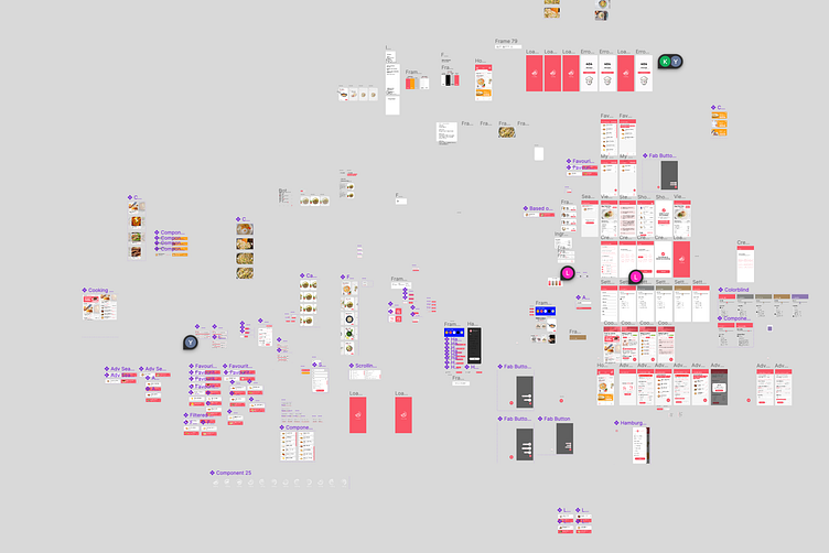
Do not freak out. It is just a Figma file with components
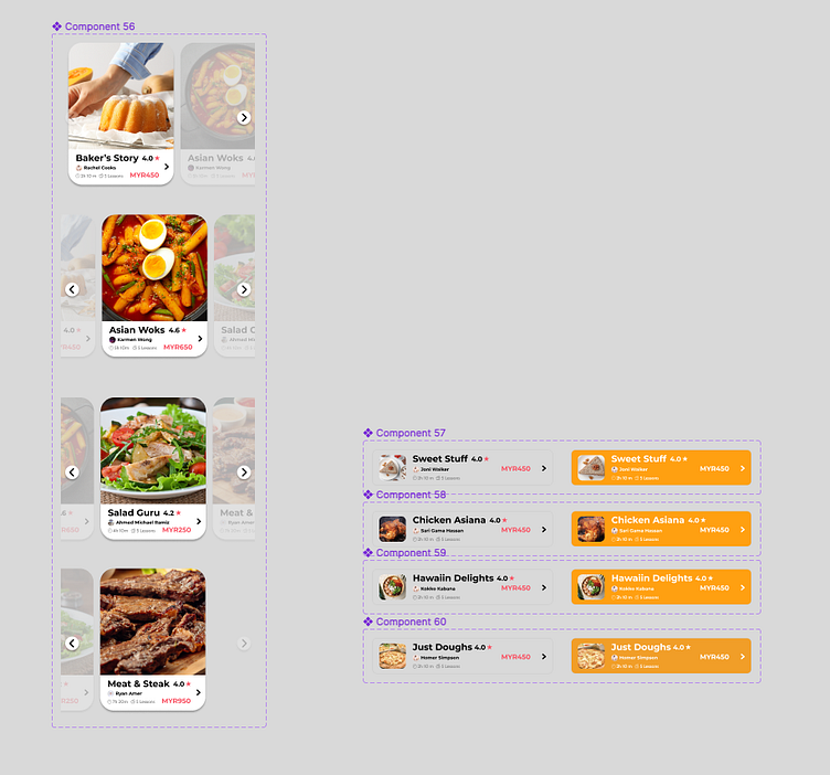
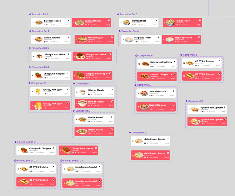
Adding components and making magic!
Feel free to view the Figma file below
Special thanks to collaborators Lynn, Kania & Yanfei


