Typefully Branding

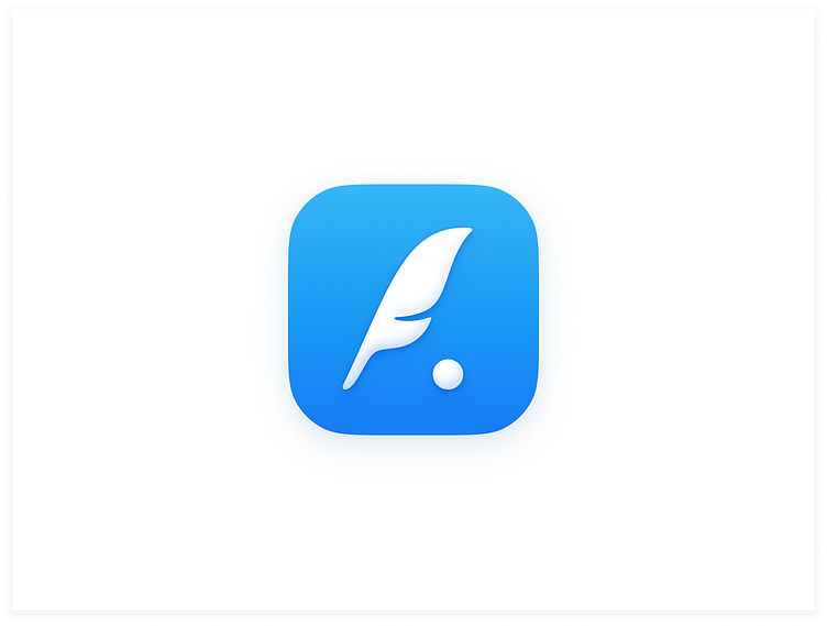
The Typefully team reached out to me to collaborate on improving their branding. They wanted to keep the spirit of their old logo, but take it to the next level. After 3 rounds of sketches, 14 digital concepts, and a lot of experimenting we landed on this new logo and we could not be more proud. Below I've added some more designs, sketches, and unused concepts. Check out all their assets here.
Typefully is a popular tool to write better tweets and grow your Twitter audience, letting you schedule and publish your thoughts without distractions, and offering analytics and engagement tools.
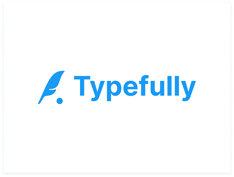
The full lockup of symbol + text. Clean and simple, no gradients, and using Inter Bold.
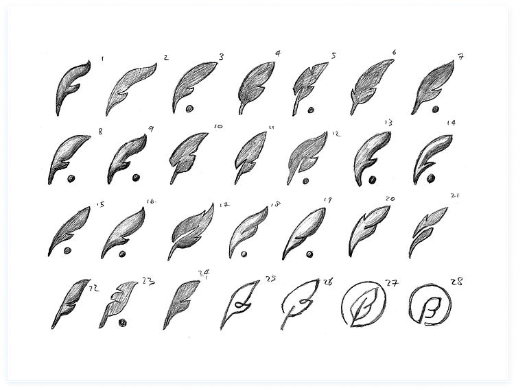
The second round of sketched logo concepts. Sketched on paper, scanned, and cleaned up in Photoshop. These are variations of some of the earlier sketches that stood out to the team and me, plus a few more experiments at the end.
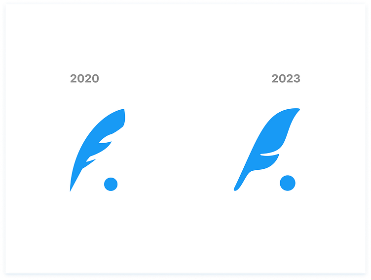
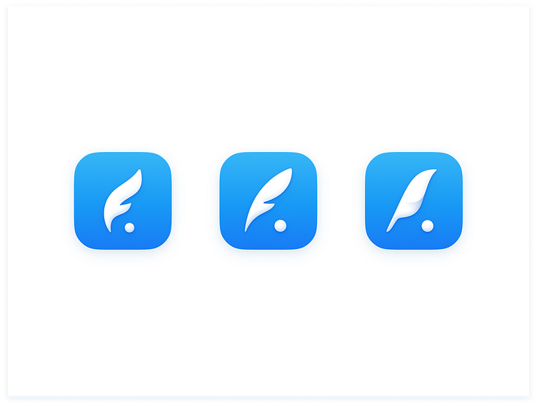
The old vs the new, just to show the difference. As you can see we preserved the concept of the original one, but made the shape more iconic and pleasant to look at.
A small portion of the unused digital logo concepts. I really like these, but not as much as the final logo.
Thanks for reading! As always, feel free to drop a comment with your thoughts.
✌🏻


