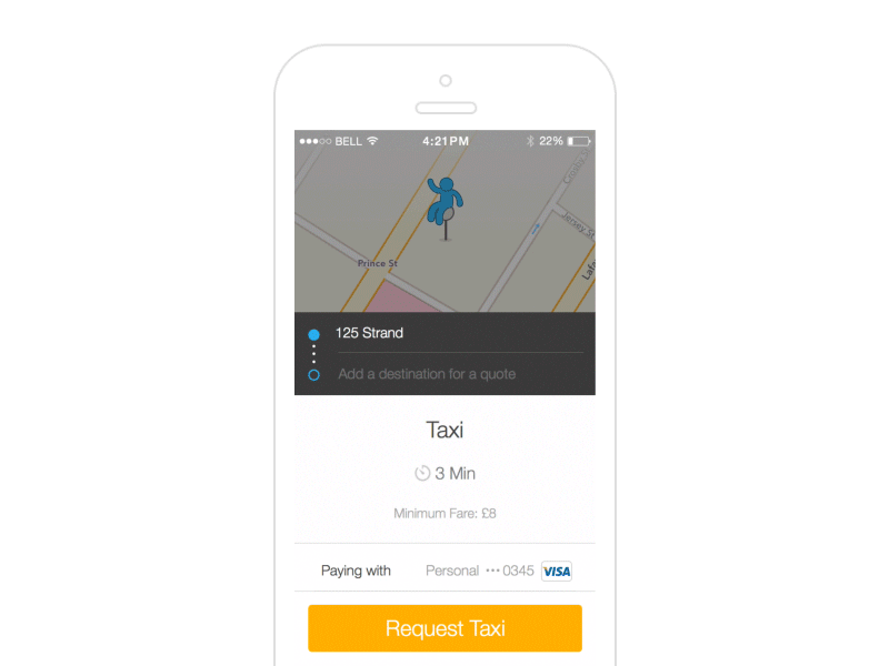
Hailo destination picker created with Pixate


Looking at how we can use hierarchy and screen interactions to improve the current experience when trying to select a destination.
Current destination screen attached. The problems..
- No clear hierarchy for actions a user can take. The screen is very white making it difficult to interpret where to start.
- The title bar, search bar and tab bar are fixed even when scrolling leaving little room to view content especially on smaller screens.
Prototype made using Pixate, video then created from a screen recording using Quicktime. Touch points and frame applied in AE.
Let me know what you think to the solution so far, would love to hear your feedback.
Many thanks!
Credits to @Saffad Khan on this one as well!


