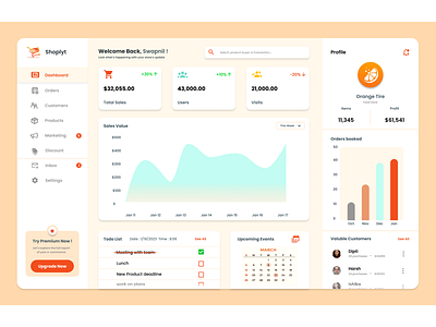
Dashboard for store owners

Hello everyone!!
Colors can speak in ways that are as powerful as language.
They can attract users, better communicate your message and
the right color selection always supports better information readability.
I worked on the UI design of the dashboard for the users hosting their shops on a fictional brand Shoplyt.
I have used shades of orange color as it represents warmth, happiness, and success.
and White as it keeps the interface clean, highlights the interaction color and improves readability.
What are your thoughts?
I hope you all like it!


