Data Visualisation Process

This is the last of the series of small infographics illustrating my processes in various roles (see two previous graphics for my UX Design process and Product Management process). This graphics explains my process as a Data Visualisation Design Expert.
Data visualisations as a part of UI are most often employed by the Big Data products. However, some simplistic datavis can frequently be seen in the various common mass-market SaaS, for example, quite often in the Statistics feature.
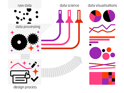
How I work with Data Visualisations: the process starts with raw data, that is being processed by data science methodology, while I am preparing data visualisation design for dummy dataset.
The choice of data visualisation type used for a certain component is based on two factors: the data and the data affordability for the viewers.
The data factors: key variables or their combination, the number of variables, the datasets scale and amount of displayed metadata.
The user factor: depending on how datavis- or data-savvy the users are, we have multiple options of choice between less or more complex and sophisticated data visualisation types.
All these characteristics also determine the interactive elements of the data visualisation components. And, of course, the visual design and look of the final component.


