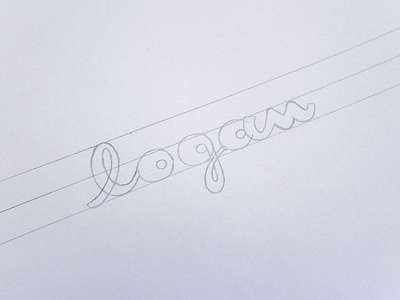
Make Better Lettering by Studying Famous Wordmarks 1/3
You know them. You’ve seen them on every possible medium and they’ve become so powerful that it feels like they’ve been there forever.
But what is noticeable about wordmarks for us lettering artists is how creative and well-balanced they can be. Whether you like the brands or not, there’s so much we can learn from the curves of Coca-Cola, the weight distribution of Vespa or the texture of Virgin.
This dossier will be divided in three parts. We’ll study various wordmarks classified into subjective categories, in order to understand what makes them special and identify the little details and main principles that lie behind a well-executed piece of lettering.
View all tags
Posted on
May 3, 2015
More by Sarah Dayan View profile
Like


