Kinetica Branding Design

Kinetica Branding Design
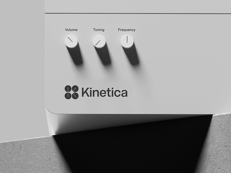
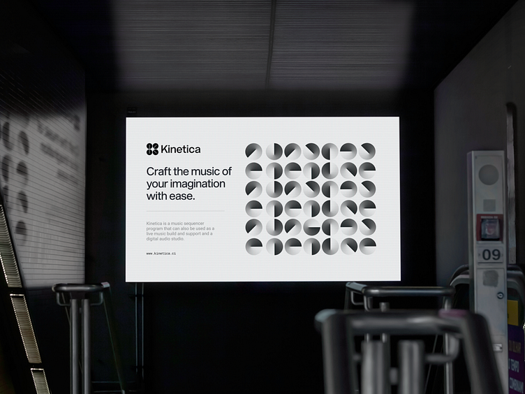
Kinetica is a music sequencer program that can also be used as a live music build and a digital audio studio. With an intuitive interface that does not restrict your creativity.
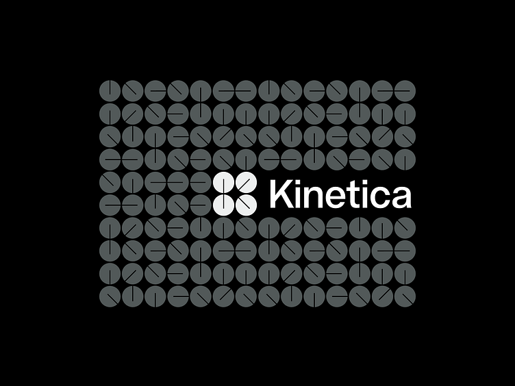
Kinetica got its name from motion, which served as the source of inspiration for the entire brand, beginning with the visual language of moving parts and ending with the symbol.
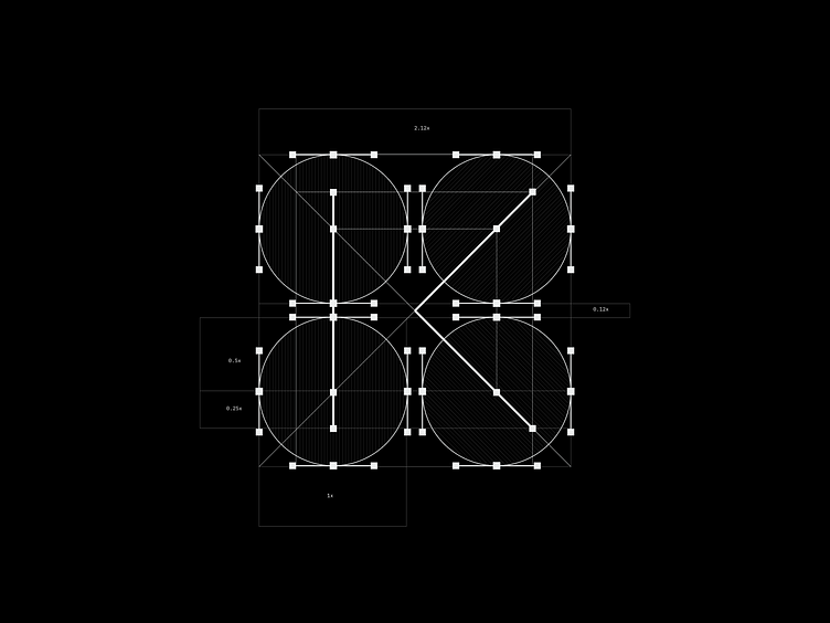
The buttons on the old-school controllers that let you adjust the channels, voice effects, and other settings are the direct source of inspiration for the symbol. There is a hidden letter K present, which is the initial letter of the name, created by a group of four buttons that are turned into different positions.
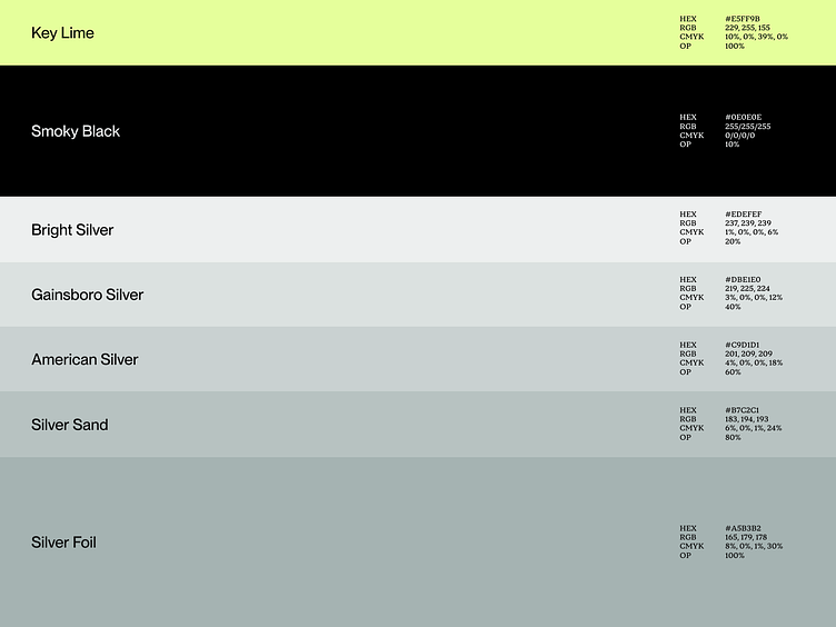
The branding is meant to symbolize the basic values of the organization, which include seriousness, strength, simplicity, and innovation. Beginning with hues that are composed primarily of monochromatic colors and progressing to fonts that are serious and strong.
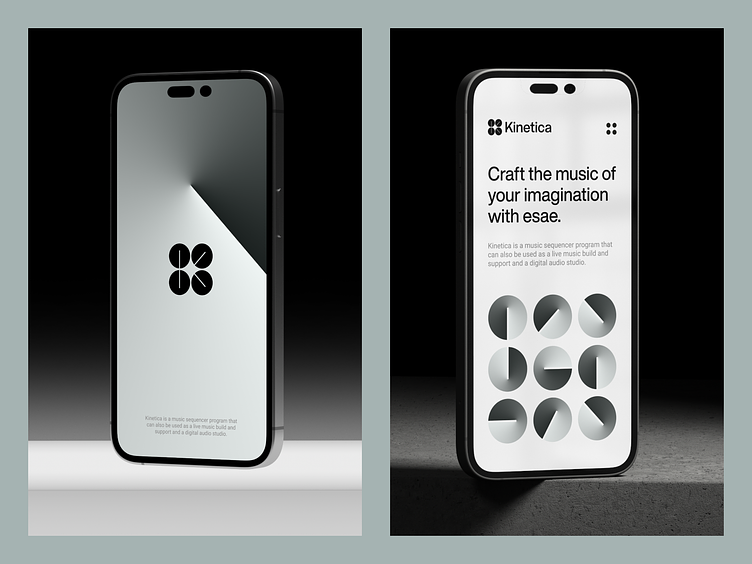
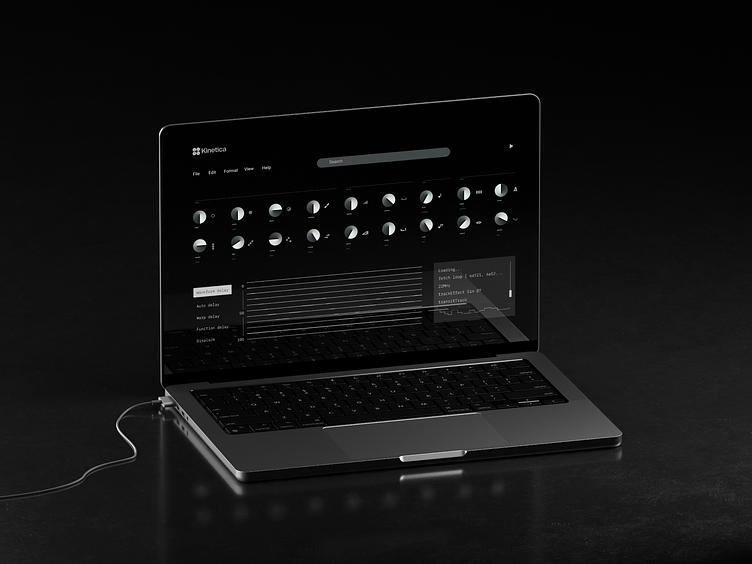
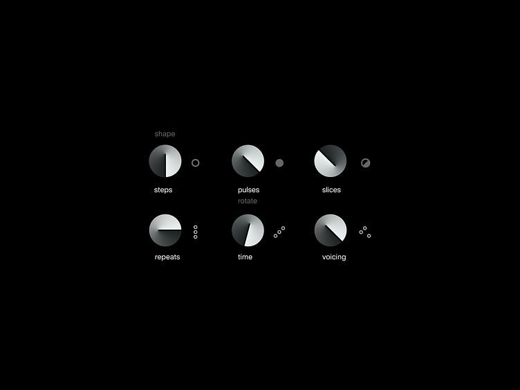
The user interface of Kintetic is based on the company's visual language and other branding elements, which were taken from the interfaces of old mixing devices and the symbol itself.
As a result, an unique brand was built for Kinetica, with the objective of portraying the company as an industry leader, respected, and technologically advanced.