Optio: Charts


👐
One of the main elements of fintech projects is charts showing financial relationships in various ways.
Today we want to present some charts from the Optio project.
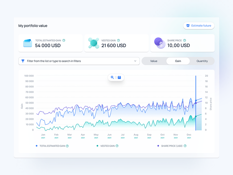
Line chart for an employee showing the value of his portfolio changing over time.

Waterfall chart for CFOs to track company instruments to better manage company capital.
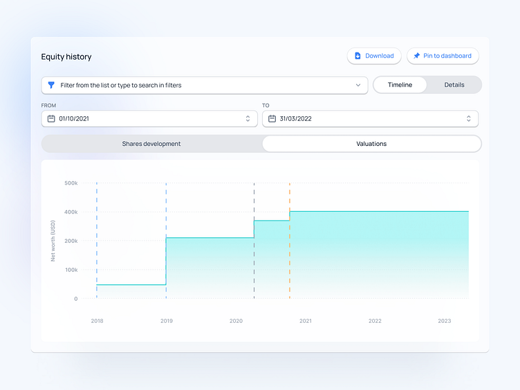
Type of chart showing the historical growth of a company's value.
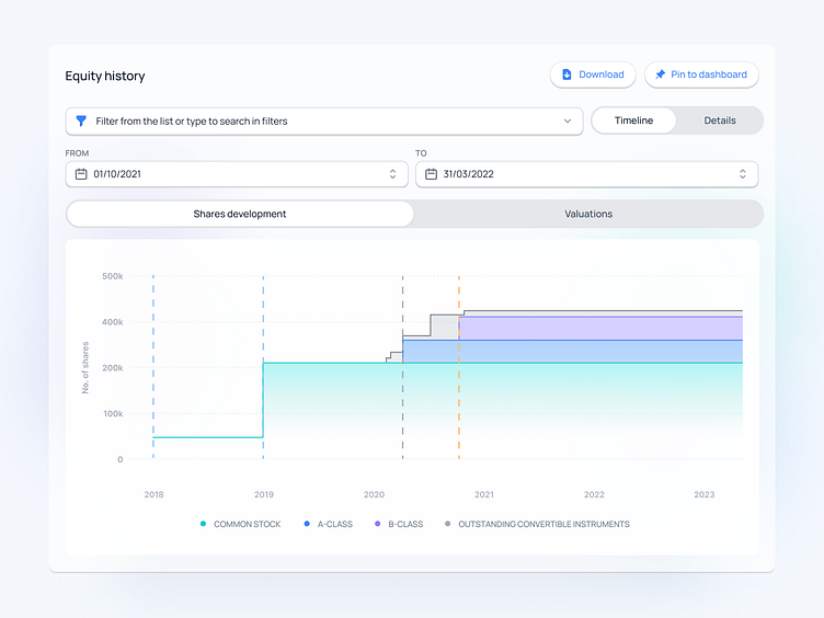
Another line chart based on the above, shows the development of the shares divided into different classes of holdings.
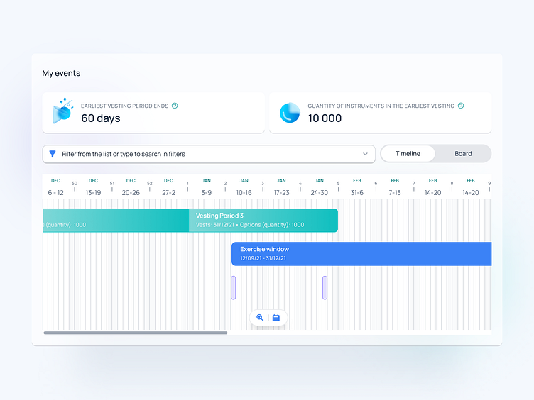
Event timeline for the employee, so that he can easily see all the historical, current, and future events available to him.
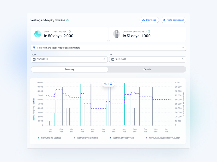
Bar graph combined with line chart, for the person managing the company's shares to see how the shares have behaved over time correlating with the employees' actions.

Pie chart showing the percentage distribution of company shares by a specific type of shareholder.


