Sea-Doo Logo Refresh

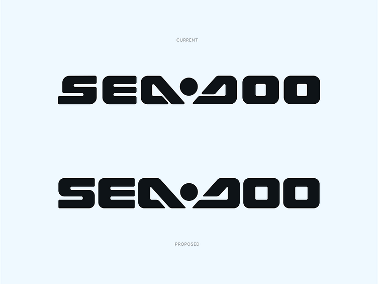
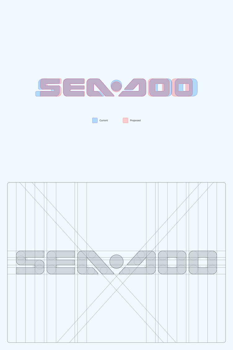
Excited to share a fun logo refresh of Sea-Doo, a Canadian brand of personal watercraft. Living in a tropical climate calls for water activities such as jet-skiing. Riding their jet-skis, I've always noticed the inconsistencies in the logo. I decided to take a stab in correcting those issues and cleaning it up. When evaluating the current, a lot of inconsistencies came up such as corner rounding, spacing, and overall thickness of the letterforms.
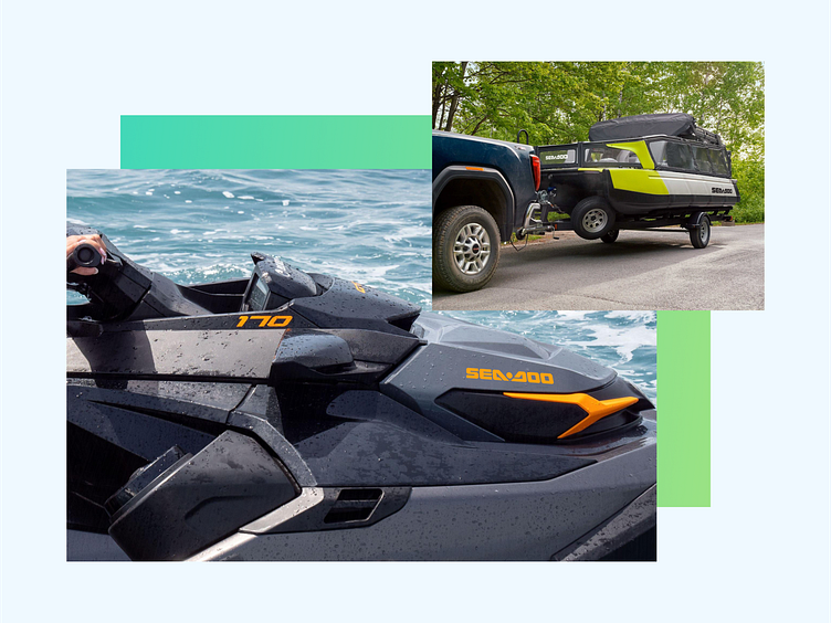
And that's it. Hope you enjoyed this refresh!


