Horovod shorts

Horovod.Space is an ecosystem for territorial and real estate development offering modern strategies and solutions in marketing, technology, and architecture. To highlight their fresh approach to development, we’ve created a visual language that builds on the meaning behind the brand's name.
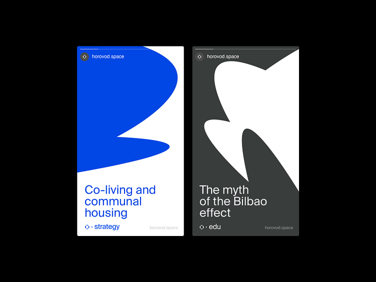
The name has a distinct rhythm. It also serves as a metaphor for constant movement, change, and the search for new meanings and forms. To represent this in the brand's graphics, we make a visual comparison between the areas transformed by the company and the dance's invisible internal space.
Learn more about this project!
| ESH gruppa | Instagram | Behance | LinkedIn | Twitter | Pinterest |


