Tunar. Guitar tuner app

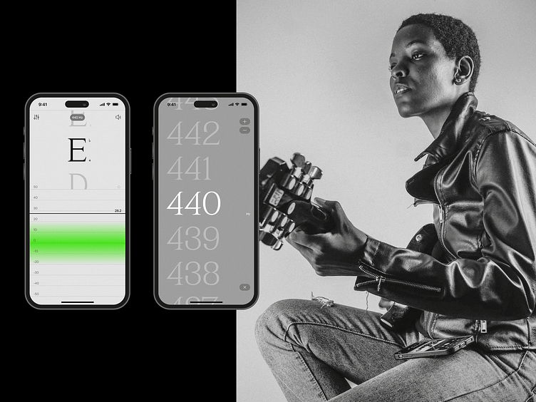
Have you ever noticed that most of the guitar tuner apps still use a skeuomorph approach in their UI design? When you open these apps, you will likely see a variety of metallic textures, shadows, 3D buttons, and a plethora of indicators on one screen. This makes the interface look busy and outdated. But why should a modern tuning app try to imitate an analog tuner? The Tunar app takes a different approach, focusing on a clean and minimalistic UI that highlights only the essential features.
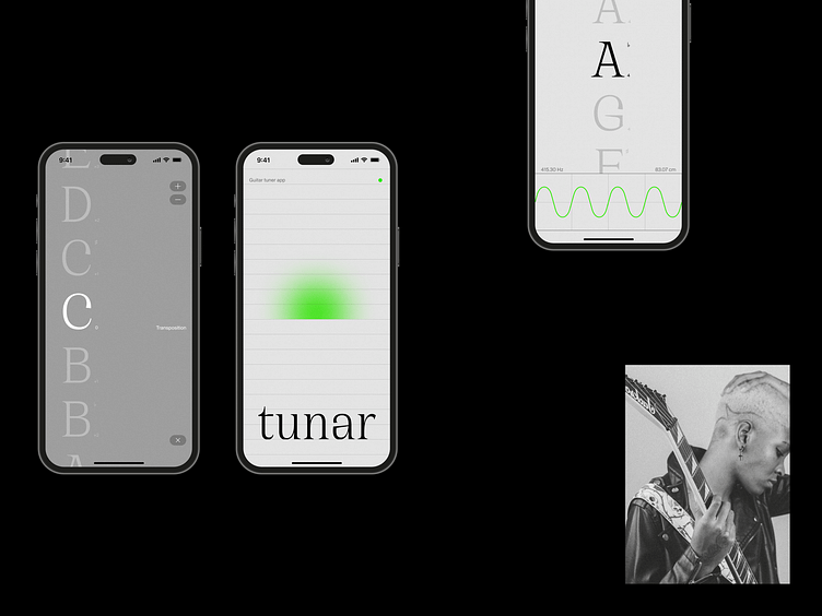
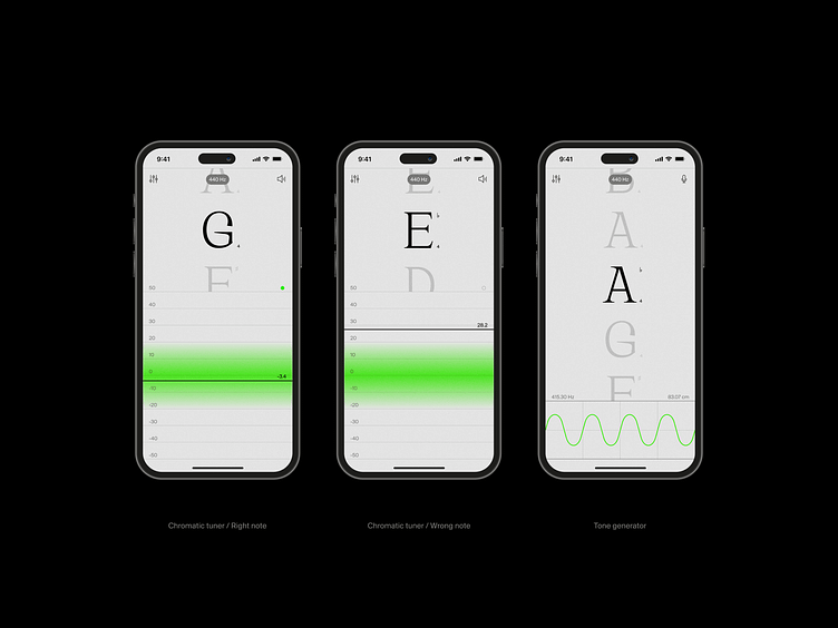
The key screen of the app is a chromatic tuner, which features a unique vertical sound meter. Unlike most tuners, which place the sound meter horizontally, the Tuner’s vertical layout maximizes the use of screen space. Additionally, the app includes a tone generator that utilizes the same vertical layout for the notes, making it easy to quickly change the note by simply scrolling up or down.
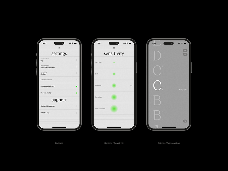
Even standard sections of the app, like Settings, have been designed to present the UI in a visually appealing way. For instance, the sensitivity adjustment feature uses gradients to visually indicate the difference between options.
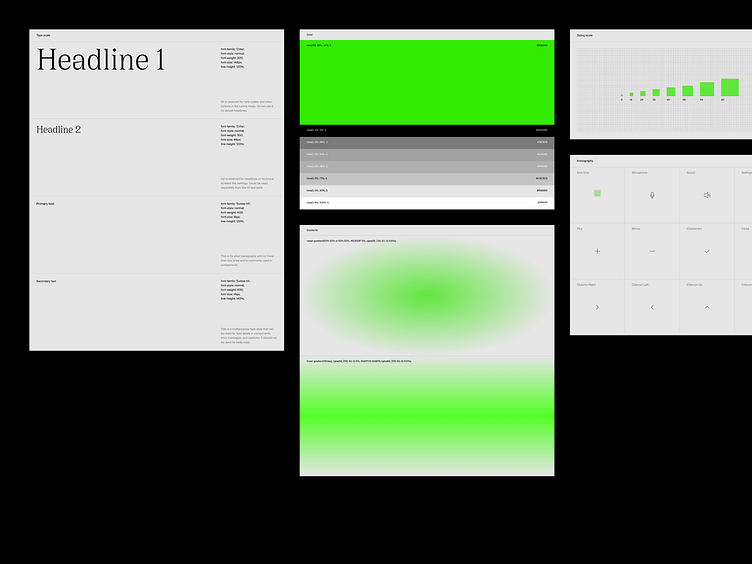
The visual language of the Tunar app is articulated through a design system, featuring core elements and styles such as typography, color schemes, sizing, iconography, and UI components.