Market Insight: Interactive Chart Dashboard (SaaS)

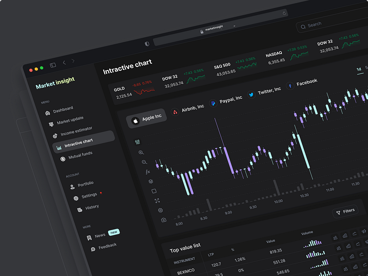
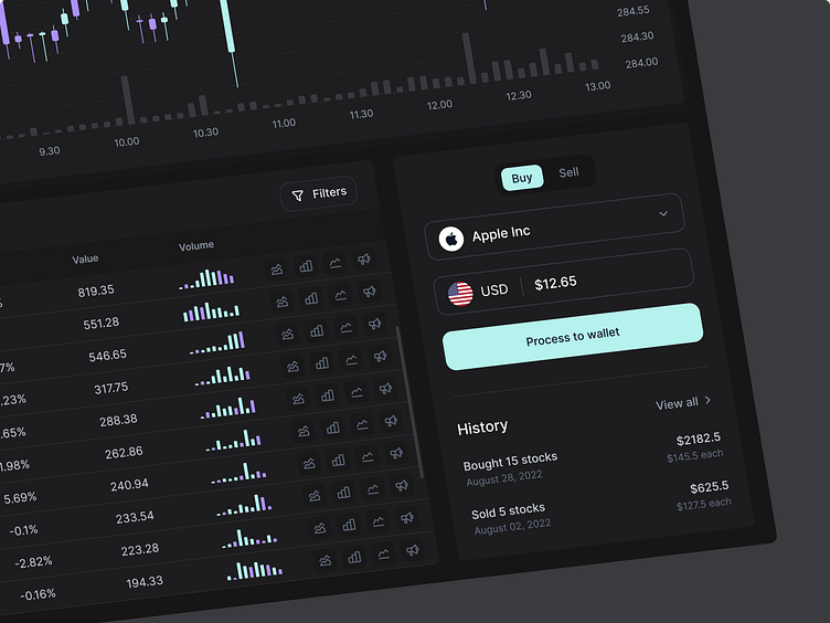
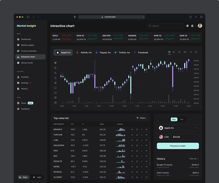
Choosing the right charts and appropriate color contrast is the most important part of visualizing data. The color black for the background makes others' color pop and comfortable for the eye; we also use purple and teal to make aesthetic visuals.
What do you think about the design? We would love to have your feedback!
Schedule a call at ☎️ 👉🏼 Calendly.com
Let's talk about your project..
✉️ hello@musemind.agency
Website 🌐 www.musemind.agency
Explore Our Design Case Study Featuring ➡️ Behance
Let's Check Our Others Dribbble Profile:
musemind saas • musemind mobile • musemind branding
Follow us to see more exciting shots and insights on:


