Bento cleaned up


Bento really knocked it out of the park. It's the kind of product idea that—like Linktree before it—everyone not only wishes they'd thought of, but wishes they'd been the ones to execute on.
Their arrangement tooling is intuitive and fun, and even allows users to consider the problem of responsive too—control that is rarely allowed in such site builders.
The irony is that the entire category of "simple namecard website builders" wouldn't have existed in as big a way as it does without Instagram wanting to forcibly increase in-app retention, by preventing users from including external links in their Instagram posts. This of course frustrated users, which initially led to the "link in bio" user hack, and later to Linktree, a site where people could list their favorite links. Linktree's design leaves a lot to be desired though, and that's where Bento came in.
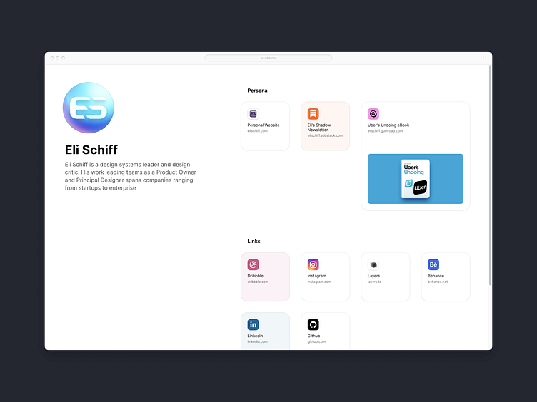
That said, while Bento has a great visual direction, it could do with some design tightening. This is my redesign of my Bento page. The existing Bento site is a simple 50/50 splitview with text set with a max-width. This suffers because the text has no relation to the grid, and it throws off other relationships on the page. I created a standardized grid in response to this. Their type also lacked finesse on letterspacing and weights, which I cleaned up. I also did manual favicon redraws, improved the color choices, and reversed color combinations for the brands that felt overly heavy.
See the @2x images or view the before and after in the carousel below: