KF Shkëndija

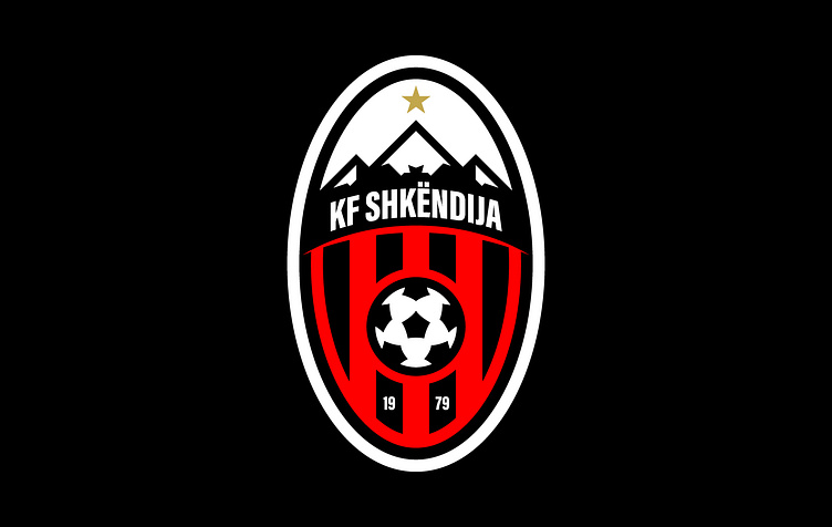
This is the revised logo of KF Shkëndija. Errors in the current logo have been corrected and it has been redesigned to a new version. The font has been altered to be more legible, the black stripes have been reduced from 6 to 4, and the soccer ball has been updated to a more modern design. The press of creating the proposed new logo identity began by incorporating several key elements that together convey the story of the city and the club.
Each element has its own distinct meaning. The star, taken from the old crest, represents the club's achievement of the first Macedonian Football League in 2011. The mountain symbolizes the Šar Mountains and Popova Šapka, a popular ski resort in the region. The horizontal line represents the Pena river that runs through the city, and is depicted as extending beyond the line to represent the river being out of the city. The four black stripes represent four popular tourist destinations in Tetovo: The fortress, The Mosque, Tekke, and The Stone Bridge. The wordmark is the name of the club, KF Shkëndija. The soccer ball, the main equipment in the game, represents the sport of football. The date represents the year the club was founded, which is an important year for the club's identity.
Full Project:


