Oxygen Fitness Gym Logo Concept

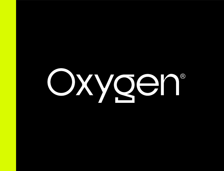
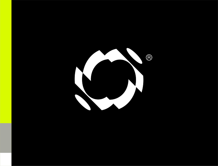
Hey everyone, I am excited to share with you the latest logo design I did for a gym brand called Oxygen! The logo features a minimalist design with custom typography that reflects the modern and edgy nature of the brand. The letters are sleek, with sharp edges and clean lines that give the logo a sense of movement and power.
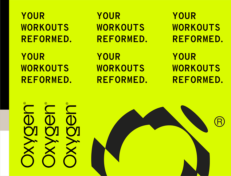
The custom typography ensures that the logo is unique to Oxygen, setting it apart from other gym brands.
The colors used in the logo design are black and neon yellow, creating a striking contrast that conveys energy and vibrancy. The bold black text, with its commanding presence, is contrasted by the bright, electric yellow that adds a sense of excitement and energy to the logo.
The minimalistic design, custom typography, and the striking color combination of black and neon yellow all come together to create a logo that represents the energy and excitement of Oxygen's brand.
I am thrilled to have been a part of this project, and I believe that the logo design will help Oxygen stand out in the crowded gym market.
What do you think of the new logo design? Let me know in the comments below!