LL14
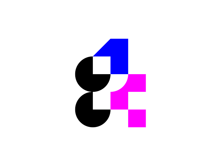
Logo proposal for LogoLounge Book 14
Made of basic shapes:
The circle, the square and the triangle.
Circle shapes with black color helps to pick letters (LL) out of entire logo.
Number 1 & number 4 have different colors, sizes & perspective angles.
Number 1 standing above of number 4 symbolizes competition between uploaded logos.
Lighter color of number 4 and negative space around it makes it look less heavy & balances the logo.
1
14
4
book
brand
identity
idolize
irakli dolidze
ll
logo
logodesign
logoinspiration
logolounge
logos
mark
minimalism
monogram
symbol
typography
visual
View all tags
Posted on
Feb 19, 2023
More by Irakli Dolidze View profile
Like


