Moon: The New NFT Marketplace


The Brief:
I had the delightful opportunity to go through Dribbble's UI course and dedicate some time to invest deeply into applying my background in graphic design and design thinking to UI. For this project, I took completed wireframes and crafted a UI library and final user interface. Here’s how it went.
Objective:
The client, Moon, is a startup with the goal of revolutionizing the NFT marketplace business with a design-first approach and a deeply curated experience for the users. Goals include:
• Establish a visual language of this new NFT marketplace app.
• Lock a visual aesthetic and then scale the design on multiple screens, based on the wireframes and the flow provided by the client.
• Build a UI Library based on the final UI and create a functional prototype.
Target Audience:
The audience of this project is all those people that are embracing and following the world of NFT digital art. Primarily tech savvy people who are fluent online in the world of crypto and NFT. With also a strong sense for visual aesthetic and art, they value beautiful, curated experiences with their interface as much as they do with the digital art that they create, buy, and sell.
Deliverables:
• New visual language for Dig/Art.
• Fully designed flow in High Fidelity.
• UI library.
• Functional Figma Prototype.
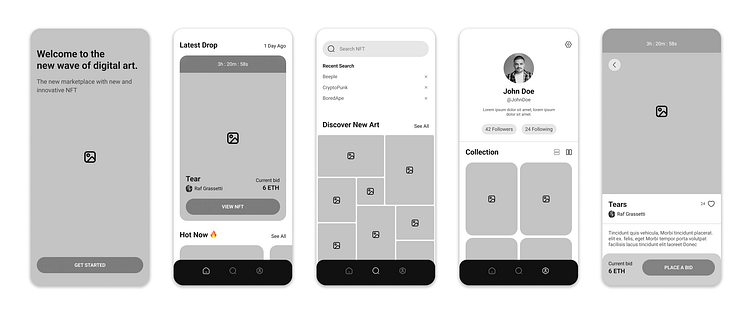
Wireframes
The client had a pretty good starting point with some wireframes and flows ready to go. I had some freedom to stray, but wanted to stay fairly faithful to the time and resources already invested. As always though, when in doubt, test it.
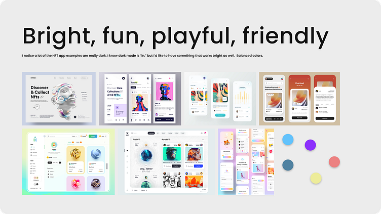
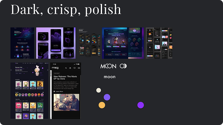
Moodboards
I pursued two disparate visual directions to start. I spent a good bit of time on Dribble and Pinterest pulling ideas and inspiration for more bright and whimsical direction and for a dark and sophisticated direction.
One thing I noticed was that there was a vast trove of dark UIs for NFT app inspirations. There seemed to be a particular psychographic in mind with much of the artwork and UIs being a bit same-y.
I ended up going with the brighter theme. I felt like it was looking much more unified and that I could more confidently develop it out into a full UI library.
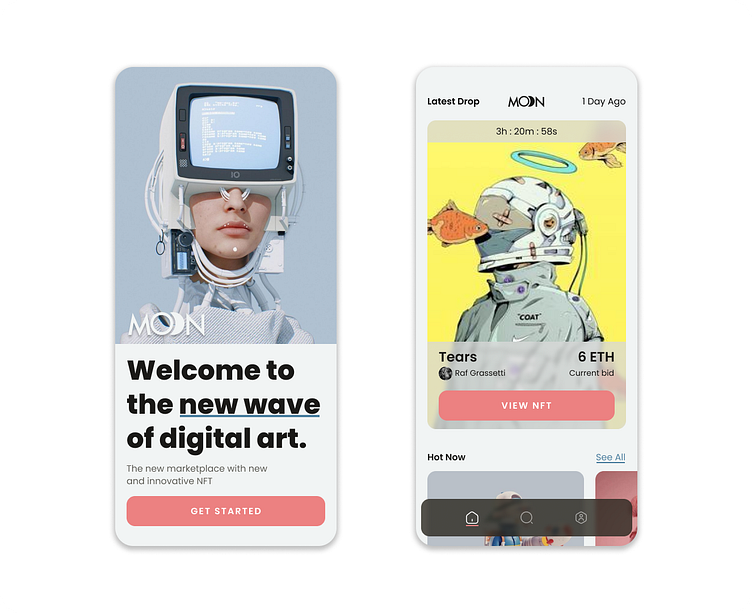
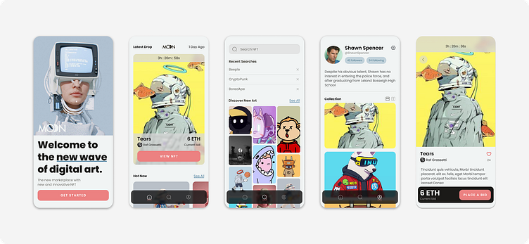
Final Concepts
The final two concept screens for each direction. If I were to do it over, I think I would need to lean into the "crisp" and "sophisticated" aspects for the darker theme to work. I conceptualized the two rows of thumbnails on the dark splash screen to move slowly in opposing directions. I did like that aspect of the concept in particular but ended up choosing the light concept.
I liked the subtlety of some of my light theme inspirations. I leaned into the soft grey background and muted color palette. I'm always inspired by classic Swiss design and by use of materials in industrial design. I pulled some inspiration from those sources as well with color and glassomorphic touches.

Scaling Up
After locking the final visual direction, I scaled the design across the rest of the wireframes. It's always delightful to see how building and applying style guides early helps bring the whole structure to life dynamically.
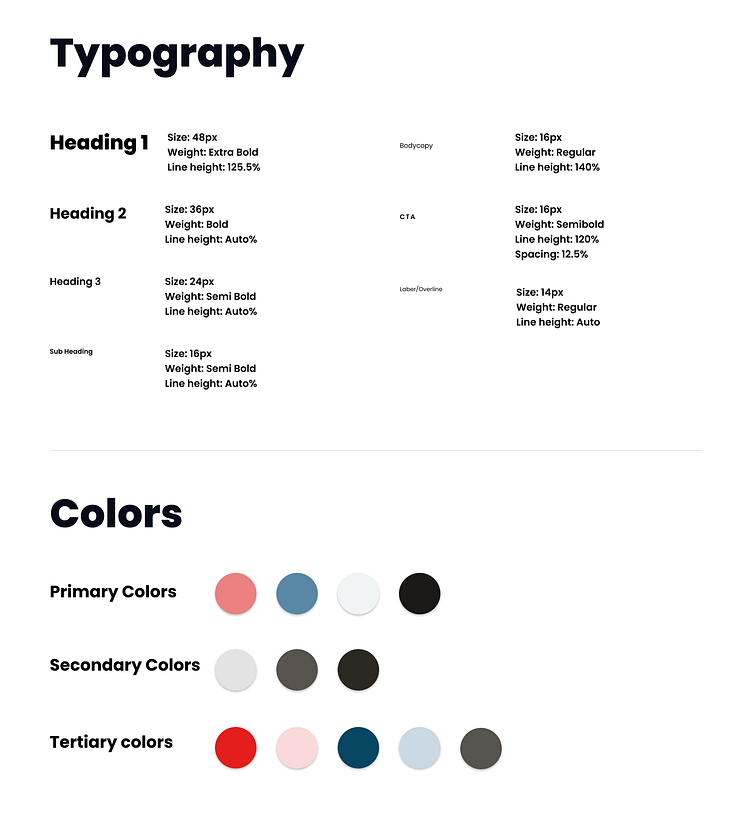
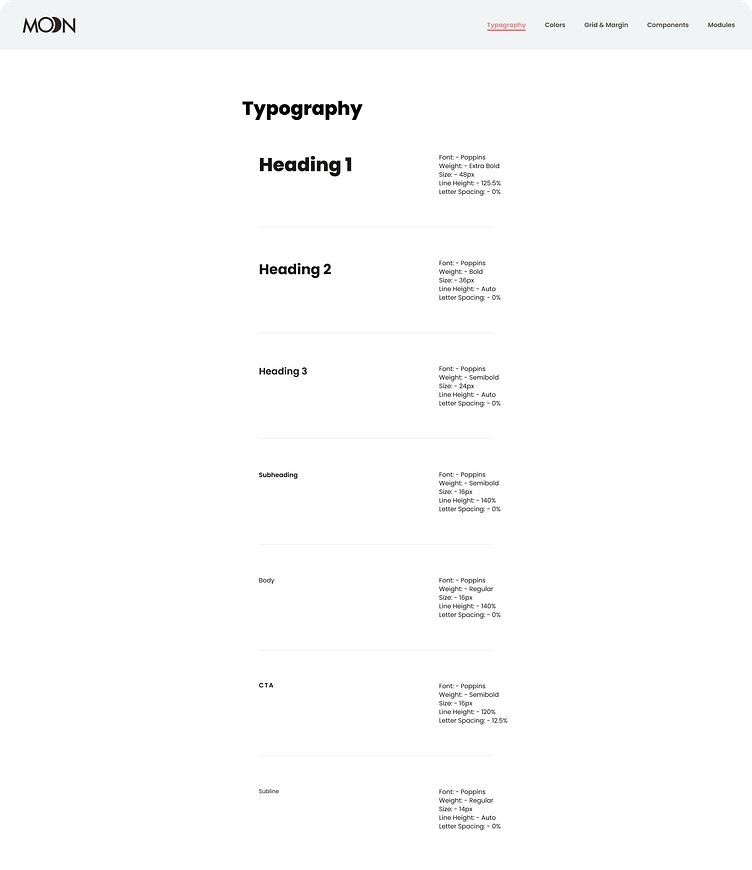
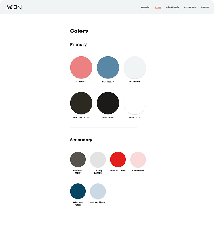
Style Guide
Locking into a style guide early helped move more quickly through each successive screen, saving time and resources and making later edits quicker and easier.
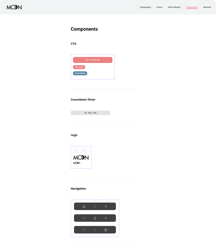
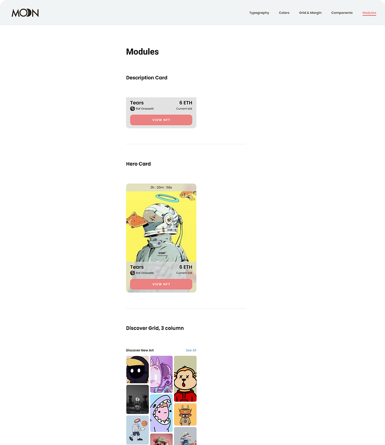
UI Library
Check out the full UI Library prototype here. Building the style guide out into a full UI library made components and state
Outcomes
Check out the full prototype here.
Through this project, I was able to start with the design brief, explore visual concepts, lock into a concept direction, and scale the design into a reusable UI library.
For me it was very helpful to have the time dedicated in visual exploration and in design documentation. The visual exploration helped push me creatively and helped lead to a more cohesive and refined design. The design documentation helped me practice making design repeatable and scalable across a project.
I ended up with a design that is friendly and minimal, allowing the artwork to be the focus and stands apart from many dark and quirky themes in competitor apps.


