MOON | Case Study for UI Design

Project Overview
Fictional client Moon (for the Dribbble UI Design Course), is an up-and-coming startup with the goal of revolutionizing the NFT marketplace business with a design-first approach and a deeply curated experience for its users. Their target audience largely consists of tech savvy Millennials and Gen Z, mostly familiar with crypto and NFTs. The product however needs to be inviting and easy to understand for newcomers to the NFT space. Moon wanted the app to have a strong visual aesthetic that felt aligned with the market but also disruptive and new.
For this project I established the logo and overall aesthetic of the Moon brand, as well as being responsible for the end-to-end design process, from research and ideation to building the final prototype for the Moon app.
Visual Mood Explorations
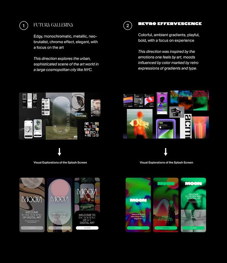
Ahead of exploring visual possibilities with given wireframes, two visual mood boards were identified to meet the needs of the client. After deliberation, a final mood board was selected to proceed with the visual design of the product.
Finalizing the Visual Direction
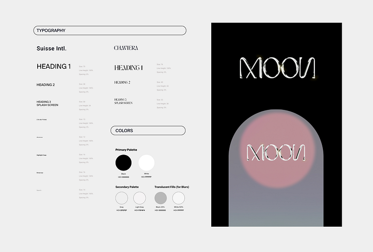
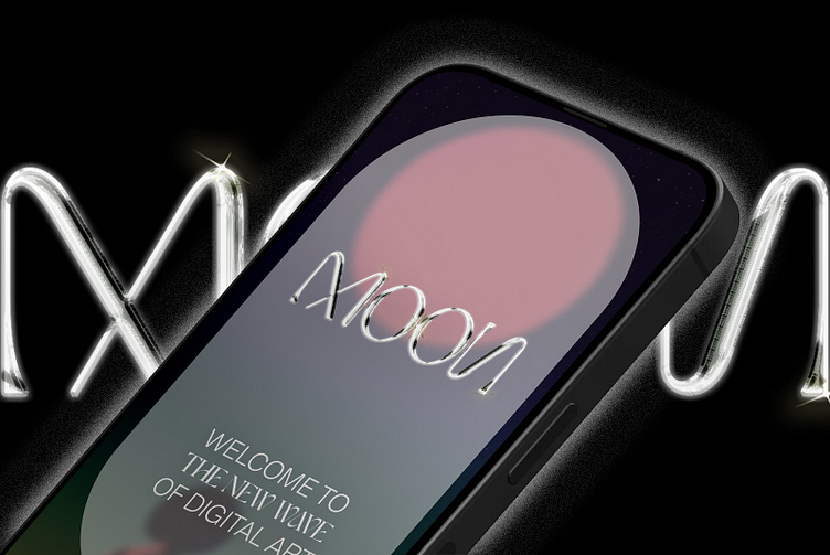
Mood Board #1: Futura Gallerina was the selected direction for Moon. The reasons for this decision were two-fold. Firstly, this direction felt the most innovative visual approach of the two mood boards for the industry. In contrast to the colorful and youthful approach to communicating digital art that currently dominates the NFT space, this design direction sets itself apart. Through bold mixed serif and sans serif typography and chroma effects in the logo, this direction has a slight urban, neo-brutalist edge that more tech and art savvy users may gravitate towards. The Futura Gallerina direction will help Moon stand out amongst its competitors and be sophisticated and flexible enough to adapt to the needs of the business over time.
Secondly, this direction felt a bit more aligned with an art marketplace model, through making the art at the focus by removing too many graphics as distractions. The monochromatic palette and lack of colorful ambient gradients means that there are little or fewer distractions to appreciate the art featured, hopefully leading to a better user experience and increased conversions.
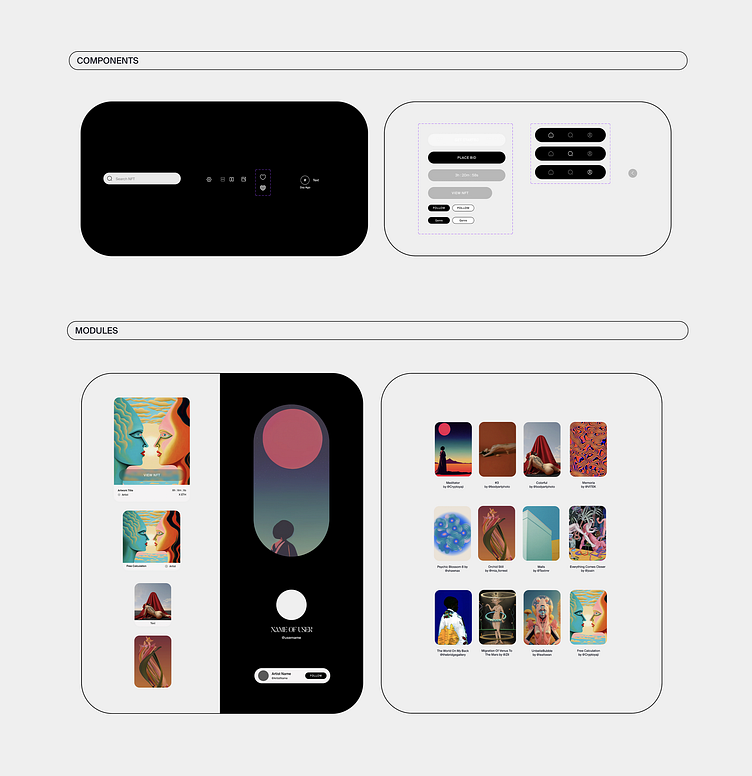
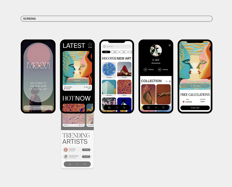
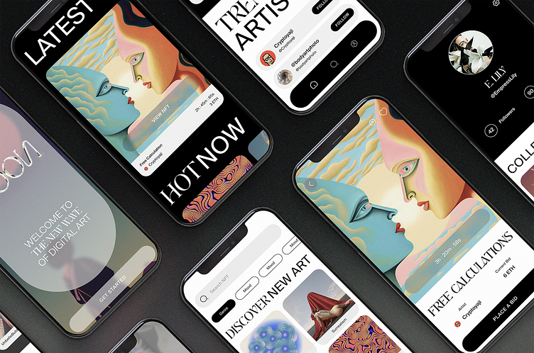
Design Process: UI Library, Modules, Wireframes, and Screens
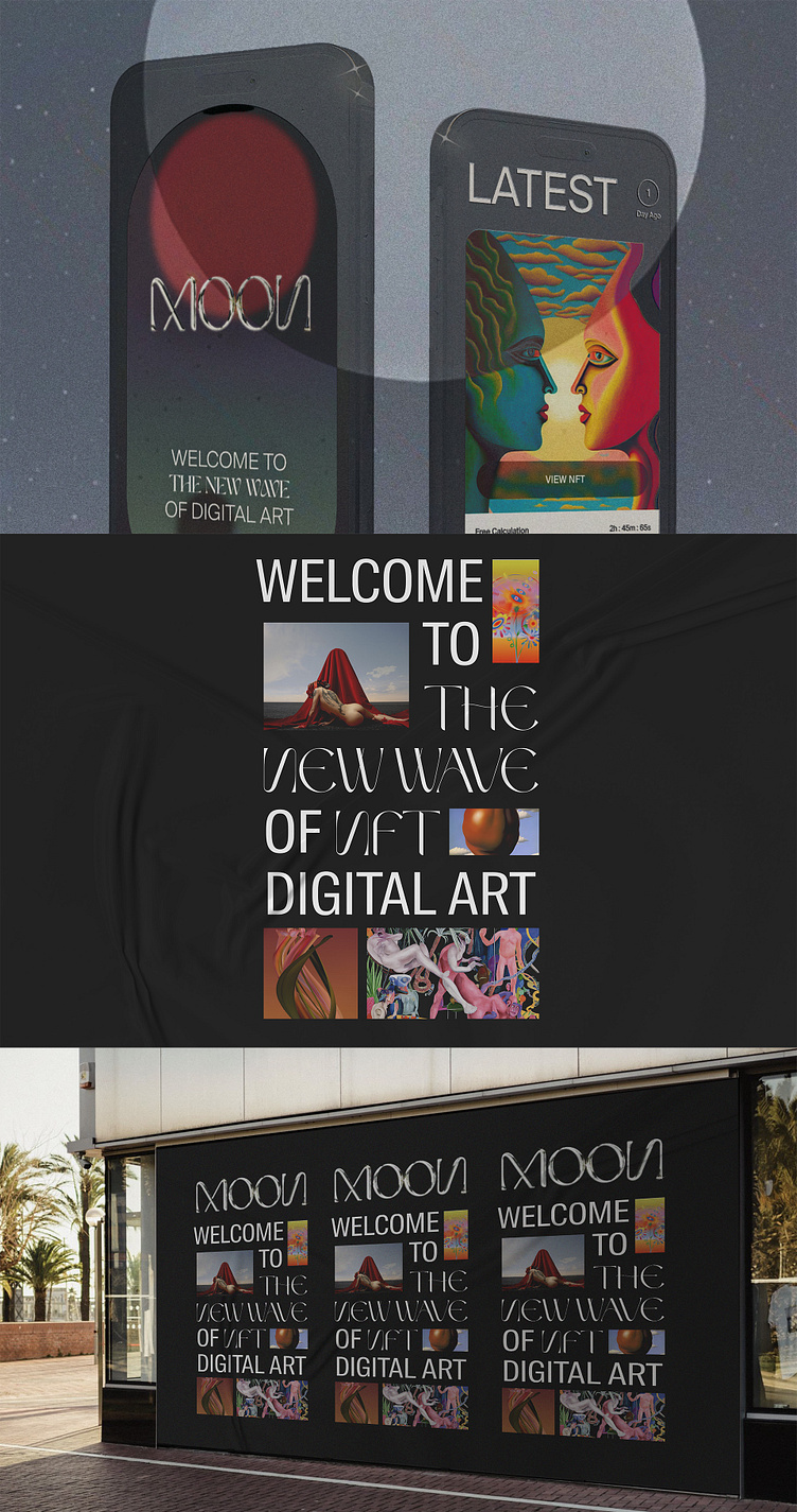
Translating the visual direction to wireframes for the app meant thinking through how to use black and white as negative space to best highlight certain sections of each flow. I wanted the focus to be on the art so I kept things minimal, letting the mixed typography add points of interest to the trendy needs of the Moon user. Because the focus is on the appreciation and purchasing of digital art, I designed the discovery search flow to have multiple paths towards exploration.