Branding: Logo Design, Visual Identity

Concept
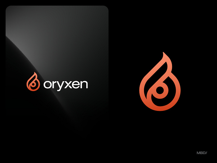
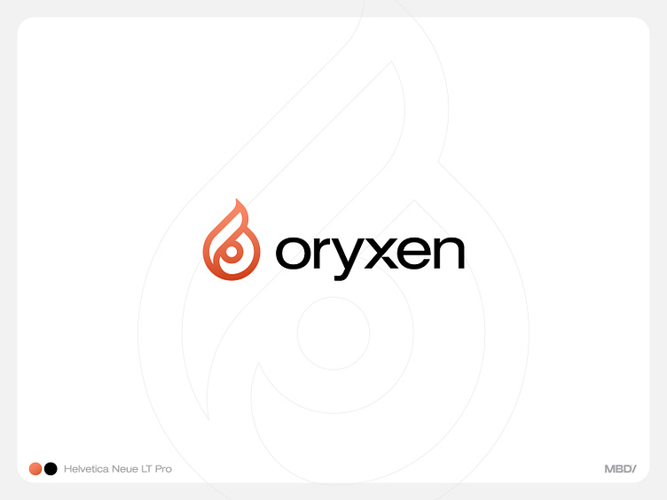
The logo for "oryxen" incorporates the letter "O" and a flame, creating a visual representation of the brand's focus on fire safety. The orange color used in the design is commonly associated with warmth, energy, and caution, all of which are relevant to fire safety.
The letter "O" in the logo may also represent the circle of protection and safety that "oryxen" aims to provide to its customers. The flame symbolizes the potential danger and destructive power of fire, as well as the need to be prepared and take preventative measures to minimize risks.

Like What you see! Support me with like 💖
Let me know your valuable feedback in comments.
DM or email for work inquiries - mihirbhavsar98@gmail.com


