Case Study: Chocolate Bars Packaging Design

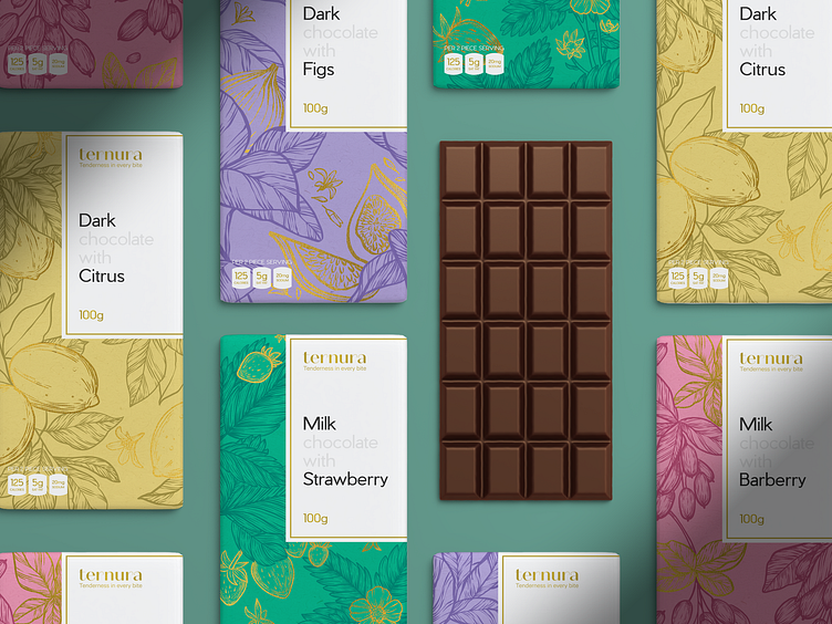
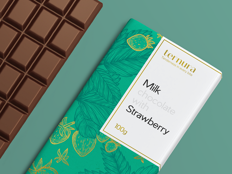
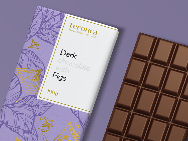
Feel the taste of sweet tenderness in our graphic design project. Here's a deeper glance at the elegant and neat packaging design with custom artistic graphics we developed as a part of the brand identity design for a chocolate brand.
Each chocolate bar gets an original look due to a specific color and sophisticated illustrations featuring the fruit added to this type of chocolate. The typography plays on the contrast of logo wordmark using beautiful decorative font and text descriptions performing in readable sans-serif font with visual accents on the type of chocolate and the type of fruit filling. Together, this approach gives an attractive, diverse, recognizable, and consistent appearance to this set of items. Catch the tasty vibes!


Also, welcome to check:
• the diverse collection of tubik design case studies
• the illustrations about technologies for the disabled
• the illustration art inspired by architecture
• the set of artworks inspired by wildlife
• the big collection of people illustrations
• the art on workspace and creativity
• the illustrations about love and romance
—
Tubik | Tubik Blog | Behance | Instagram | LinkedIn


