People Horizons Squarespace Website

Shelan gave me the brief to design a website that inspired trust and confidence and was clear, contemporary, bold and professional. She was keen to have parallax areas and the whole website to have a sense being dynamic.
The brand designed by Emma Charleston, had a logo, four colours and two typefaces, Comfortaa and Raleway. It used heavy stroke borders around content but I translated that into vertical lines to add more white space to the pages. I used rounded corners to add some softness and increased the colour palette so we could colour code the services pages. I also introduced parallax images to break up the pieces of content.
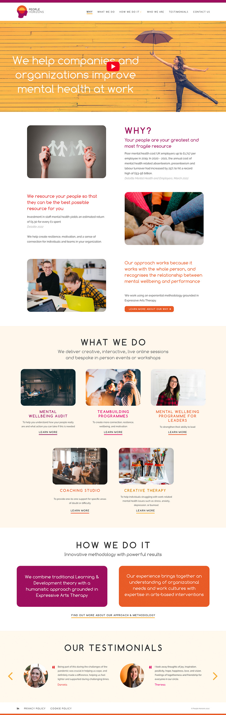
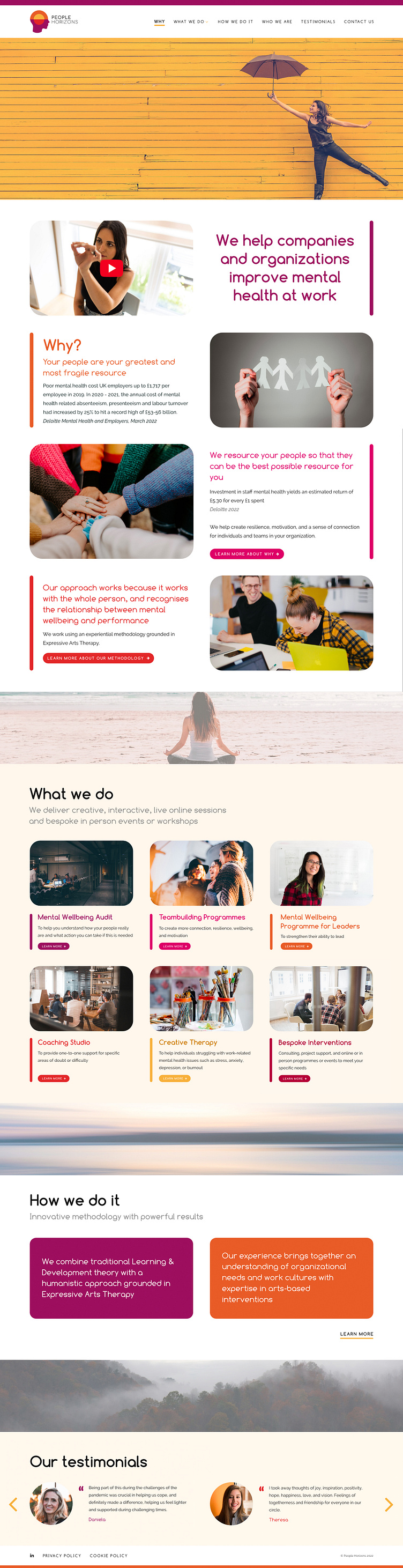
Final homepage design:
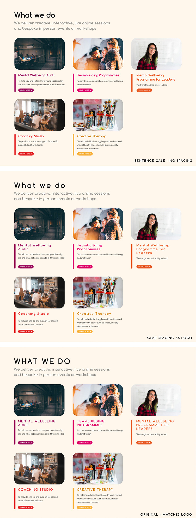
One of the areas I did experiment with was the format of the headings. I looked into how the headings looked with the same amount of spacing that the logo had and even with uppercase letters.
I also tried a simpler design without the vertical lines but felt this was very generic and made the website feel like it could belong to any business.