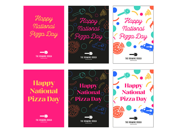
The Roaming Dough Icon Posters
Case Study - https://medium.com/p/35261db84513
I felt it was important to introduce the icons into the posters and see how the new colour palette, typeface and icons could all work together.
In the end, Suzanne decided to use the Local Brewery script font from the top row of posters.
View all tags
Posted on
Mar 8, 2023
More by Katherine Cory View profile
Like


