Heuristic Analysis of the IKEA app


A case study about redesigning an app: And I screwed it up with the hex key. In a good way.
A quick intro:
After weeks of intensive teamwork projects at Ironhack, it was time to step back and see what we can do on our own. It was not that I didn’t like teamwork, on the contrary, I liked being a team even more than I like work. But I still wondered how life would unfold without the help of smart, well-equipped, creative friends.
To give you a quick introduction, in our third project at Ironhack, we were asked to redesign an app. We could choose whatever we wanted, as long as it was an app everyone knew.
My role in this project was: UI designer
From start to finish it took: 3 days (& nights) in November 2022
Team: This was a solo project
Tools: Secondary research, Heuristic analysis, Competitive Analysis, Figma
Deliverables: Start by cloning 3 screens, then redesigned them.
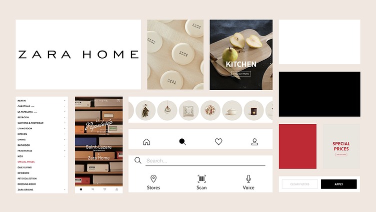
Why the IKEA app?
I made a pretty primitive reasoning: What does everyone have at home? IKEA. Then the app that everyone knew should be IKEA. But I was wrong. Because when I picked up my phone, I saw that I didn’t actually have the IKEA app downloaded. It turns out that I had always used it from the browser until today.
The heuristic process:
Since IKEA is one of my love marks, no surprise that I took the user-first approach, as the user being “me”. So what did I need as the user? A bookshelf to put in the 75-centimeter space in the hallway between the cat toilet and the kitchen door. Brilliant, I concentrated completely on this micro mission.
Long before I started reproducing the screens, I started noticing tiny imperfections that didn’t quite work. At the end of my Heuristic evaluation, I decided to focus on 4 mini bugs/problems in this UI challenge.
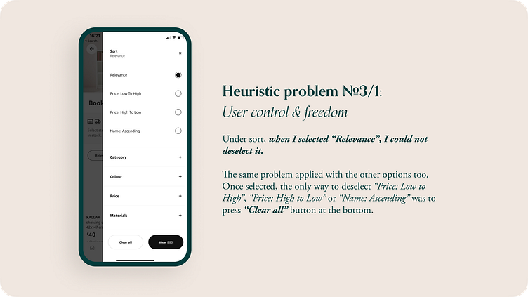
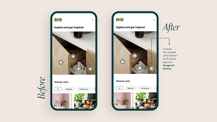
Possible solution: This can be easily solved by making it not selected when tapped outside.
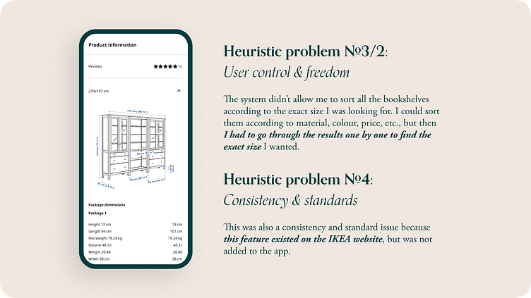
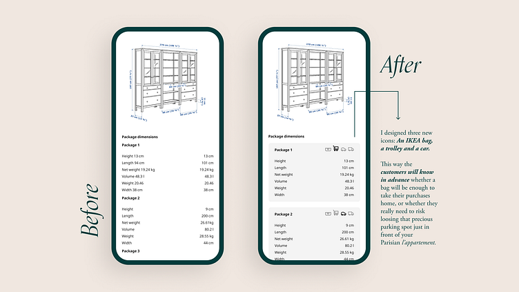
Possible solution: Adding the “sort by dimensions” feature to the app. And as I mentioned above, it already existed on the website and had obviously been tested by users.
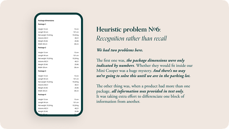
Possible solutions: For the first problem, some icons could be prepared according to the size of the packages. This way, users would be informed not only by numbers but also visually about what kind of package awaits them.
For the second problem, a box around the text can be used to further differentiate it.
Then it was time to check out the competitors
When I started thinking about the style tile and the design system, Ikea’s existing brand attributes and its tone of voice helped me focus my thoughts on what it stands for at the core, as a brand. Looking at what the competitors were doing helped me clarify my path even more.
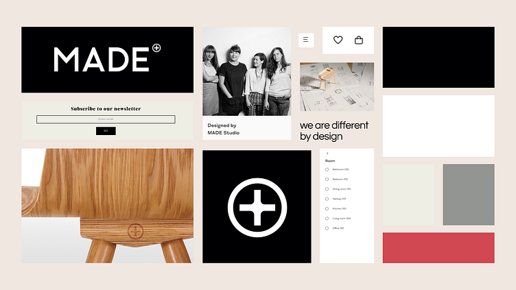
While examining the competitors’ websites and apps, I noticed something that maybe we all know but are not very aware of. These brands, whose business is to sell design products, were treating the user interface as an empty house.
Do the houses all have door handles? Yes, they all have toggle buttons.
Do they all have clean walls? Yes, they all have a neutral background.
Do they all have windows? Yes, they all have boxes and frames.
Do they all have doorbells? You got the idea. They all have buttons.
A whitewashed, empty apartment. Not much different from each other when there was no furniture, and no products inside. This is where I started to dive deeper.

I could have changed the colors, the typography, and the elevation, introducing new patterns in this challenge. But I preferred not to do it. Because I asked myself WHY? Why am I doing it? I couldn’t find a valid reason.
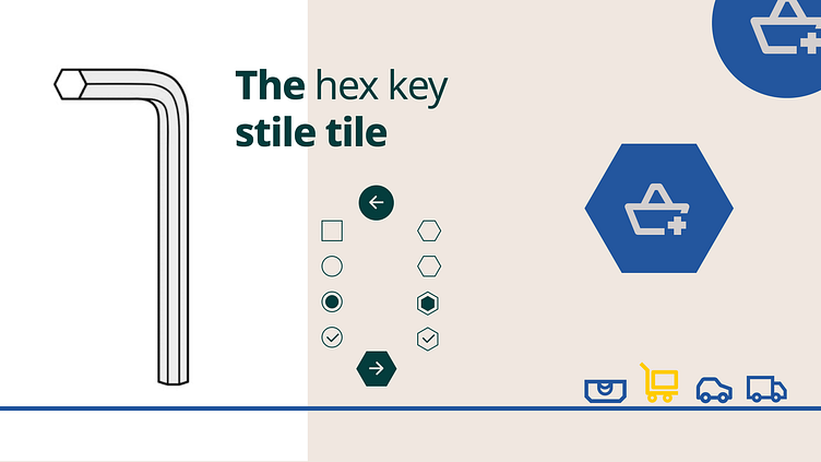
Here comes the voilà moment! What did IKEA have that the others didn’t?
I was the hex key! The North Star of Ikea. The main reason why the idea of the plat-pack was born and why it was so successful. That’s how I decided to replace these very common UI elements like checkboxes, circles, and radio buttons with hexagons.
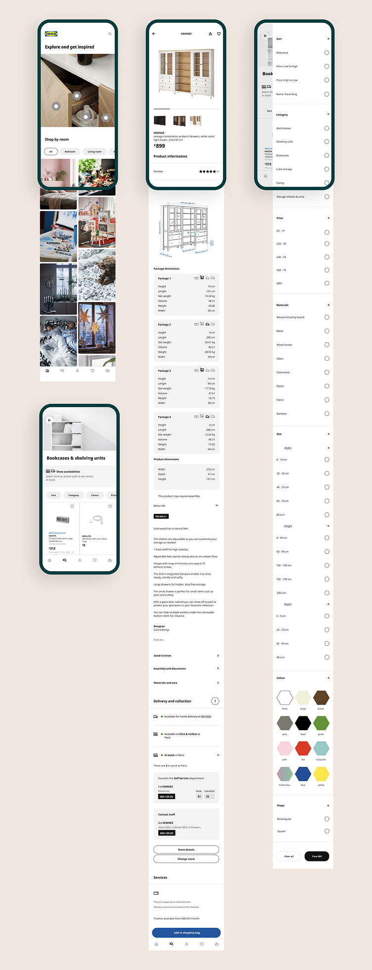
Let me take you on a tour of the screens I recreated:

Final design in full screens:
Wrap-up, and a little confession:
Just between you and me: In the beginning, I had a completely different idea! And it was to teleport the IKEA app back to those good old days before the internet. See, during the secondary research, I discovered that next year would be IKEA's 80th anniversary. Right then and there I was super excited with the thought to take the whole app back to the 80s when there were no apps in the scene. To be honest, I even spent the first of my precious 3 days in IKEA's online museum going through old catalogs.
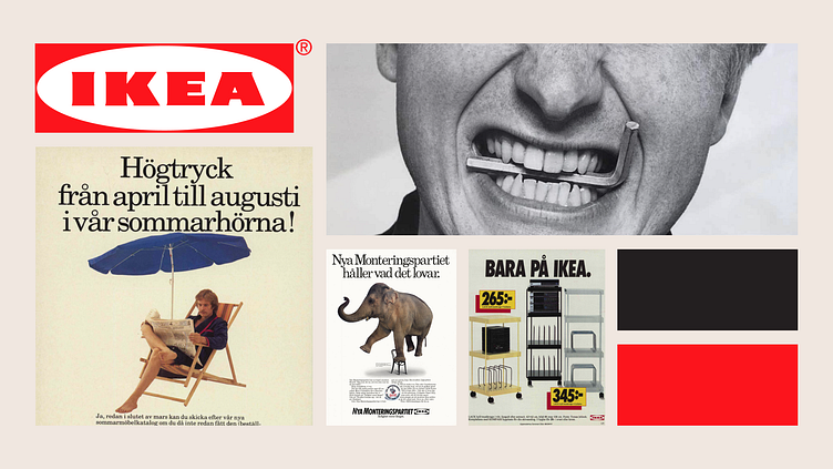
But then I stopped for a moment. Why? Because I felt I was cheating. I was positively biased towards IKEA, I was so sure that everything they did was perfect that it didn't even occur to me to check if that was really the case so that’s probably why I had chosen to take everything back to the 80s without even doing a Heuristic Analysis on the existing design.
So I'm glad I gave up on this first idea and took it the hard way. Otherwise, how else would I have found the hex key and the hexagon idea that made IKEA even more IKEA?


