Hello Bonsai - Logo Refresh

Cleaning it up
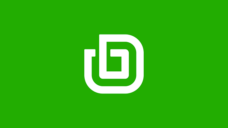
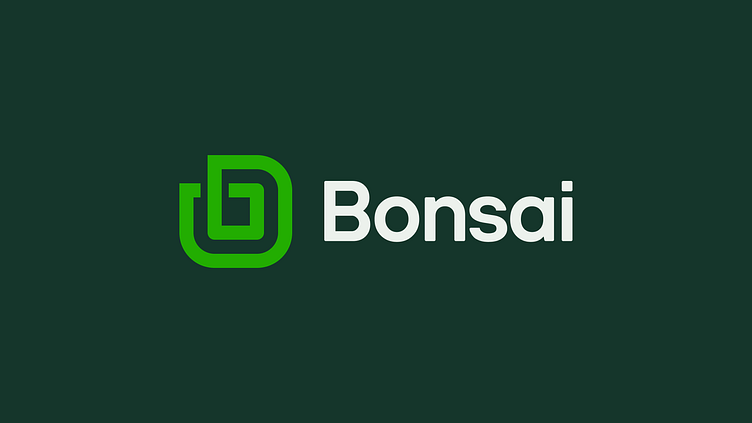
This past weekend, I took a close look at the Hello Bonsai logo. In case you aren't familiar with the service, Hello Bonsai is a freelancing management app. It offers freelance proposals and contracts. It handles your freelance invoices and payments. I noticed plenty of inconsistencies across and the logo mark and word mark. There were spacing and rounding issues within the mark and the custom wordmark kerning was far too wide. Also, there was plenty of other issues within. I decided to do a quick exercise in cleaning it up. Here is my solution.
The new mark is reconstructed on the pixel grid offering a clean and scalable solution along with a far more legible wordmark.
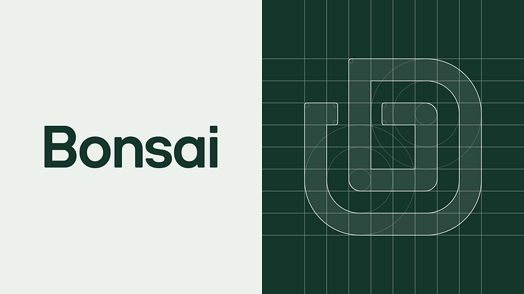
The mark and type retain the subtle rounding from the current logo which lends into the approachability and friendliness of the service.
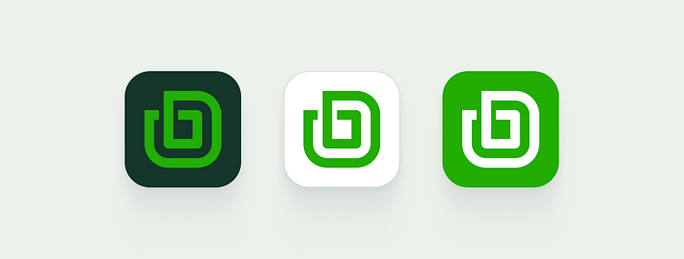
Overall, the mark locks up in an app icon much more nicely.
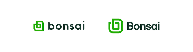
Of course, here is a side-by-side comparison of the current logo and my solution. What do you think? Should Hello Bonsai update their logo? Leave your feedback in the comments.


