WABA Brand Refresh (Women of AuditBoard and their Allies)


WABA is women of AuditBoard and their allies. This affinity group is an employee resource and champions all women at AuditBoard (and their allies) to provide networking opportunities, career growth, and mentorship both for AuditBoard and for the greater community.
They came to us looking for some new email banners, but the existing brand identity consisted of 2 logos and pattern. We didn't want to change everything, but expand and play with what we had.
Existing brand assets:
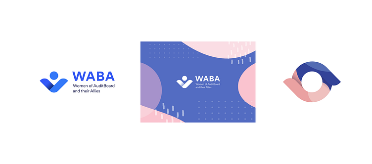
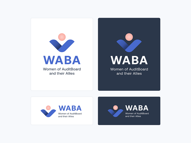
Updated logo:
I updated the colors to match our expanded brand palette, using shades of our AuditBoard blue and coral for the icon.
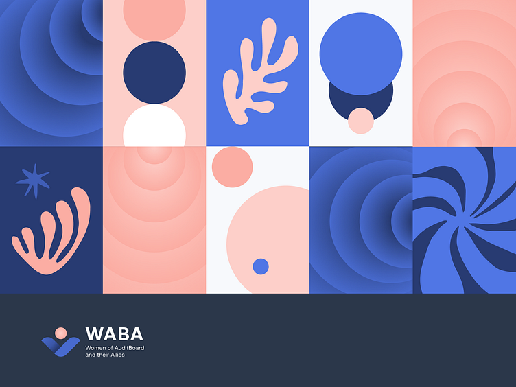
Pattern
To create imagery and a flexible pattern system, I pulled from:
The circles and gradients of the main logo
The flat geometric circles from the AuditBoard WABA logo treatment
Whimsical organic shapes inspired by Matisse's cutouts, for a playful and fluid element that our core AuditBoard brand lacks.
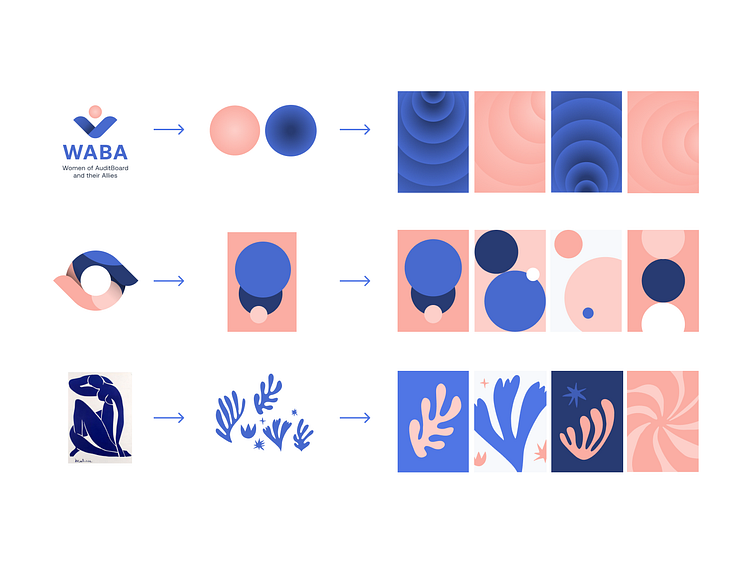
The result is a grid of different compositions that can be scaled up or down, zoomed in on, or pulled apart to create different assets.

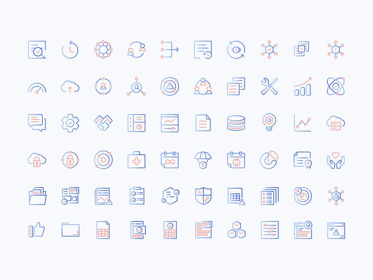
Icons
The core AuditBoard icon set was updated with the signature WABA coral.
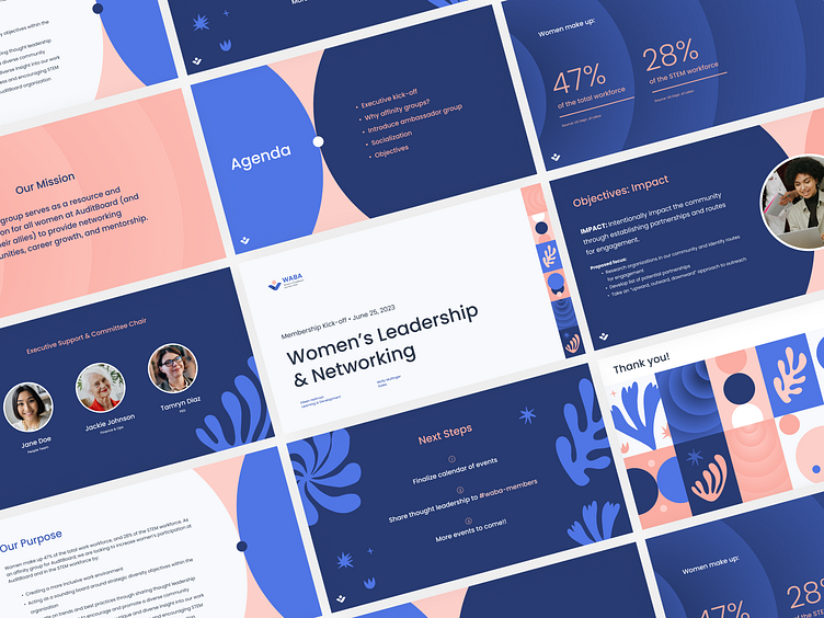
Slide Deck Template
A Google Slides template showcases the different ways the pattern elements can be pulled apart and expanded, to create a variety of backgrounds.
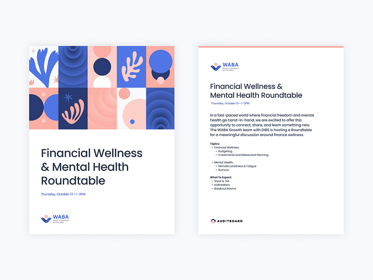
Letterhead
A letterhead and document cover were designed in Google Docs, which is easily accessible by the whole company.