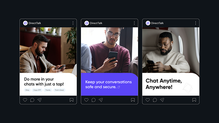
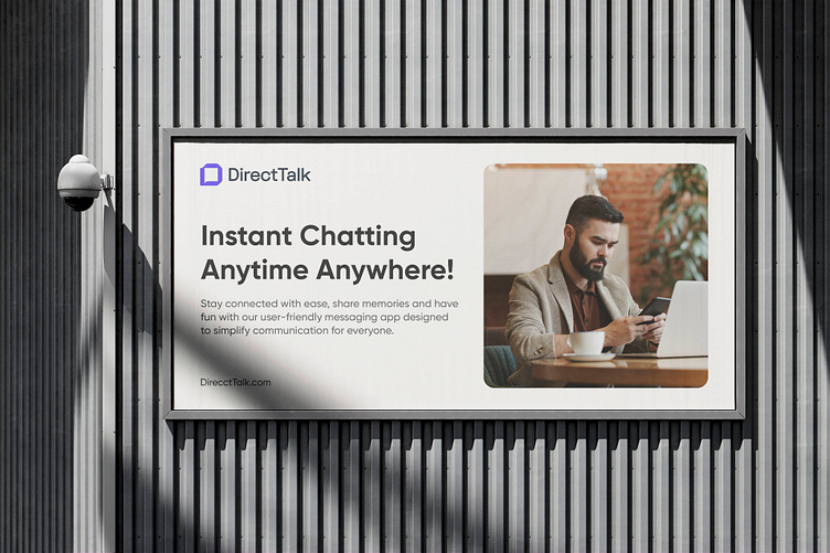
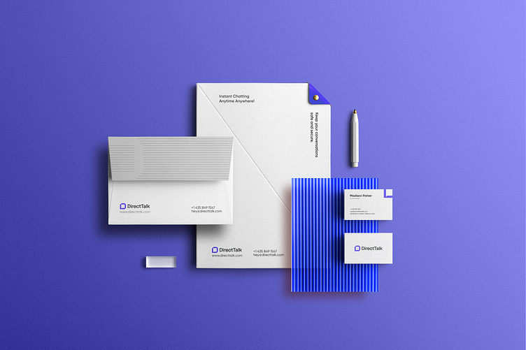
DirectTalk - Brand Identity Design


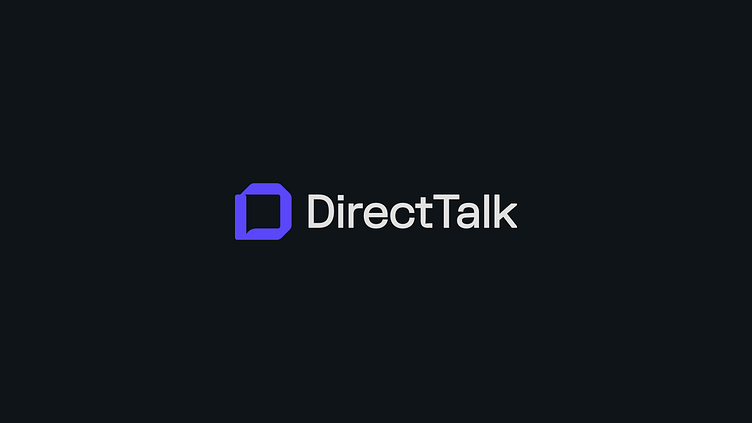
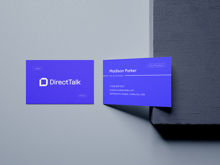
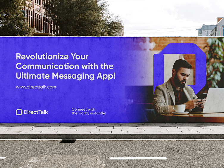
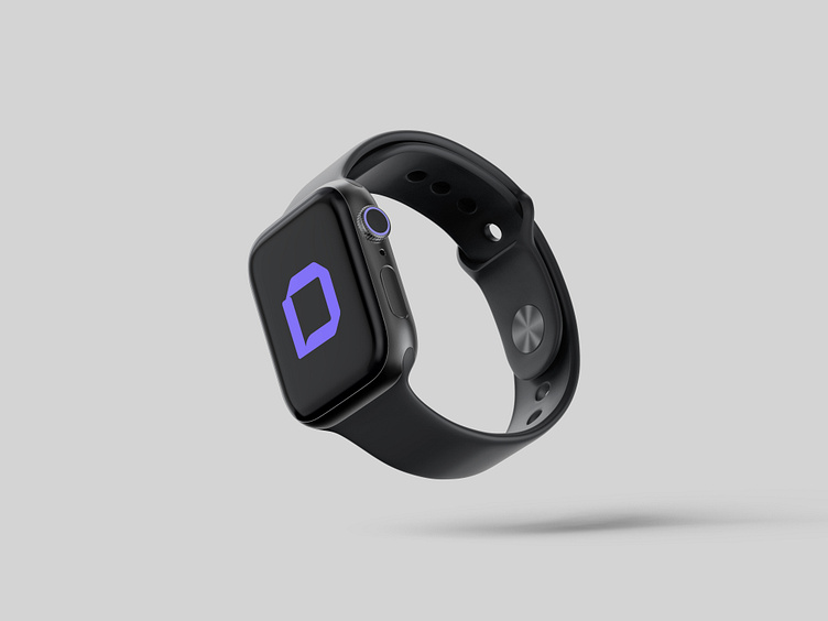
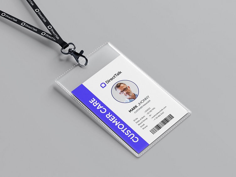
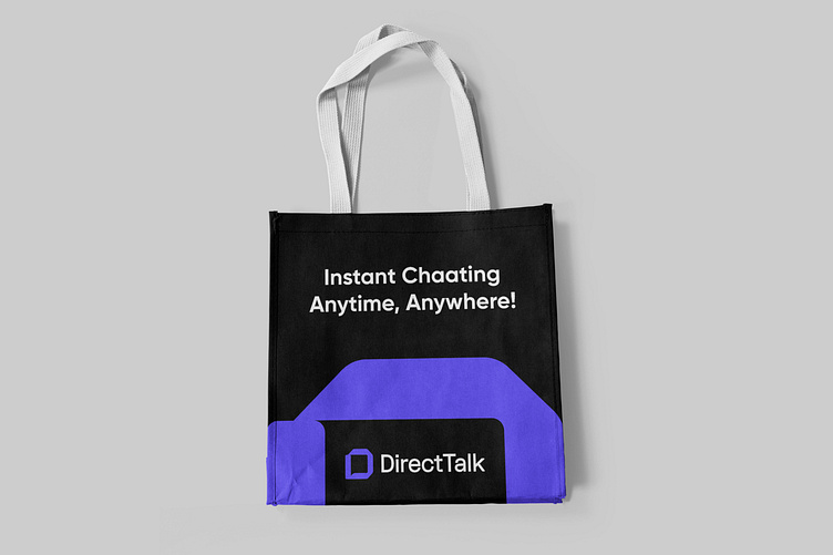
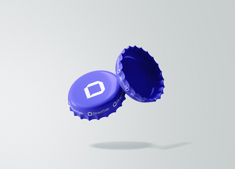
DirectTalk logo is a striking visual representation of the communication app's brand promise - to keep users connected, no matter where they are in the world.
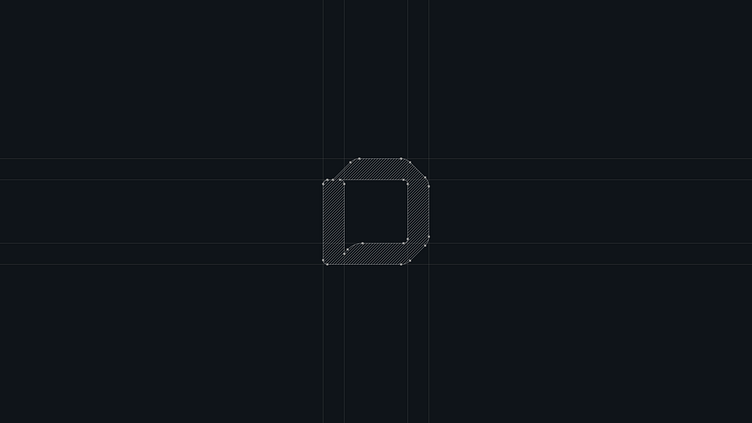
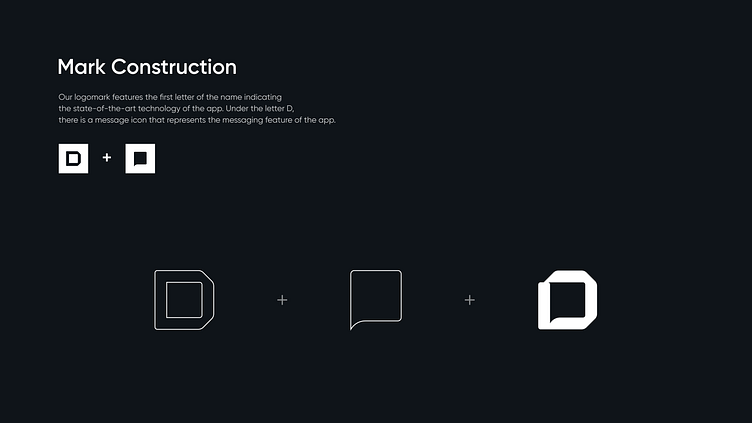
The logo features the letter D, the first letter of the name, and is designed in a bold, modern font that signifies the app's state-of-the-art technology. Under the letter D, there is a message icon that represents the app's messaging feature. The icon is perfectly positioned and blends seamlessly with the letter D, creating a cohesive and harmonious design. This design conveys the message that DirectTalk is a messaging app that allows users to stay in touch with anyone, anywhere, and at any time.
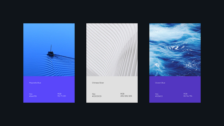
The color of the logo is blue, which is often associated with communication, trust, and intelligence. This color creates a strong visual identity for DirectTalk, positioning it as a trusted and reliable communication app.
Let’s start a project together!
Contact DesignXpart at designxpart.com/contact
Follow us on Facebook | Instagram | LinkedIn | Pinterest | Twitter | Medium
More about us on designxpart.com


