Divert - Responsive SAAS Web App (Multiple Images)

OVERVIEW
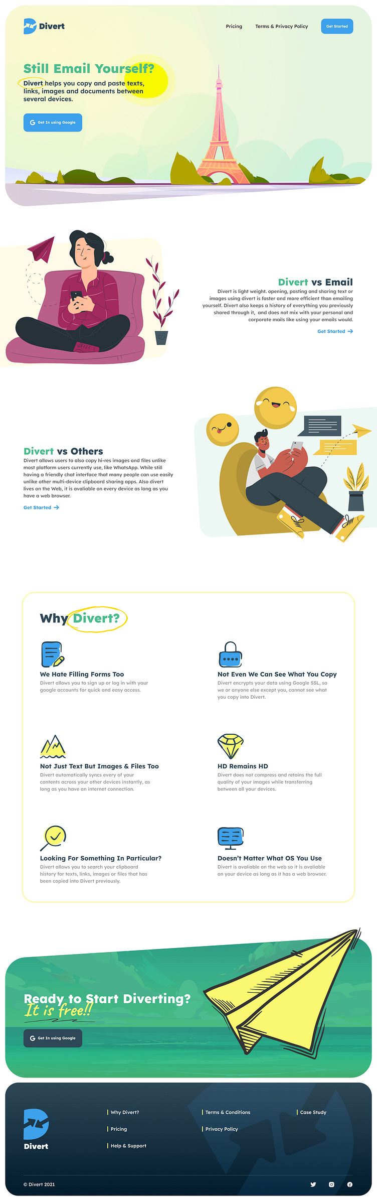
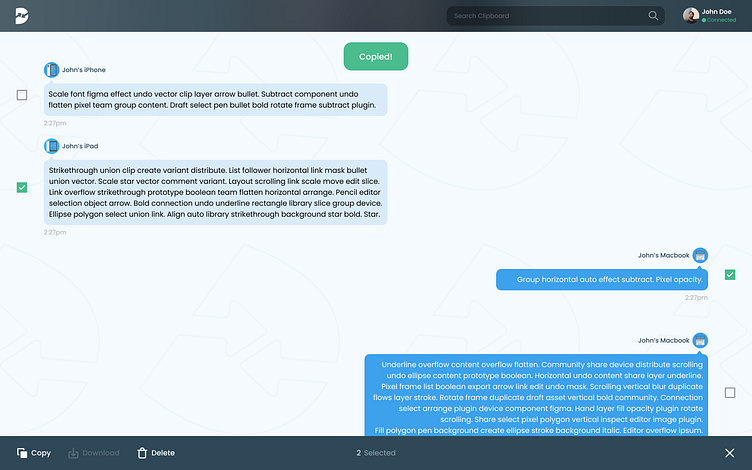
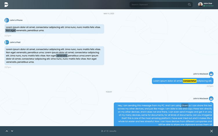
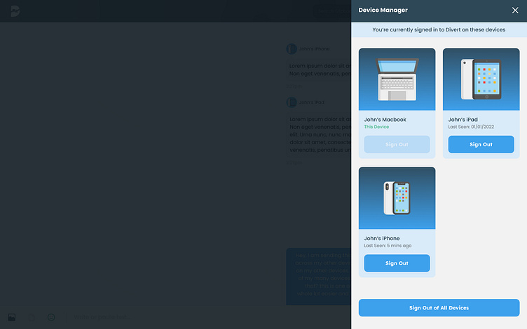
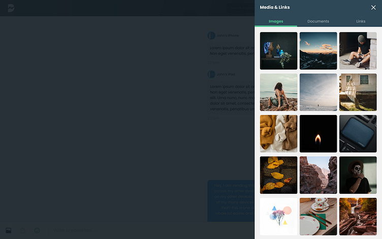
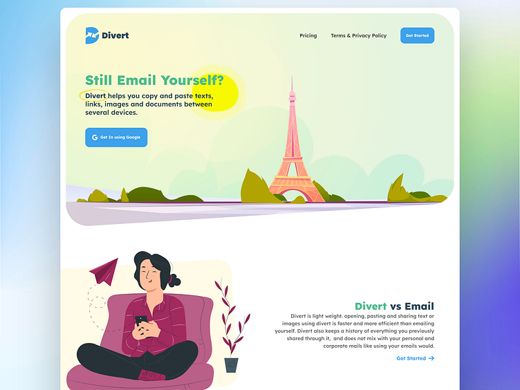
Divert is a web application that aims to solve the issue of copying and pasting items across multiple devices. With the increasing number of devices we own, copying text, URLs, emails, images, and documents between them has become a major issue for many people. Divert offers a chat-style interface that allows users to type directly into the app or paste text from their clipboard, which they can then send or save to the app. Divert syncs every user's content to the cloud so that they can access it across their other devices, making it easier to copy and paste between them.
PROJECT BRIEF
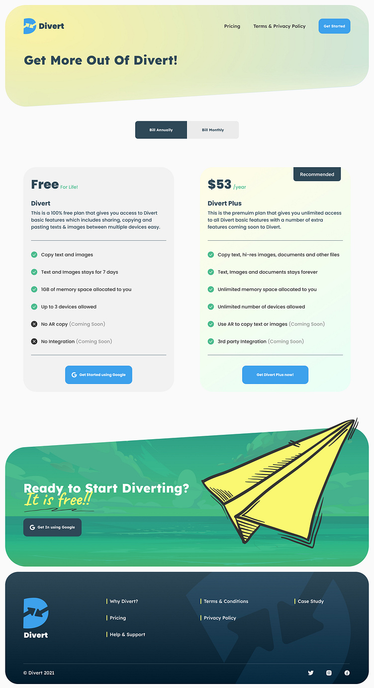
The app was designed to make copying and pasting across devices as seamless as possible. We created simple and easy-to-use interfaces that would make copying and pasting across devices as seamless as copying and pasting within the same device. Our goal was to provide better solutions in terms of functionality, usability, and overall experience than the current options many users use today, such as emailing themselves or launching WhatsApp, Slack, and other similar services on their various devices.
MY ROLE
Our team comprised of three members, and I was the Lead Product Designer for Divert. Our role was to create a web application that would solve the problem of copying and pasting items across multiple devices.
METHODS
To achieve our goal, we studied existing solutions and surveyed them to understand how they approached the problem, what the experience was like using them, and what made users use those specific services and particular features in them. We looked at various existing solutions such as Email, Clipboard, ClipDrop, Magiccopy, Lara.ng, PushBullet, Slack, WhatsApp, and Alt-C. We identified patterns between these services and got a good idea of what was available, what we could learn from, what we should not do, and how we can do certain things better.
We also conducted a survey to gain user insights. The survey consisted of nine questions, and we posted it on different platforms such as WhatsApp group chats and Twitter that matched the target user group. We received 37 responses, and we used the results of the survey to guide our decisions while designing the application.
Based on our research, we had so many ideas and features we wanted to add to Divert. We had to make a decision on which idea to keep, which idea to discard, and which idea we could implement later. We created wireframes, both low-fidelity and mid-fidelity, to build a clear visual hierarchy and define all necessary UI elements. We used Miro as our whiteboard for planning and sharing ideas, while Figma was used to build the wireframes and high-fidelity prototypes. We also designed different screens and components for different states, such as the landing page when the user is not logged in and the landing page when the user is logged in.
We created a user journey map to map out every step of the user interaction required to achieve the main goal of Divert. We began with the mid-fidelity designs to enable us to make quick changes and refine the design layout and structure, and we progressed to the final high-fidelity prototype, which included all the colors, images, icons, illustrations, and other assets needed.
In summary, our methods included studying existing solutions, conducting surveys, creating user journey maps, wireframes, and prototypes. We used Miro and Figma to plan, design, and build the application, and we used the results of our research and survey to guide our decisions while designing the application.
READ THE FULL CASE-STUDY --> https://madebystudioone.notion.site/Divert-55005723aee845f48f8e59b8c07675a2