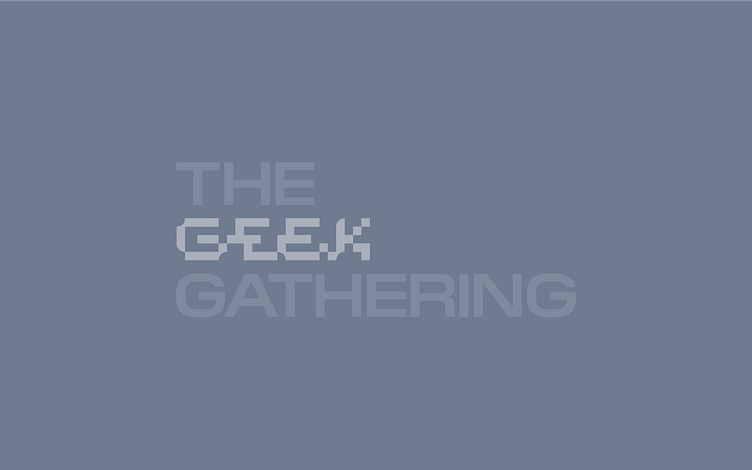
Geeky logo for a gathering for geeks


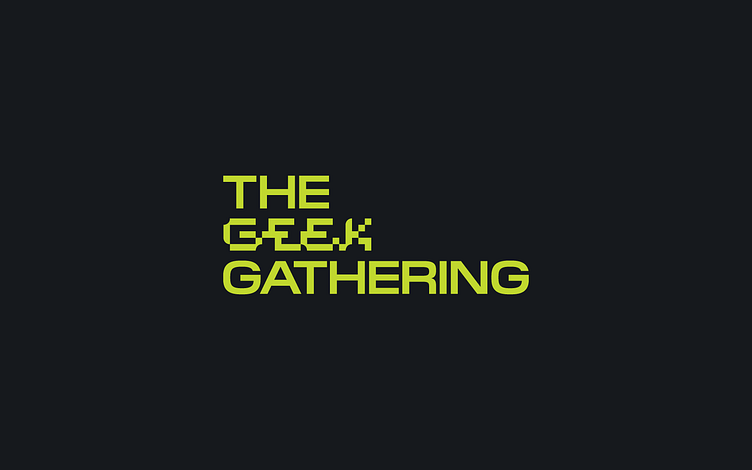
The idea was to awaken the nostalgia in an older generation of geeks and connect them with the newer generation by making a logo combining modern and retro styles.
The 90s, arcade games, and pixels inspire the logo and identity.
TGG is a gathering for all IT lovers, which is BROUGHT TO YOU BY FELLOW TECH MINDS.
It is not a classic conference but a friendly gathering in a relaxed environment where knowledge and ideas are shared.
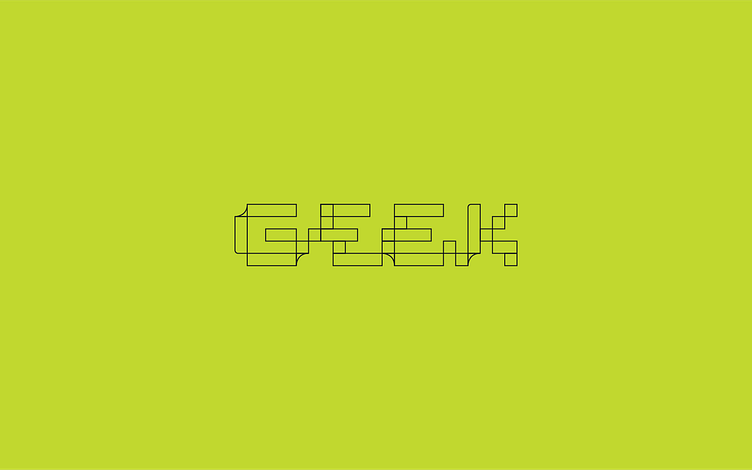
Logo grid
The word Geek is created from geometric shapes arranged in a grid. The letters themselves are inspired by the Pilat Wide typography used in the identity and logo. The custom letters follow the look of the font, and the idea was to make it look as if only the word Geek was pixelated at one point, i.e., as if a glitch had occurred in the logo.

The desire was to avoid the typical pixel look but highlight the word Geek in a modern and exciting way. The letters needed to be connected and to have a good balance.