Fitbit monospace clock faces

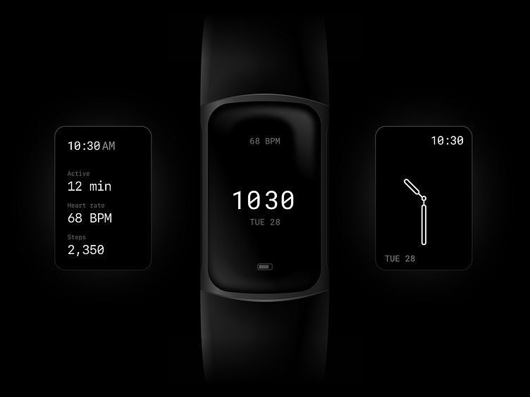
Fitbit clock faces are always too colorful for my taste and also somewhat hard to glance at quickly. To much stuff on display, too many colors, and other quirky fonts (they seem to love skewing things, making numbers hard to read).
As a user of the charge 5 that got a really neat OLED display, I'd love to see a simple set of minimal faces with perhaps a monospaced font (Roboto Mono here) for optimal number readability. I'm almost sure that the current designs don't meet accessibility best practices (not that mine are perfect either but reducing type variation, increasing scale and visual breathing room should go in that direction).
✌️


