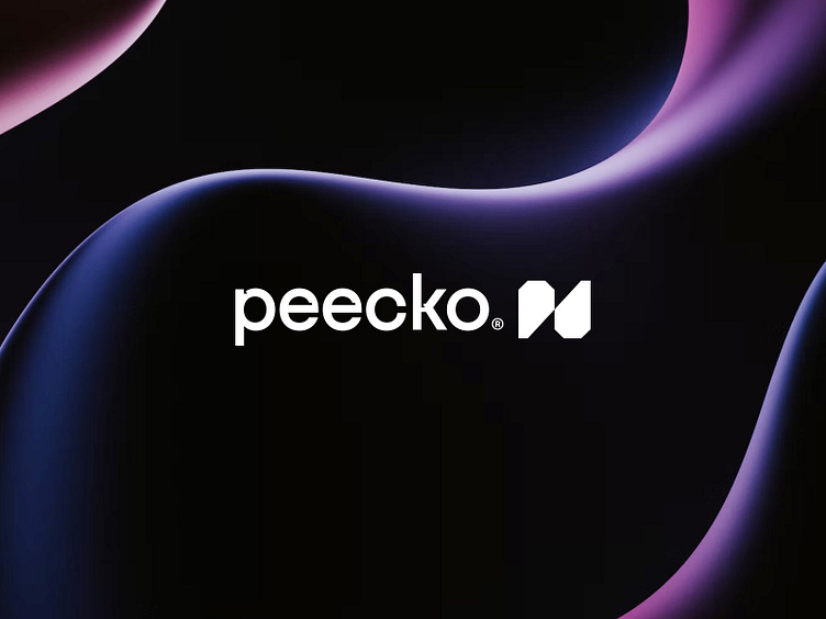
Peecko® — Logo Design


→ See the complete case study
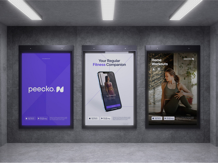
Peecko is a fitness and wellness mobile app that offers
an extensive and exclusive video content library to its users.
Their primary focus is helping corporations improve and
maintain their employees' physical and mental health.
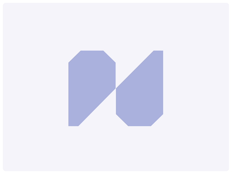
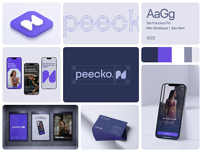
We opted for a logo mark featuring a geometric shape reminiscent of the letter P, with a deliberate cut at a specific angle to create a seamless reflection of the same shape. The aim was to symbolize a comprehensive transformation and enhancement of the human body.
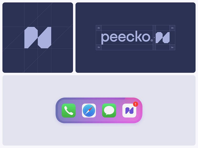
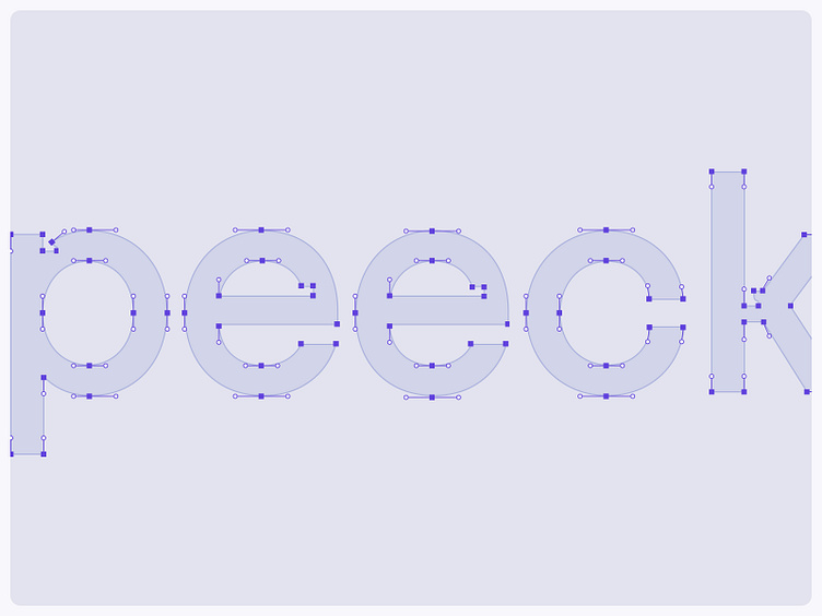
To enhance the brand's identity, we tailored the typeface, adding a touch of uniqueness that complements the brand mark.
Show some love 🖤🤍🖤 and press "L" to support our work.
---
Interested in partnering with us?
Get in touch at hello@unikostudio.co or visit our website unikostudio.co