IPTS Rebranded: The Power of an Adaptable Design System

Project overview
Project brief
For the Interplanetary Travel Syndicate (IPTS), I created three products as part of my Scaling Design Systems course with Dribbble.
IPTS.org informs interstellar travellers on the latest news.
IPTS Travel books trips around the galaxy.
IPTS Rail is a real-time web app providing information on schedules and routes.
I was responsible for creating all three products in a cohesive manner, therefore the most notable requirement of the project was to build a cohesive design system that would tie the three products together under one brand.
My Real-Life Goal
Learn how to bring an existing product with a lot of design debt into the smallest possible set of reusable components.
Check out my progress!
Ideation and wireframing
As we practiced in week 1 of the course, I used AI to pull together some key features for each product. Through wireframing, I was quickly able to identify common components shared across all three products.

Visual design
I got to work on high-fidelity layouts for all three products simultaneously trying not to spend too much time on decisions about visual identity and responsiveness at this stage. My focus remained on the requirement to create all three products in a cohesive manner with a minimum of one page each, comprising at least five components per page.

Design System
The primary objective of this project is to consolidate and apply the knowledge and skills gained during the past 8 weeks of learning about scaling design systems. This part of the project therefore needed to encompass several key areas of focus, including:
The virtuous cycle and measuring spoon approach (particularly the part where I fly to Mexico and everyone benefits 🌴🍹)
Start with the products first, and let patterns emerge naturally. Extract the commonalities, creating components as a last resort.
Utilise integrated tool features like Auto Layout where possible, but be careful not to over-egg the pudding!

Dan Mall's Definition of a Design System served as a guiding principle throughout the project. I aimed to create a connected, version-controlled software product that contained only the necessary components and guidelines required for IPTS to produce digital products that are consistent, efficient, and delightful. As emphasised in the definition, the focus was on delivering the smallest set of components that could fulfil this objective.
Styles
I defined surface, primary, secondary, accent and feedback colours as well as a handful of font styles and a sequence of drop shadows for depth.

Components
In the first assignment of the course, I learnt that using a design system built by someone else to design new products can be tricky. I knew to pay particular attention to;
the number of components—only document the components that exist now, don't get caught in the trap of predicting the future
the flexibility within them and what variants are necessary
nomenclature and the overall structure, in order to be able to locate things intuitively
and how colour, typeface and icons can be applied as intended

Tools & Plugins
During the mentor sessions, I learnt a lot of Figma tricks to help prioritise the architecture of a component over it's styling, because at the end of the day, if the architecture is sound, styling comes easily.
Figma's Auto Layout: use it only as much as is truly necessary, so that collaborators can easily work with a component.
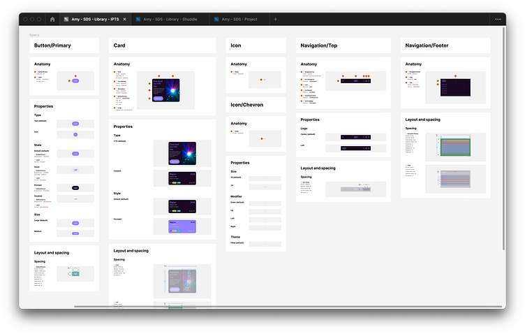
I used EightShapes Specs to produce well-presented component documentation, and learnt that you do have to put in some effort upfront to name layers effectively, and keep components simple for the sake of your readers.

Changing Requirements
Mid-project, a major curveball: IPTS rebranded and became Shuddle 😱. That's where my work was put to the test and the true value of a good design system was realised. I created V2 of the library and set about updating the styles, hoping that the components would automatically fall into line, but in reality, I hadn't anticipated the change and I had no idea how it would hold up...


And this is what I learnt:
It's crucial to have consistent and future-proof naming for layers, styles, and components. Adding the product or company name as a prefix can create unnecessary friction and limit the system's adaptability.
Keep up with the latest tool updates and best practices. Integrated features can be powerful, so investing the time upfront to fine-tune the details can save you and others significant time and effort down the line.
Pay attention to the component's architecture, such as correctly applying Auto Layout and constraints. Neglecting this can cause unexpected layout issues when updating styles.
Ensure that styles are updated in the library, not just on the demonstrating layers. An easy mistake to make, but potentially a costly one.
Consider how multiple colours interact in a layout. For example, switching a light brand colour for a dark one can have a negative impact on the overall design if it leads to poor contrast.
Only document the smallest possible set of components. Minor complexities in a design system can lead to significant complications when change occurs.
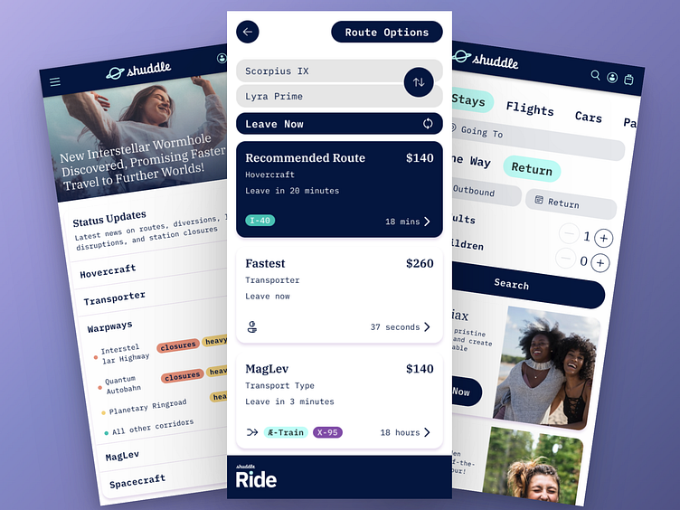
Finished products
After addressing the biggest issues, and a little polishing, this is the current status of the design system and the three products for Shuddle...


Next steps
I have already been able to apply many of these guiding principles to my daily work and have seen an increase in quality output and engagement as a result.
As the Agile Manifesto states: "working software over comprehensive documentation", I hope to be able to integrate hot potato as part of our cross-functional workflow and enable us to deliver new features much quicker. As our design system matures and evolves, a long term goal would be that we no longer need to finish a design or a wireframe for someone to notice that we can use a predefined component.
Next I'm keen to learn more about;
how to overcome the initial challenge of aligning styles across documentation and production.
effective ways to measure the success of a design system.
My definition:


