Mineral


Final logo for an amazing upcoming resort & spa near by Canada capital Ottawa. It was a big pleasure to work with guys who put all of their hearts into their project to built a unique place where people could reset them selves and reconnect with a nature. Mineral it’s all about being organic, flowly and energetic.

We explored couple of different options, starting from thinner signature style to really thicker and iconic lettering. We found a middle size. Logo is going to be used in really different situations, it has to be really functional in “real life” and stand out really well. Also I tried to keep it really unique and effortless.

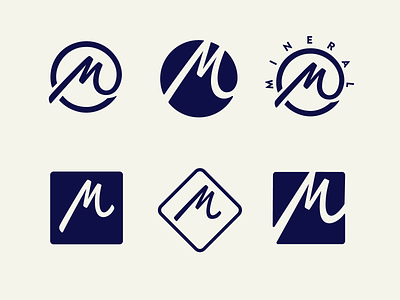
Stand alone "M" logo mark and exploration process

I had an idea to explore alternative “M” stand alone logo mark which would be more monumental and even more iconic but at the same time conncected with an orginal lettering.

How logo works in a context. www.mineral.ca
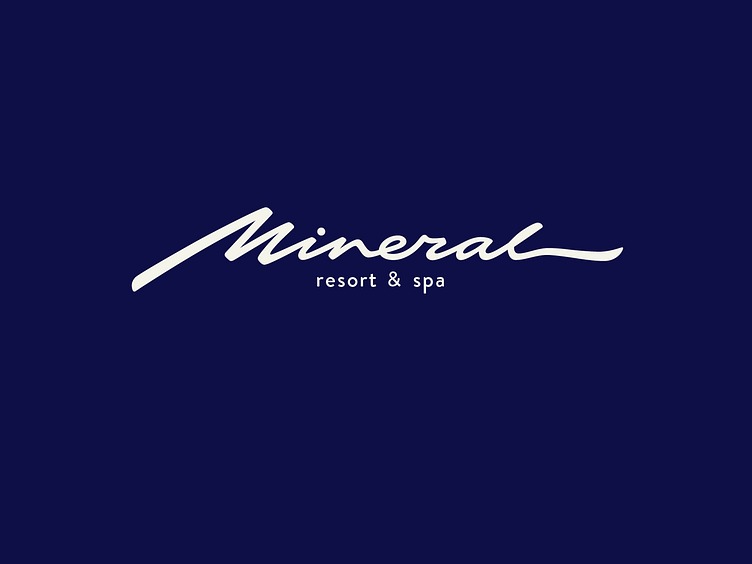
Final logo lettering. All good things are coming__ www.mineral.ca
Feel free to contact for work inquires: tadasfsg@gmail.com