ClickBids: Logotype construction


Hello there!
We have something fresh and exciting for you today! ✨
We have been working in collaboration with a skill-based online auction platform Clickbids. During our collab we designed a logo for them and also a brandbook.
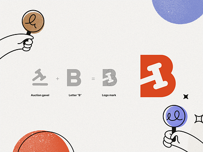
For the logo we aimed to keep it simple and easy to understand. Since one of the goals of the brand is to be transparent and reliable for the customers, the logo mark has a direct reference to ClickBids field of activity, auctions. It is composed of the letter “B” and an auction hammer.
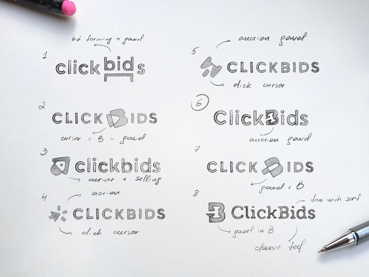
But to get there we tried other approaches. All of the options were sketched with simplicity in mind. We tried working with click, auction and sales metaphors, sometimes intermixing them. But in the end the most easy to read option won.
Which one do you prefer?
Case study: https://flatstudio.co/projects/clickbids
Behance: https://www.behance.net/gallery/150684529/ClickBids-A-new-way-of-winning-in-11-clicks
┈┈┈┈┈
Looking for a design company? We would love to hear about your needs. Contact us: http://flatstudio.co/contact
┈┈┈┈┈
Flatstudio · Instagram · Facebook · Twitter
P.S. Follow us & Like ❤️ this shot to share the love! 😍