Bangladesh Premier League Logo

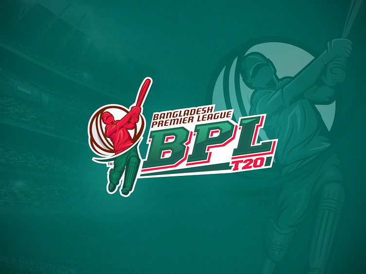
In the icon/logomark - I tried to implement something figurative, with the idea of 'Cyclone', portraying the ‘force of a t20 batsman’. There is a t20 cricket ball back of the batsman which is spinning and making another storm/cyclone. Since the t20 game is all about showing a thrill with every ball by ball, so I developed the logomark based on the action between the bowler and the batsman. But I've emphasized on the batsman part, because all we want is to enjoy the ball out of the playground, hitting the crowd, right? Only the batsman can hit the ball to the viewer's gallery. So the ball is not only spinning in the field but also in the gallery. This is the foremost idea that I implemented in the logomark.
The typography - I made it like a straight, cutting-edge type. Some shiny portions and gradients are to highlight the text, and the contrasts are for making this more visible.
All the colors used in the logo took significantly from the flag of our country. Furthermore the green color is also signifies the 'field, nature and the youth'.. The red is for boldness, it signifies 'strength, challenge, contend' as well as red is symbolic for love & unity. All the secondary colors are based on the assistance of the main color and theme.
At the bottom of the BPL typography, I used a line to balance it with the text T20.
Hit 'L' if you like it. I am available for freelance, text me here razibkws@gmail.com


