Astro Design System

A Figma & React Design System capstone for Scaling Design Systems by Dribbble and Dan Mall.
Background
Design systems are a must-have for companies that work at scale because they allow teams to deliver better products faster. By establishing a shared language and set of practices, design systems enable teams to focus on innovation and problem-solving instead of repetitively recreating the same patterns.
The skills necessary to create and maintain design systems are essential for designers working in today's fast-paced industry. The Dribbble design course provided me with the tools and knowledge necessary to develop effective design systems, ultimately allowing me to deliver better products in a more efficient manner.
Problem
For the course Capstone, we where to immerse ourselves into a role and scenario and put our new skills to the test:
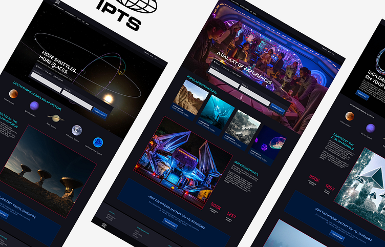
You’re the Head of Digital for the newly launched IPTS: the Interplanetary Travel Syndicate, a bustling transportation network that shuttles people from world to world within our galaxy.

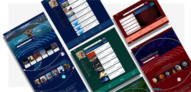
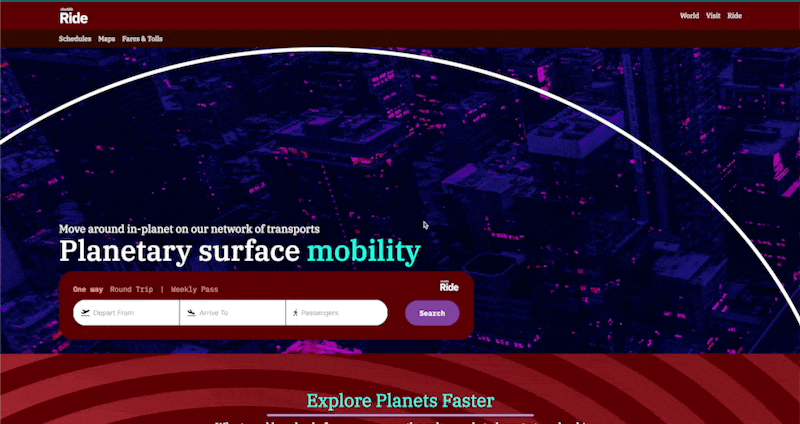
The company has three website: IPTS.info, IPTS Travel and IPTS Rail.
I was tasked with delivering three websites and a design system (which I later dubbed Astro Design System) in just one week. It was a challenging endeavor, but thanks to my experience and the skills gained from the Dribbble design course, I was able to rise to the occasion.
Roles
Branding: In this project, I was responsible for creating the visual identity of the newly launched IPTS company. This involved creating a logo, color palette, typography, and other visual elements that would be used across all three websites and the design system.
Design: I was responsible for designing the three websites. This involved creating wireframes, high-fidelity mockups, and other design assets that would be used to build the websites.
Front-end development: In addition to designing the websites, I was also responsible for coding the front-end of each site. This involved writing code in React and creating NPM packages to bring the designs to life.
Documentation: Finally, I was responsible for creating documentation for the design system. This documentation would outline the rules and guidelines for using the design system, including the visual elements, typography, components, tutorials and getting started material.
One Week Later
What Components to Include in a Design System
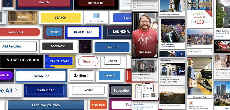
When I was working on this project, I realized that I didn't have enough UX for each website and wasn't completely sure what to do. So, I decided to do a competitive audit to find out what similar companies were doing. In doing so, I was able to find components from each industry-type website, which I documented as references for the design system components. Additionally, I looked at properties that might be helpful to extract from each into the components. This work allowed me to pick the initial components to start with.
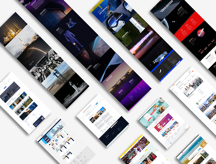
I found that doing a competitive audit was extremely helpful because it gave me a better understanding of what was already out there and what users might expect. It also helped me to identify gaps in my own design and to come up with creative solutions to fill those gaps. Took this one step deeper, with each component, this would have been done differently had I started with an existing product.
Ultimately, this work allowed me to create a more robust and effective design system, which helped me to deliver better products in a more efficient manner.
A Visual Language from Scratch
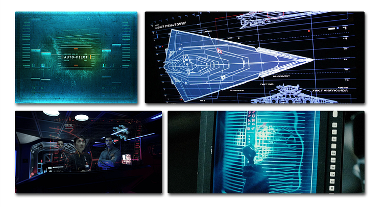
When it came to approaching the visual language for IPTS, I drew inspiration from dark, futuristic UIs from movies like Blade Runner, Star Wars and the Expanse series. I felt that this style conveyed the feeling of an evil space syndicate that IPTS was giving me the vibe to go with.
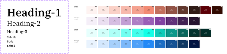
For typography, I chose the Elnath font for its bold, futuristic look. I paired it with Maven Pro for a more classic, readable feel. Elnath was used for headings, while Maven Pro was used for body text. I felt that this combination of fonts worked well together and helped to reinforce the futuristic theme. Below is some of the discovery work that helped me arrive at the typographic decisions.

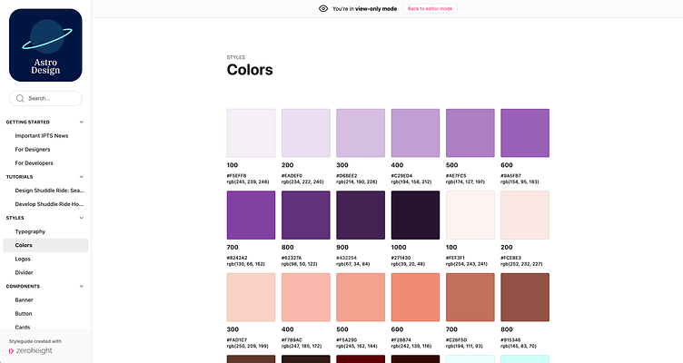
For the color palette, I started by creating moodboards with images that evoked the feeling of futuristic space, yet with that darker undertone. From there, I used Colorbox, a tool developed by Lyft, to create a palette that would work well for IPTS.
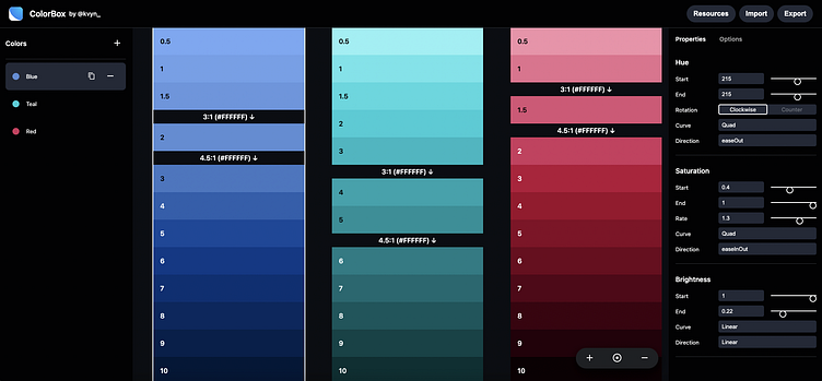
I found that this process helped me to create the building blocks for a cohesive and effective brand identity.
User Experience in Design Systems
I started building the components in Figma and coding them in React, but quickly ran into trouble as there was no context to the website. Without a clear understanding of the purpose and audience of each website, things started to get much harder. Components without context felt incredibly hard to build.
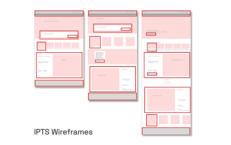
I had fallen into the mistake of assuming that design systems were exempt from the Discovery phase any product requires before getting started. However, after realizing my mistake (doubly so as the course had taught us not to take that path), I went back to basic wireframes to better understand the website structure, context, copy, and imagery. This led to a better understanding of the project as a whole, and ultimately gave the work more life.
Learning from this experience, I gained a better understanding of the importance of discovery and user insight and how it relates to design systems. By going back to the basics and focusing on the needs of the user, I was able to create a more effective design system that was better suited to the needs of the project, and frankly easier for me to design.
Designing, Coding & Documenting
In the Dribbble design course, I learned about Dan Mall's "hot potato" process, which involves quickly passing off design decisions to other roles to keep the project moving forward. This allowed me to efficiently design components in Figma, turn them into a Figma design library, code them in React, visualize and test them in Storybook, and publish them to NPM while keeping everything up to date with each other as I worked through each component.
In a team this can reduce the hours spent on specs and preparing handoff files, as well as decisions that may have needed adjustment along the way. It required another level of multitasking. As well as some great tools to add to the workflow.
Focusing on the components first allowed me to have more time to give the website attention in areas that wouldn't be covered by the system. This practice, which I learned from the course, is one of my favorites because it allows for flexible design systems.
Adapting to Breaking Changes
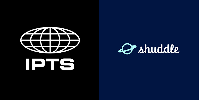
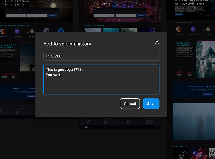
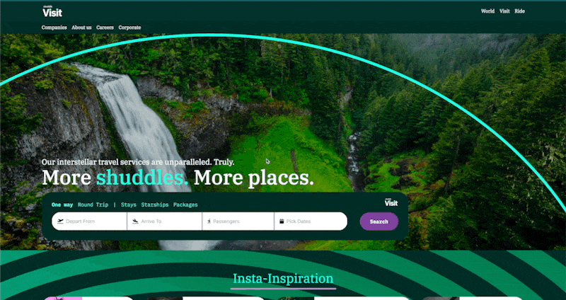
All the progress I had made up to this point was faced with a new challenge that would affect everything. IPTS was about to go through a rebrand because it looked too sinister, and new visual assets were given, along with a new perspective on what each website was all about.
The changes were a lot more than I could have anticipated, and multiplied by how I was working in Figma and React, I was a bit worried that I would not be able to finish the work. This is where the Dribbble design course really showed the depth of the content and the teachings because, although it was a huge change, the weeks of practice and study had given me the confidence and skills to take on the challenge. So with a week to turn this around and deliver, I had to say goodbye to IPTS.
As a result of saving as much of the previous work as possible and keeping the style assets connected to every component, I was able to make small changes quickly and efficiently.
Getting Things Done
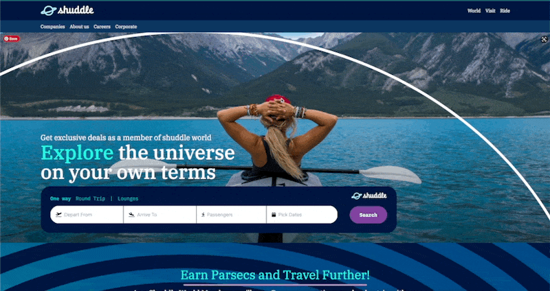
I struggled a lot more with the new branding than the previous one, for a few reasons. I had become attached to the IPTS brand, and the new Shuddle brand had a totally opposite vibe. However, building things as a system, allowed me to make these changes in key places and have them take effect throughout all the parts of the product.
There were many iterations to get the Shuddle brand feeling right, but the continuous deployment approach and connectedness of everything gave me a lot of flexibility. I was able to keep changing stuff as my understanding of what Shuddle was grew, without having to multiply the effort.
As a result of that, the visual language of Shuddle is night and day from IPTS.
It didn't take very long to make the first round of changes, and in fact allowed me to make multiple explorations before arriving at what it is today.

A Single Source Of Truth
Working in Figma and React taught me the importance of having consistency across platforms. It's crucial to speak the same language, and Figma layers should match the code structure. Not doing this is very painful, especially when context switching, and even more when you are context switching often.
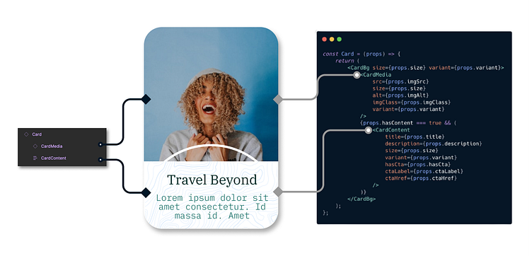
Structuring everything to be similar to each other saves a considerable amount of time when making changes. For example, a change in the card above in Figma is easy to find in its code equivalent. Consistent naming across platforms takes away the extra cognitive load of trying to decipher what things are and where they are. The more I practiced this, the more efficient and effective my workflow became, that extra time allowed me to update documentation just as easily.
Leaving Breadcrumbs
One of the things that the course went over is how to approach documentation. Without it, the users of the Design System would probably have a difficult time adopting the system.
Keeping everything up to date, while making so many changes at once is not easy. It takes a systematic approach to how documentation is added and updated. Zeroheight became the place to merge design and code with the design decisions I made along the way.
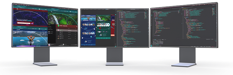
After taking the course I was able to create a design system from scratch, and a deeper understanding of the effort and understanding needed to deliver on these. In the end I was able to deliver the following:
A Documentation Site
Component Library
Design Library
Styleguides
and more...
Designed & Deployed
Documentation:
Live Websites:
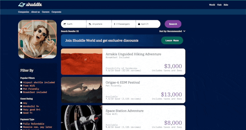
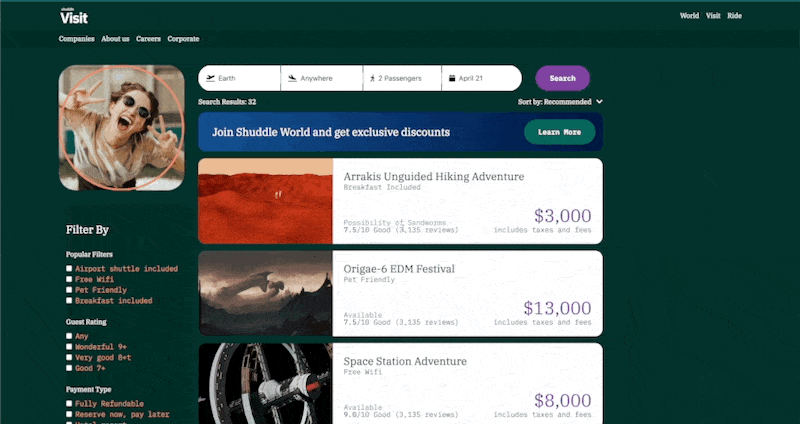
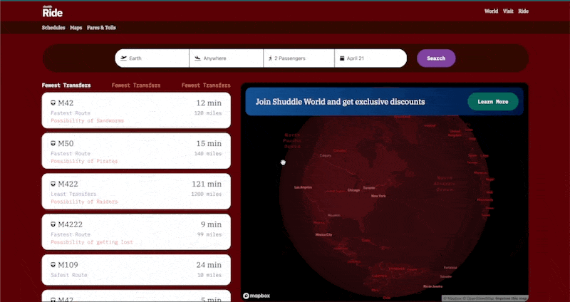
Click Search for Search Results Pages
NPM package
Lessons Learned
Discovery and user insight are critical to the success of a design system. There are Users (external to the development & design teams) and there are users (the development & design teams) and design systems have to take all into account
Dan Mall's process of the ‘hot potato’ turbo charges the workflow and processes that it takes to build these systems.
Building a design system that can be continuously changed and deployed is better than one that has to be pixel perfect before deployment. Also making subcomponents available or the fact that components are made up of smaller components can allow for faster workflows.
Having consistency across platforms is crucial to speak the same language and save time and energy. Having components that work seamlessly across different platforms and having documentation that includes reasoning behind design decisions makes things easier.
All in all, I have to say this was a huge increase on the skillset I came into the class with. I highly recommend anyone who wants to level up in Design Systems, to take this course, and try all the exercises, you will get what you put in!!
Next Steps
Build this out more completely, I left out the states for each component, interactions such as dropdowns and calendars to really flush out this design, onChange events and a lot of the responsiveness. It was my first time working with TailwindCSS and did not know that meant having to do that (thought it was like bootstrap) , but i'm hoping it wont take long to add these changes


