Re-Imagining Popular Equine News Website

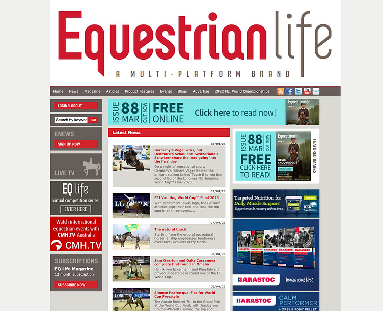
Current Website:
The current website is a one-size-fits-all design that does not respond to mobile or tablet. The text is illegible on a phone, the ads even more so. Many of the previous blog posts no longer have images attached, and instead have a small image icon, suggesting that there is much work to be done on this site.
The current homepage:
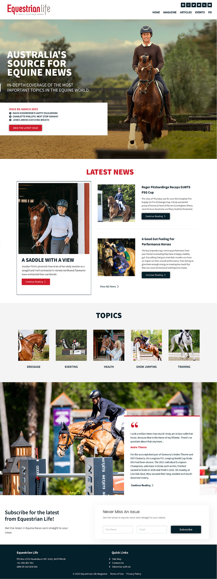
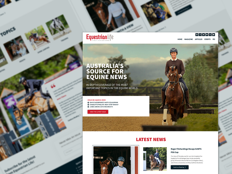
The New Design
A new design would bring this website into the current century by focusing on what matters most: the user's experience. High-quality images, visually appealing, on-brand colours, and text in a size that viewers can read (on desktop and mobile) would greatly improve this website. Additionally, using design to create movement would help this brand's audience feel as though they were a part of the excitement.