Shuddle Design System Case Study

Shuddle (previously IPTS) is the Interplanetary Travel Syndicate, a bustling transportation network that shuttles people from world to world within our galaxy.
Overview
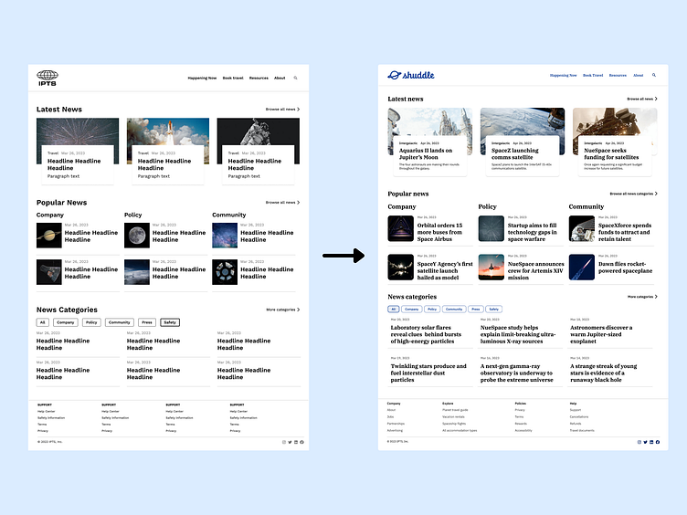
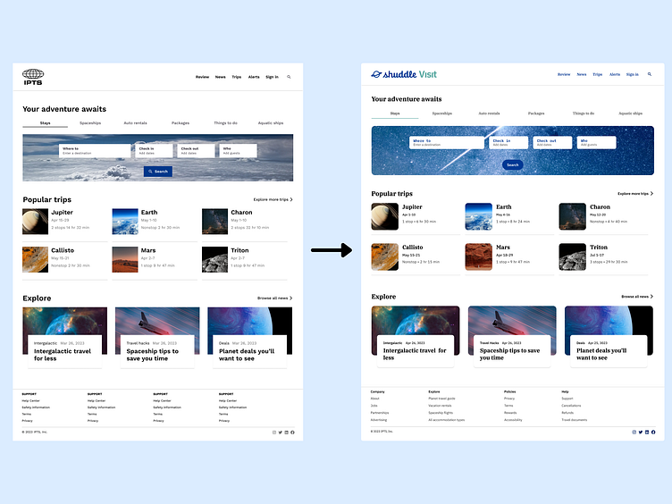
As Head of Digital, my role was to start a design system and re-brand two products: IPTS an informational website, and IPTS Travel, a website where you can browse and book travel to and from multiple destinations within our galaxy.
IPTS became Shuddle, and IPTS Travel became Shuddle Visit below.
The Re-brand
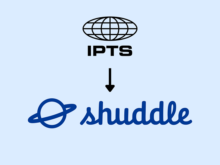
Leadership at the IPTS—the Interplanetary Travel Syndicate—hired the prestigious branding firm MegaBrand to rebrand the entire organization and products.
MegaBrand discovered through focus groups that the IPTS name and logo felt very cold.“The eyeball-shaped logo doesn’t help,” said one candid participant.
In addition, the IPTS wanted to appeal to a younger demographic. After weeks of research and exploration, they settled on the new name “Shuddle,” which felt more like a cool, new startup.
The Details
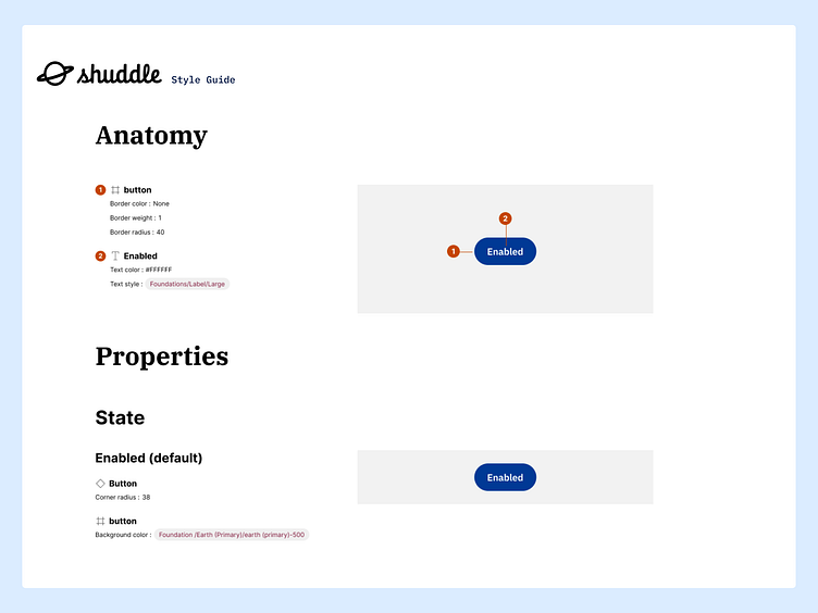
After creating the two product websites, I audited the products and searched for patterns that I could create components from. I then created a style guide to help me organize and begin a design system for Shuddle.
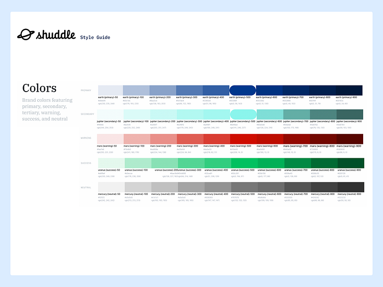
Color
Since color is used to express style and communicate meaning, I began with a color scheme of primary, secondary, neutral, warning, and success colors that then expanded into tonal palettes with 10 tones. Specific tones from each tonal palette were assigned to color roles across a UI.
Foundational colors were essential to creating a dynamic color scheme. With foundation colors established, the Shuddle design system had a full spectrum of colors needed for expressing interaction states, errors, and accessible contrast.
The primary foundation color is used to derive roles for key components across the UI, such as the prominent buttons, active states, as well as the tint of elevated surfaces.
The secondary foundation color is used for less prominent components in the UI, such as tabs while expanding the opportunity for color expression.
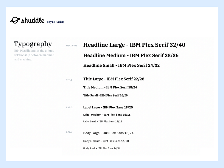
Typography
The default typeface for Shuddle is IBM Plex which includes hundreds of glyphs and languages worldwide.
IBM Plex is an international typeface family designed by Mike Abbink, IBM BX&D, in collaboration with Bold Monday, an independent Dutch type foundry. Plex was intended to illustrate the unique relationship between mankind and machine. The result is a neutral yet friendly Grotesque style typeface with a Sans, Sans Condensed, Mono, and Serif. They all have excellent legibility in print, web, and mobile interfaces. Plex’s three designs work well independently and even better together.
Sans is a contemporary compadre, the Serif for editorial storytelling, or the Mono to show code snippets.
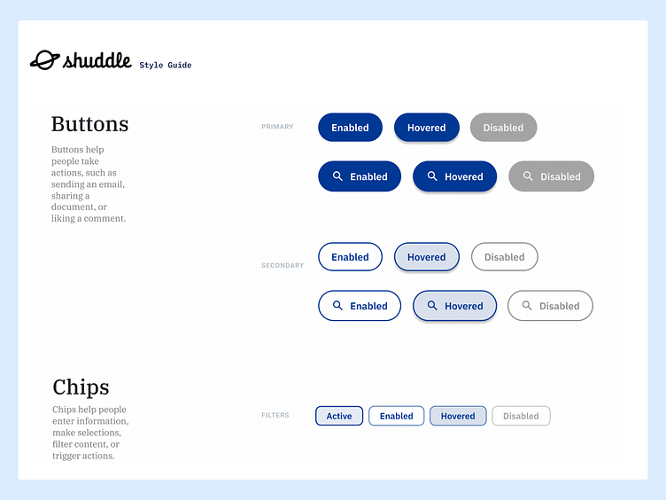
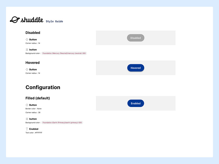
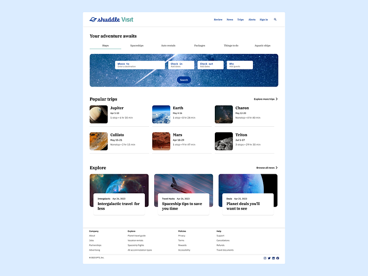
Buttons & Chips
Buttons were designed to be either high or medium emphasis for important or common actions on a page.
The primary buttons are high emphasis, and the main actions are to search, create, or compose.
The secondary buttons are medium emphasis, and the main actions are to not distract users from other onscreen elements.
Chips can show multiple interactive elements together in the same area, such as a list of selectable categories.
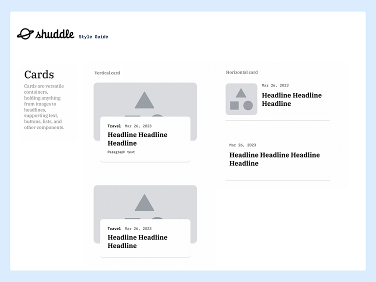
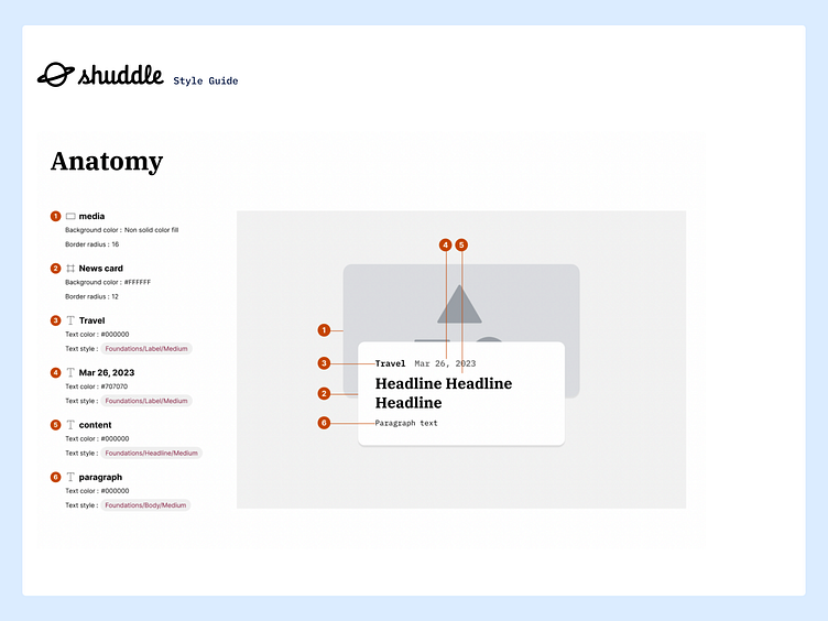
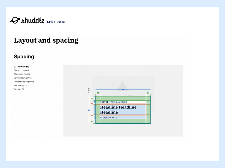
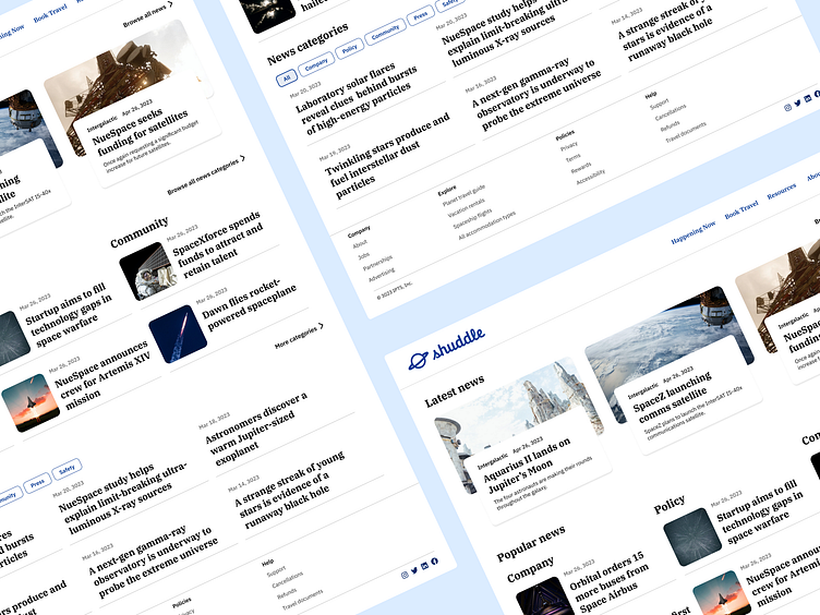
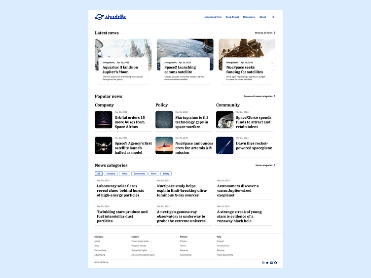
Cards
There are two main types of cards: Horizontal or Vertical. The cards are identifiable as a single, contained unit. They can hold anything from images to headlines, supporting text, buttons, body text, and other components. A card’s layout and dimensions depend on its contents. There is no one right way to make a card.
Cards are used to display content and actions on a single topic. They are designed to be easy to scan for relevant and actionable information. Elements like text and images are to be placed on cards in a way that clearly indicates hierarchy.
Summary
After designing pages for IPTS products and supporting their re-design to Shuddle, I identified patterns in the UI to create components and a style guide.
The style guide focuses on typography, colors, icons, and examples of components, while the component sheets explain the layout, spacing, properties, states, and anatomy of a component.
From these initial foundation steps, the design team can continue to scale and implement new components to the design system through continuous product auditing.


