Moved Case Study 5: Responsive website design

The final chapter for our client's project is called Moved. You can check all pieces of this case right here
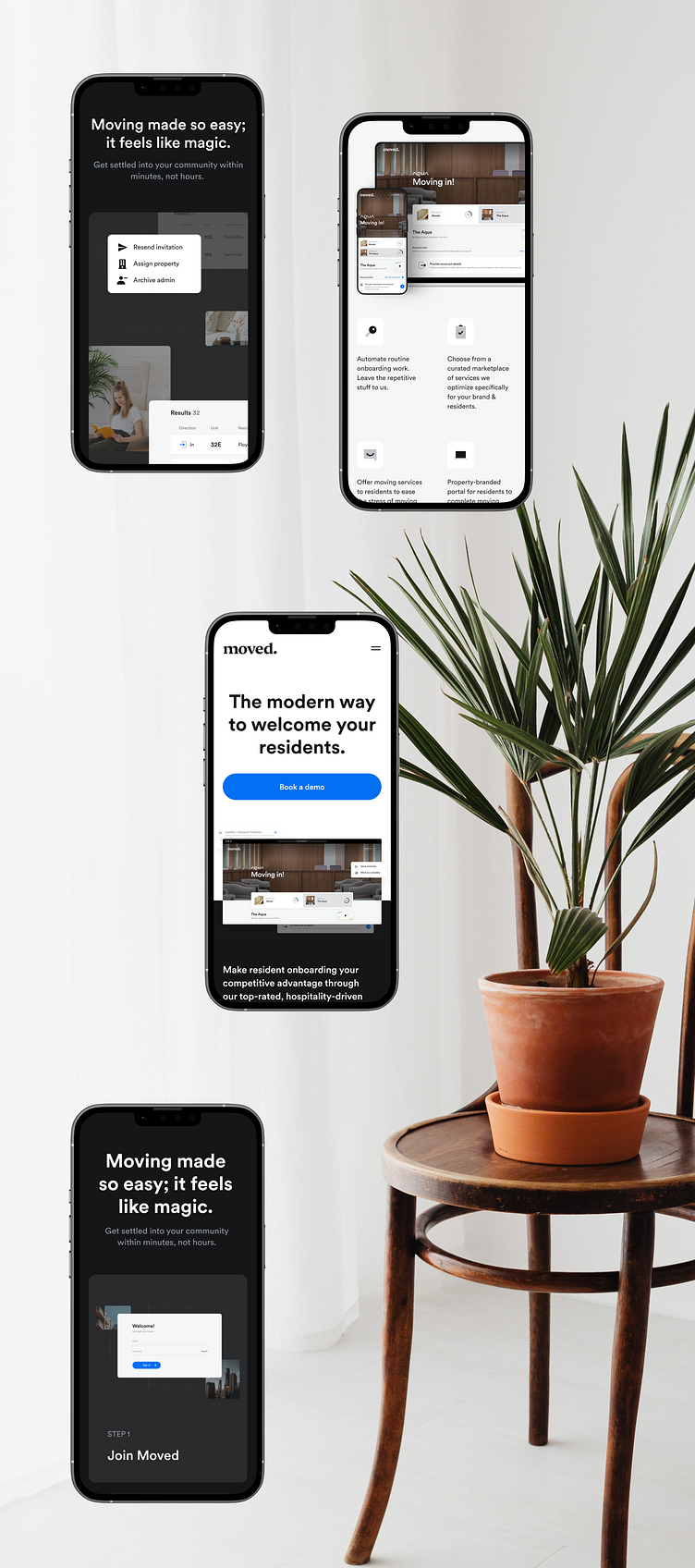
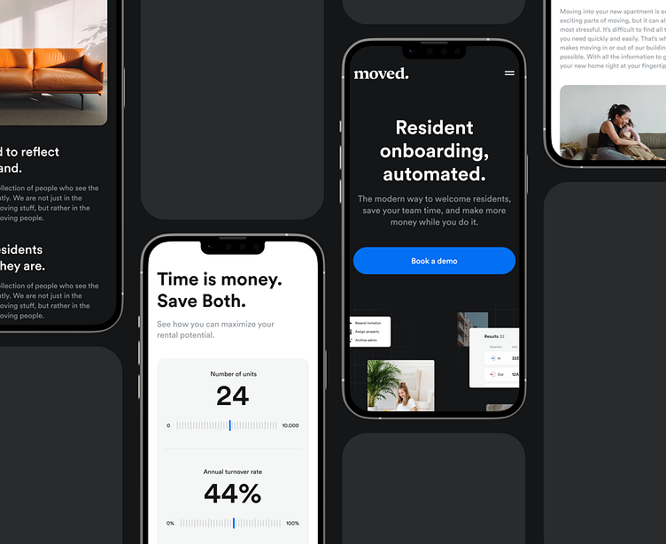
Mobile-first design era
For a decade or so we are living in the era of mobile-first design. People use every opportunity to watch something interesting on their smartphones. Therefore, it is impossible to imagine any website without it.
Moreover, responsive design can positively influence search engine optimization and improve your website's ranking in search engines (which is a priority for rankings).
Websites with responsive design have one URL (and one HTML) regardless of the device, which helps Google index the site better.
That's why we always make a responsive design for all projects, and Moved is no exception.
Check out how we harmoniously adapted all the web pages.
Peace, calm, responsive!