Scaling Design Systems Case Study
Overview
Problem
Head of Digital is releasing their beta version for IPTS Org, IPTS Travel, and IPTS Rail Websites. The rebranding of IPTS to Shuddle occurs in the process of creating the websites, which creates a lot of manual changes and longer execution time between the designers and front end engineers.
Solution
Develop a unified and robust design system, with synced design tokens, that can handle the many changes of the 3 websites between designers and developers.
Impact
Decrease development and designer work time from ~1 week's worth of effort into ~1 day of effort, through the usage of design tokens in the design system.
Improve the user experience by providing consistency and unity.
Increases visibility across both designers and developers at IPTS/Shuddle.
Role
<What did I do for this project and who was involved>
Feedback
<what did people mention about the project throughout the work> Add in a quote to help break up the flow, rather than blocks of text.
Project Links
Design System in Figma - Official Design System of Foundations and Components.
Nested card component in Github - contains an image, text descriptions with various font sizes, and a button component.
NPM package of design system - contains the nested card component code and the design tokens JSON file packaged.
Discoverability
ChatGPT
Space websites
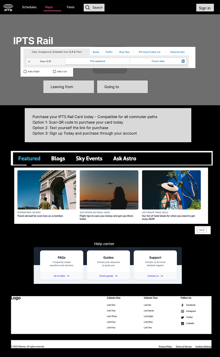
Travel websites
NYC and UK Railway websites
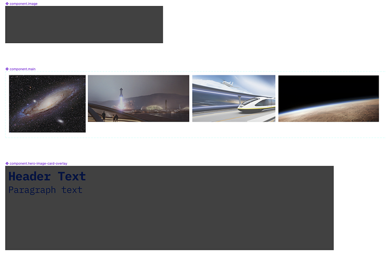
Low Fidelity Wireframes
I started creating the 3 websites first, prior to creating my design system components and elements in Figma. It started out with blocks on a canvas, to screenshots from different websites of what can potentially look like when working with high fidelity wireframes.
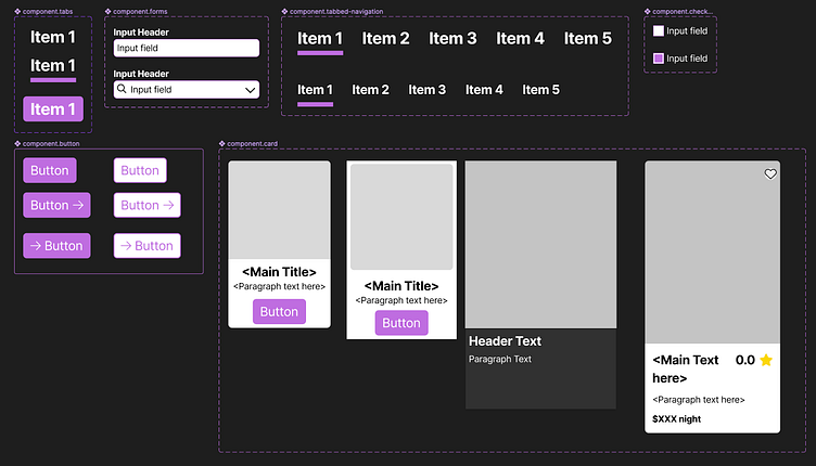
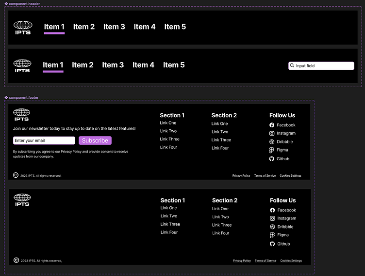
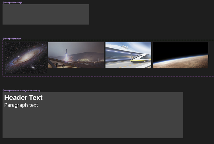
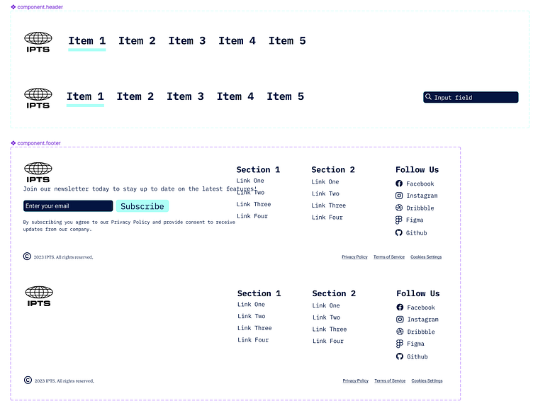
IPTS Design System creation
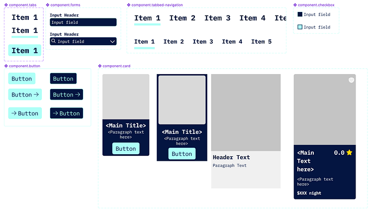
Once I started seeing the components structures across all 3 websites, I then decided to move into another Figma file for my design system of components. I first created the foundations, then worked on the components after working on the low fidelity wireframes of the website. Through the usage of autolayout and component variant creation, I was able to achieve a very clean design system component structure.
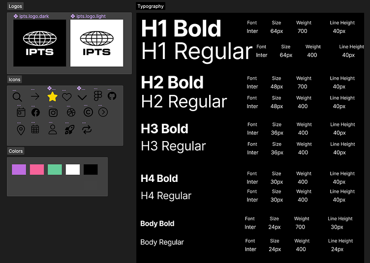
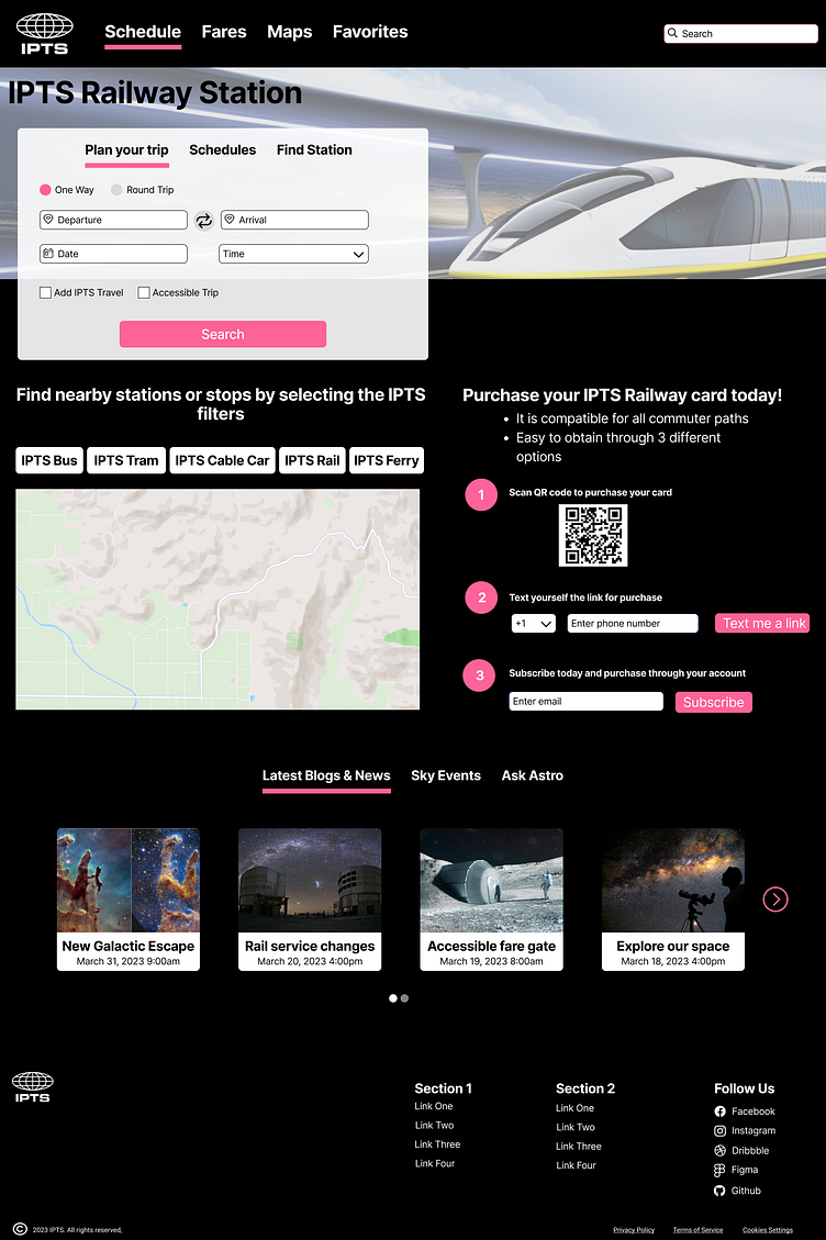
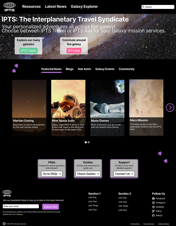
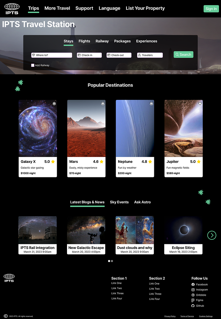
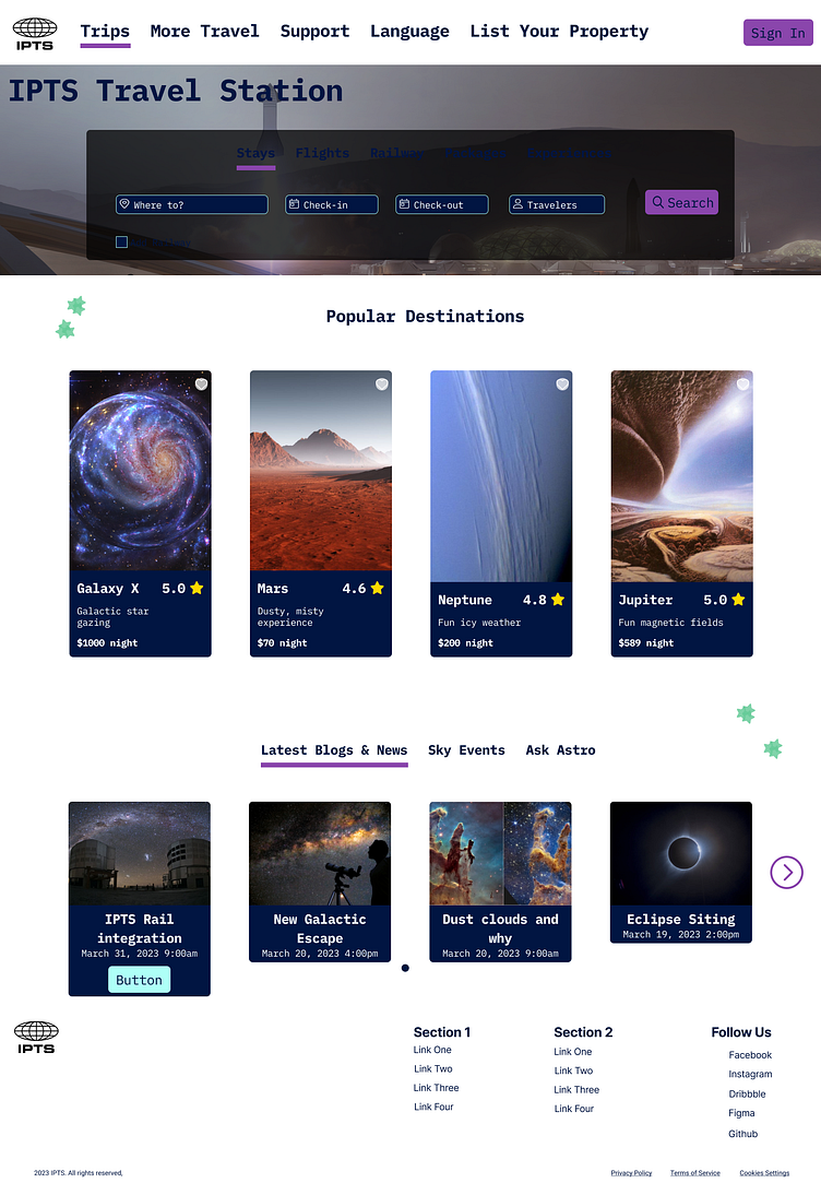
Once the components and the foundations have been defined, I was able to create the websites. With my low fidelity wireframes created, I replaced the screenshots/blocks of where the components would potentially be to the actual components created from my design system file.
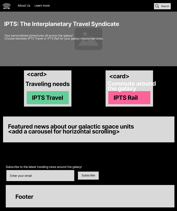
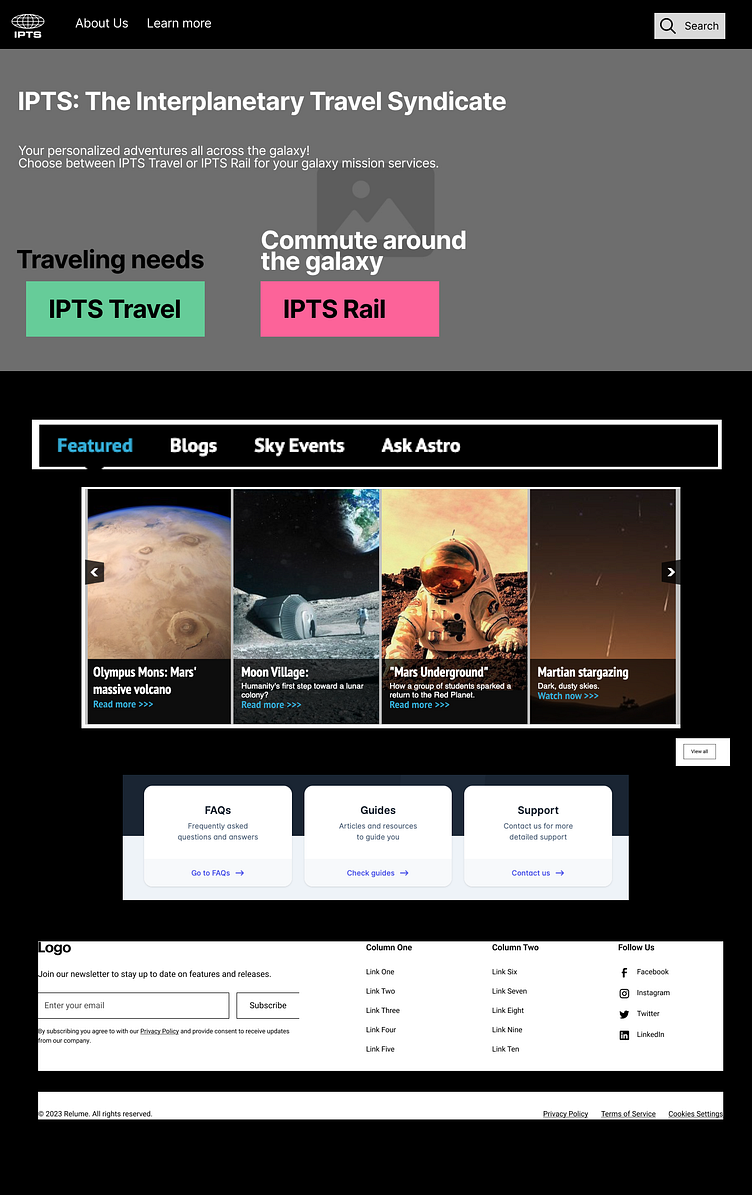
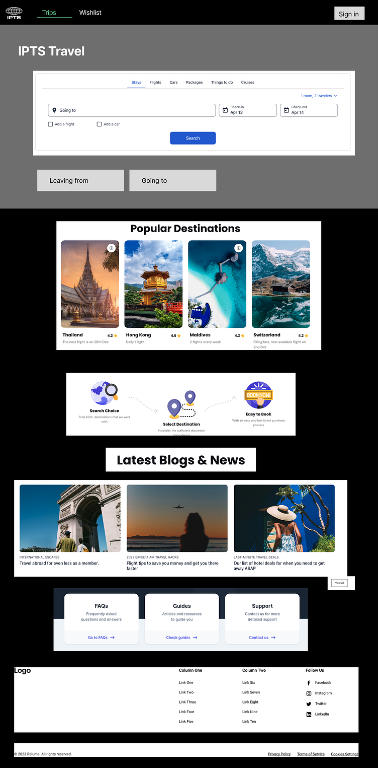
IPTS Websites
Rebranding the IPTS Design System to Shuddle
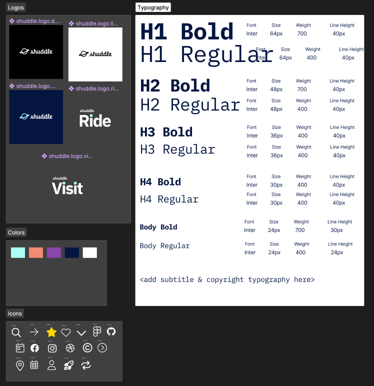
Design Tokens Creation
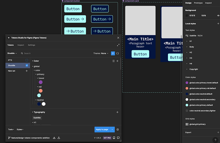
In order to help swap out the typography and color styling of the new rebranding guidelines, I leveraged the Figma Plugin 'Tokens Studio for Figma' to help me set the design tokens in place. I created 2 Tokens sets: IPTS and Shuddle.
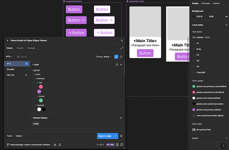
After adding in the new token set, I was able to swap out the colors and font size to all the components, as seen below.
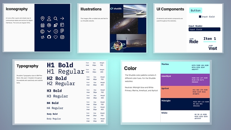
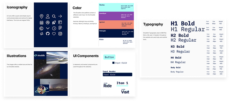
Shuddle Design System
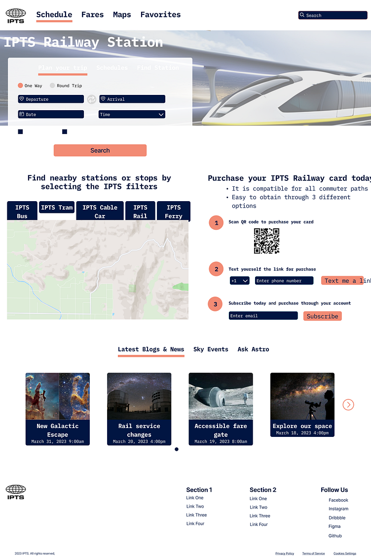
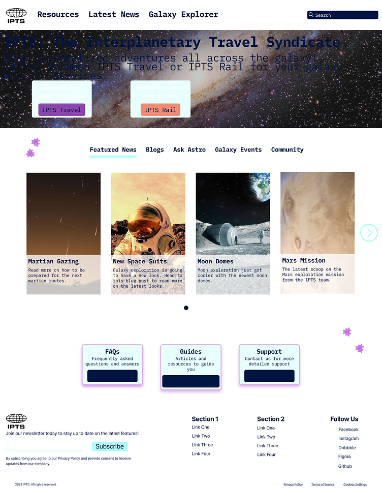
Once I swapped out the colors and typography of all the components, I published the changes to the team library, which created updates across all 3 websites. The website images below show how robust the design system is. After a color and typography change, the following websites were changed without modifications.
Shuddle Websites
Usability Test
Need to be ran -> show stats of which design system to include.
React Application with Design Tokens
You can upload your tokens.json file to Github, which will allow you to create design token variables that point to the values in your tokens.json file.
Tokens.json file in Github.
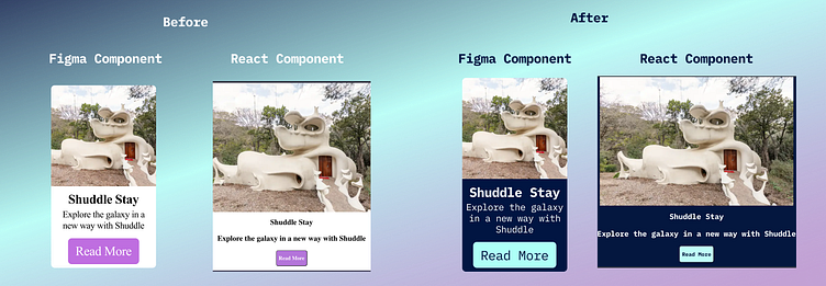
Figma and React Card Component with different themes
Demo
Exercise 1
Change the default neutral color from Midnight Blue ("#011542") to Subtle Pink ("#E73C70"; passes WGAC AA Compliance).
Exercise 2
Show theme changes from IPTS to Shuddle, on both the Figma and Github side.
Next Steps
Focus on improving the UI of the 3 websites with better visuals and fixing up the logo/photos across our platform.
Ensuring everything is Accessible by checking the following:
Colors are WCAG compliant of Levels AA and AAA.
Accessible Typography across the website.
Components, such as buttons and dropdowns, are ARIA compliant.
Document more information on how to use the components on Zeroheight
Enhance the design token structure in the React code by leveraging Style Dictionary (https://amzn.github.io/style-dictionary/#/README).


